An Inevitable Confliction – Black & White or Color
What you are about to read is a carefully pieced together word puzzle that in the end still has no real catharsis. I felt compelled to inform you of that fact in the very first sentence of this article. You should understand some beautifully simple questions have no true answer.
One of these great queries has been posed by so many people in regard to photography. It is a question that is so easy, so simple, and yet it will burn white hot in the heated conversations of photographers who are passionate and energetic enough to argue the subject.
Which photographic representation is better: color or black and white?
Now, let’s take a step back to mentally stretch and collect ourselves before we begin talking about this so that we can better understand the question we are actually entertaining. We’re not picking out paint for the kitchen here. This isn’t an issue of what looks best or a probe into what personal taste might dictate to be superior. Admittedly, I wrestled with how to even approach this topic.
Nevertheless, we find ourselves on the brink of wholly introspective thought and self opinion. The purpose of this discussion is to cause you to think about what emotion photography communicates to a person. What part of the presentation of the medium conveys that emotion?
Personally, I have always gravitated towards images that are presented in black and white. Monochrome has just been my inclination from the very beginning. But at the same time images with vibrant or emotive coloring also speak to me in the same way and with the same power as those in black and white. I completely understand how the question of black and white versus color can be such a personal conviction. I know of photographers who shoot exclusively in black and white as well as those who work only in color. Ironically, when asked, most of those photographers cannot give you a straightforward or less-diluted answer other than it is what “feels right” to them and “it’s what I prefer.”
There lies the problem. As photographers, should we ever do anything without a purpose? Meaning, shouldn’t we know why we do this or that or use this lens instead of that lens or prefer color over black and white images? I feel we should know the answer to this question for our own sakes and for our own artistic growth.
Whenever I find myself faced with a photographic conundrum whether it be a technical problem or a creative block I always seem to fall back and ask myself “WWAD“? What Would Ansel Do? Ansel Adams is my penultimate hero not only in the field of photography but also in the world of natural conservation and awareness. Ansel actively and vigorously photographed the world from the 1920s up until his death in 1984. He was and is still known as one of the fathers of landscape photography in America. So naturally he bore witness to the many changes that photography as an art would endure and had great foresight into the future of the medium. He is famously known for his black and white photographs but what is less known is that Ansel also produced a select number of photographs in color.
A “beguiling medium” is how Adams characterized the color photography during his time and he was most likely correct in this labeling. This early color film required such complex development and processing that it was daunting even for the master-grade darkroom skills of Ansel Adams. Instead, he believed that he could convey greater depth and emotion and even a better sense of color through black and white images than he could by shooting actual color film. Still, like many visionaries, Adams understood that the bounds of expression with color photography were limited by the technology of his time. The color film technology, in his eyes, simply was not on par with what he felt should be conveyed through a photograph. He poetically called this the “inevitable confliction.”
The conflict being the limitations posed by not having the correct tool to complete the deceivingly complex task of emotional expression with a photograph.
So maybe the question we should pose is not which is better, color or black & white. Perhaps we should instead be conditioning ourselves to better recognize the situations when a color photograph will make a stronger representation of our vision. So too should we learn to look past the color (or lack of) and understand when recording a subject in black and white might do a better job at accomplishing the same. Here lies the conflict within the conflict. When and how do you know which will work better? Luckily enough this a question we can answer at least to some degree. A good rule to follow when choosing between color or monochrome is to first decide what kind of scene you are working with at any given time. Is the scene full of contrasts of light and textures or contrasts of colors? If there are dramatic differences in light then a black and white photograph would most likely be desired.
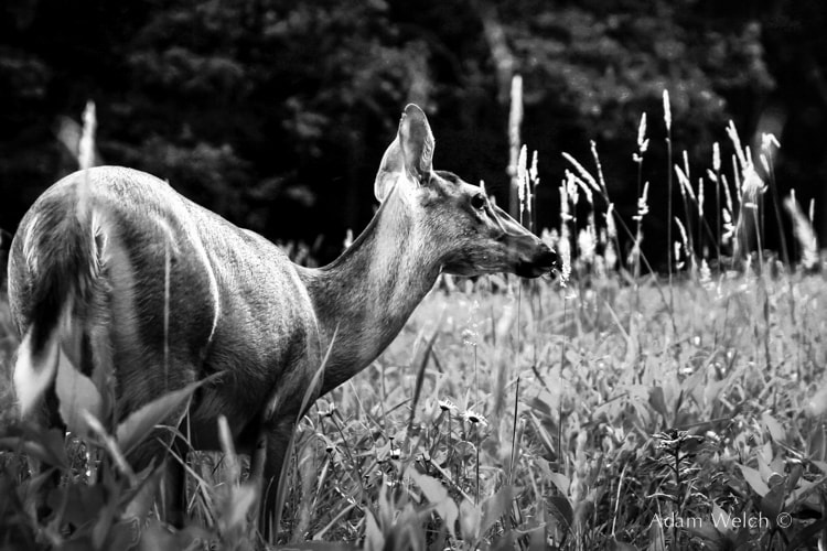
There was a lot of color in this photo but I thought the textures in the deer’s hair and the differences of lights and darks made for a more interesting image.
If the color is the predominant factor of the scene then of course you should work to emphasize that and display the colors in their full chromatic lustre.
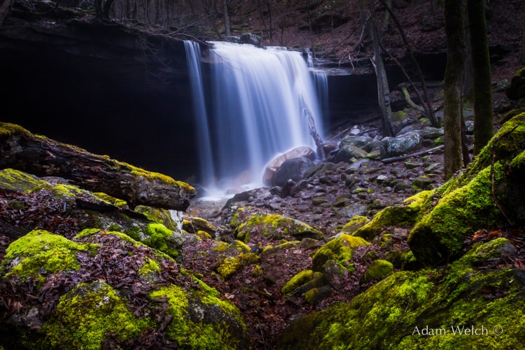
Look at the incredible color of the moss in contrast to the rocks. The overall tone of the scene was the same except for the vibrant greens.
The opposite proves to be true with this photo. Take a look at the original RAW file. It has no real remarkable distinctions of colors.
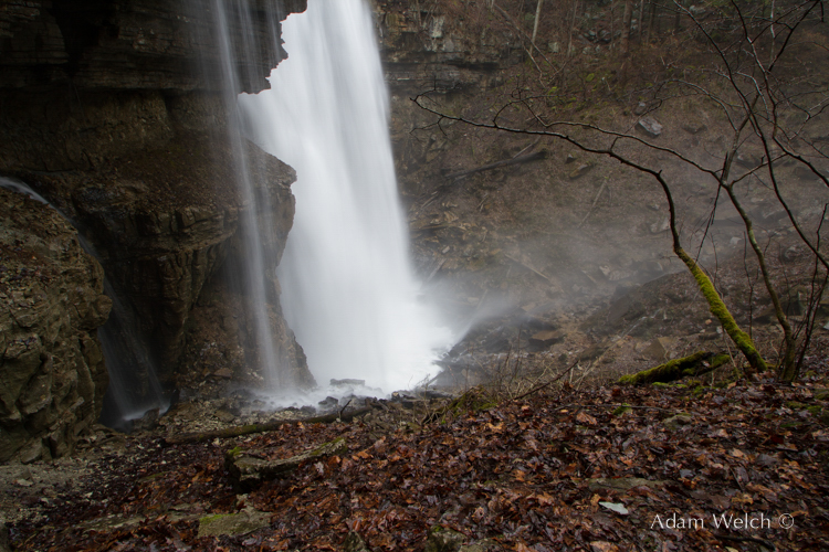
And now with a slight crop and converted to black and white.
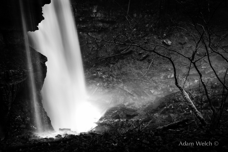
Pay attention to how the feel of the image changed using only differences in lights and darks.
Even this rule has exceptions so each photograph should be approached with objectivity and your own discretion should be relied upon. That “gut” feeling and artistic instinct is what you should always trust over anything else.
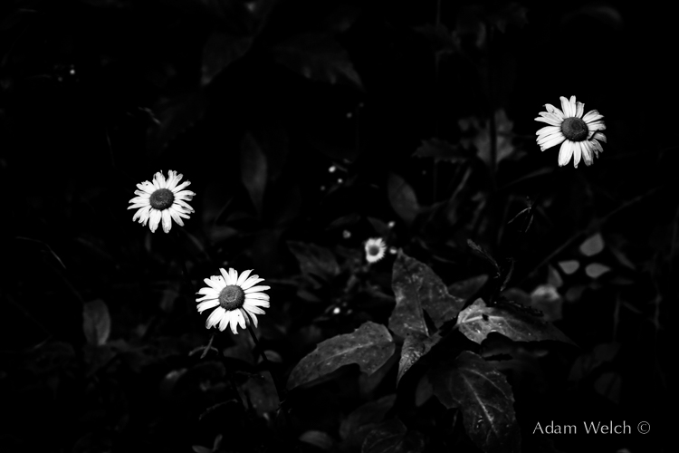
For example, have a look at this image.
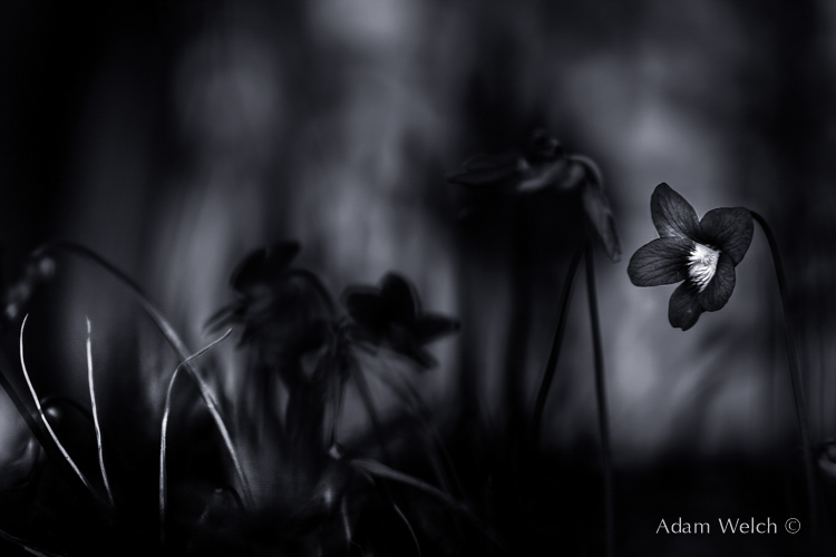
The flowers were an impressively bright purple but I went with black and white. I went with monochrome because I wanted to convey a sense of loneliness with the photograph.
I warned you in the beginning that the ultimate goal of this writing was not to give you a reliable method for choosing black and white over color or vice versa. It really isn’t even an attempt to offer an opinion for answering the question of which is better. Both of these issues are to some extent forever bound to the artistic and personal preferences of the photo maker. That responsibility in itself is somewhat intimidating and even nerve wracking at times. Did I make the right decision by converting this image to monochrome? In the end that is up to you.
Luckily, there are a few basic rules that can be applied to aid your decision but unluckily there are no set ways for determining which is better for expressing such a personal subject. As Ansel said, that is the inevitable confliction. Even with today’s advanced digital imaging there will always be a confliction and a subjectivity when attempting to portray a scene so that it shows others what was in the beginning only a concept within our own minds.
With which do you prefer to work? Black and white or color?
Tell us your thoughts on which and why via Twitter or Facebook!
