Picking Colors to Highlight Emotion in Your Pictures
Here’s what the smart use of color can do for your pictures: It can provoke emotion and even give deeper meaning to the stories you tell with your shots. In other words, spending some extra time to pick the appropriate colors can infuse your photography with so much more character. In turn, this creates a much richer viewing experience for anyone looking at your shots.
Think of color like this: In your photography, color should be the supporting player to the narrative that you’re trying to weave. Sometimes, color can even offer great contrast to the story you’re telling, which provides an unexpected, surprise element in your shots.
If you know your color theory well, you already know how color can set moods and affect the interpretation of a scene. That’s what we’re going to talk to you about today.
Using One Color at a Time

photo by planetlight
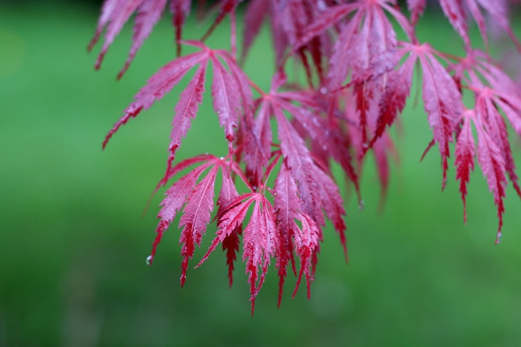
Monochromatic’s a great word because it indicates a commitment to only using one, specific color at a time. By highlighting one color exclusively in your frame, you get to express your deliberate side, which can provide a confident feeling in the entire frame.
Picture this: You take a shot of a blue sky above a sparkling, blue sea, and there’s a blue boat in the middle of the frame, too. This one-color harmony can make the viewer’s heart sing because it demonstrates a thorough cohesion in the frame.
Keep in mind that a shot like this is made even better by the use of different shades and hues of the same color. Using various shades and hues will help to bring up the quality of the shot even further. Remember that “monochrome” does not necessarily mean black & white, it can be any single color.
Using Color to Balance Shots

photo by Ginny
Balance in your pictures keeps everything from getting too excessive or, on the flipside, too underwhelming. As with other things in life, aiming for balance in photography is recommended as well.
So ask yourself if your shot feels balanced in terms of the way that the color elements are arranged. You can usually tell if your color balance is alright or not by analyzing both halves of the frame. If one half is too heavy with one color while the other side is way too light, then you know that imbalance exists, which should be fixed immediately.
Alternately, you may want to double-check to see if there’s just one color running throughout the entire frame to offer an element of unity in the shot. Again, if it’s there, you’ll want to fix that.
When one color is used too excessively – say, red – it can make your picture seem “angry” or too intense/passionate. If that’s the mood or theme you want for a particular shot, then more power to you, but if it isn’t, then you need to go back to the drawing board.
Using Specific Colors in a Symbolic Way

photo by Lucky Lynda
It’s common knowledge that colors stand for different emotions and so have come to symbolize different things. This bit of powerful knowledge will serve you very well in your photography if you use it wisely. Knowing what colors tend to evoke what specific emotions can empower you to create even more stirring and vivid shots.
For instance, we all know that the color red stands for intensity (at least in America and most European countries), such as when danger or passion is present. In contrast, the color yellow is much more subdued and calmer. As such, it usually is associated with emotions of cheerfulness and happiness.
To use red effectively, you may want to get a shot of a red-faced person… wearing a red shirt… screaming in anger. While this may not be the most pleasing image, it demonstrates very effectively how red can complement the emotion of passion in this example. Alternately, to use yellow to promote its associated emotions, you could take a shot of a smiling, young girl wearing a yellow sundress… standing in front of a bright, yellow building. This would naturally inspire feelings of cheerfulness in your viewers.
Using a Color Repetitively

photo by Comrade Foot
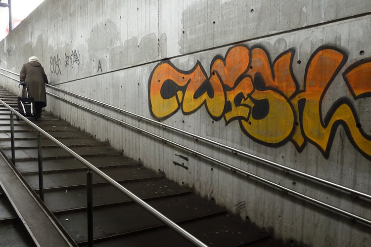
The good thing about repetition is that it helps to make something stick in the viewer’s brain. That’s exactly why using a color repetitively in a shot is another useful technique to help invoke emotion in a picture. Keep in mind that you can have other colors in the shot – that’s not a problem. However, if you want to use this technique, then one color has to be predominantly used again and again in the frame.
The interesting part about using one color repetitively in a frame is that it mirrors how effective this technique can already be with basic lines or shapes. By repeating a color, you create a visually attractive image that allows the viewer to home in on something specific. This naturally has the effect of drawing your viewer in, which is what any intelligently composed shot will do.
Think of photographing a mural out on the street, as one example. Let’s say the mural has the color orange repeated throughout… that’s its constant theme. The viewer will come away from looking at that shot with a feeling of excitement due to the vibrant nature of the repeating color.
Create More Emotion, Create Better Viewing Experiences
Photography should always be about the viewing experience, as in how you make your viewers feel when they’re looking at your work of art. Yes, you can experiment with new techniques here and there, but the primary goal should be to touch your viewers, which is the cornerstone of creating emotion in a shot.
When you succeed at creating emotion in photography, you also help to create a better story for each picture. This only adds to the increased connection of your work to your audience. And when you do that, you not only succeed as a photographer, but also an artist.
