The Importance of Contrast and Tone in Black and White Photography
 by
Kent DuFault
by
Kent DuFault

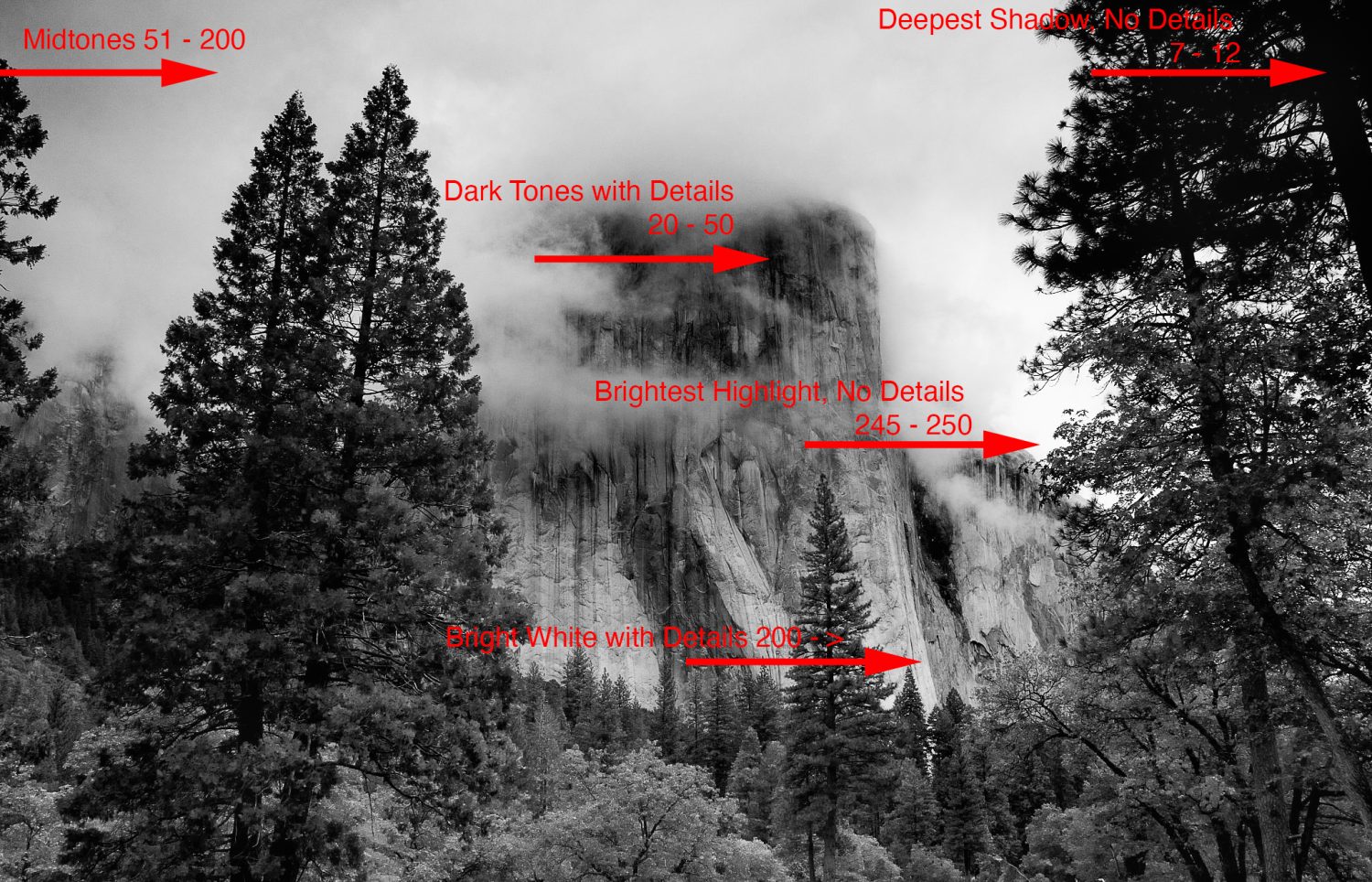
001
Students and new photography enthusiasts often ask me what’s the difference between taking color photos and black and white images.
The truth is that most of the same concerns and techniques apply to both.
However, two imaging attributes are generally more critical in black and white photography than in color.
Those two attributes are contrast and tone.
Why are they more critical in black and white photos than in color photos?
The colors of a color photo can carry the visual weight even if the contrast isn’t the best or the tonal values are misplaced. They can sort of camouflage those crucial elements.
In black and white photography, unless you have a good reason to do so (for a special effect), having either or both of those two attributes ‘off the mark’ can tank even the best-composed pictures.
The good news is that we have a vast amount of control over both of those picture components in digital photography.
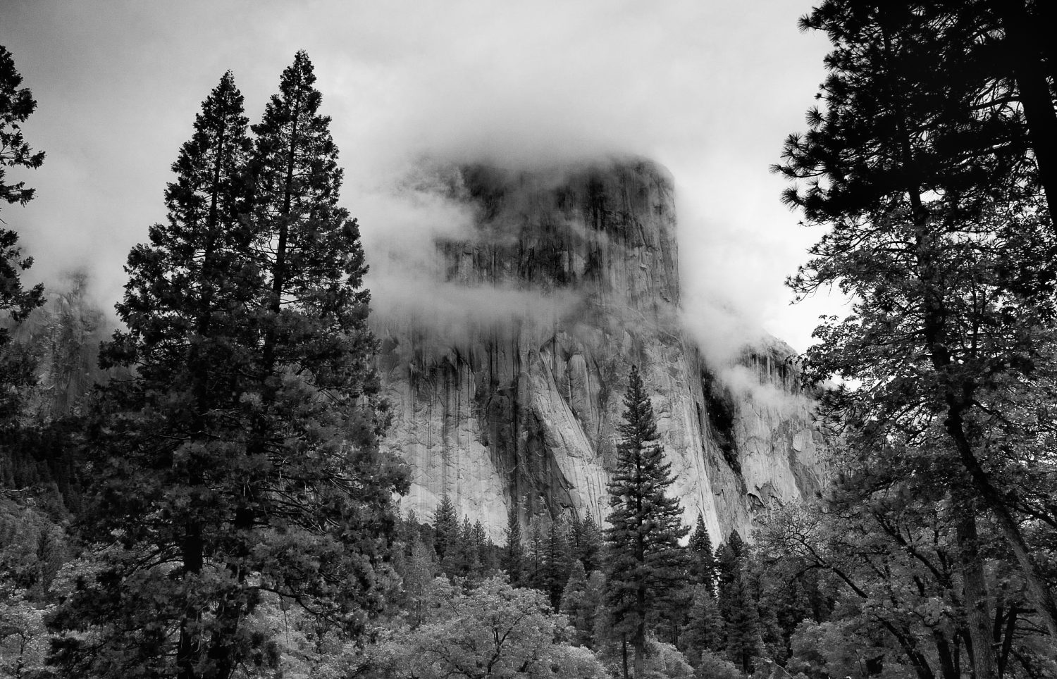
Image 001 is an example of a black and white photo with perfectly set tonal values and contrast range.
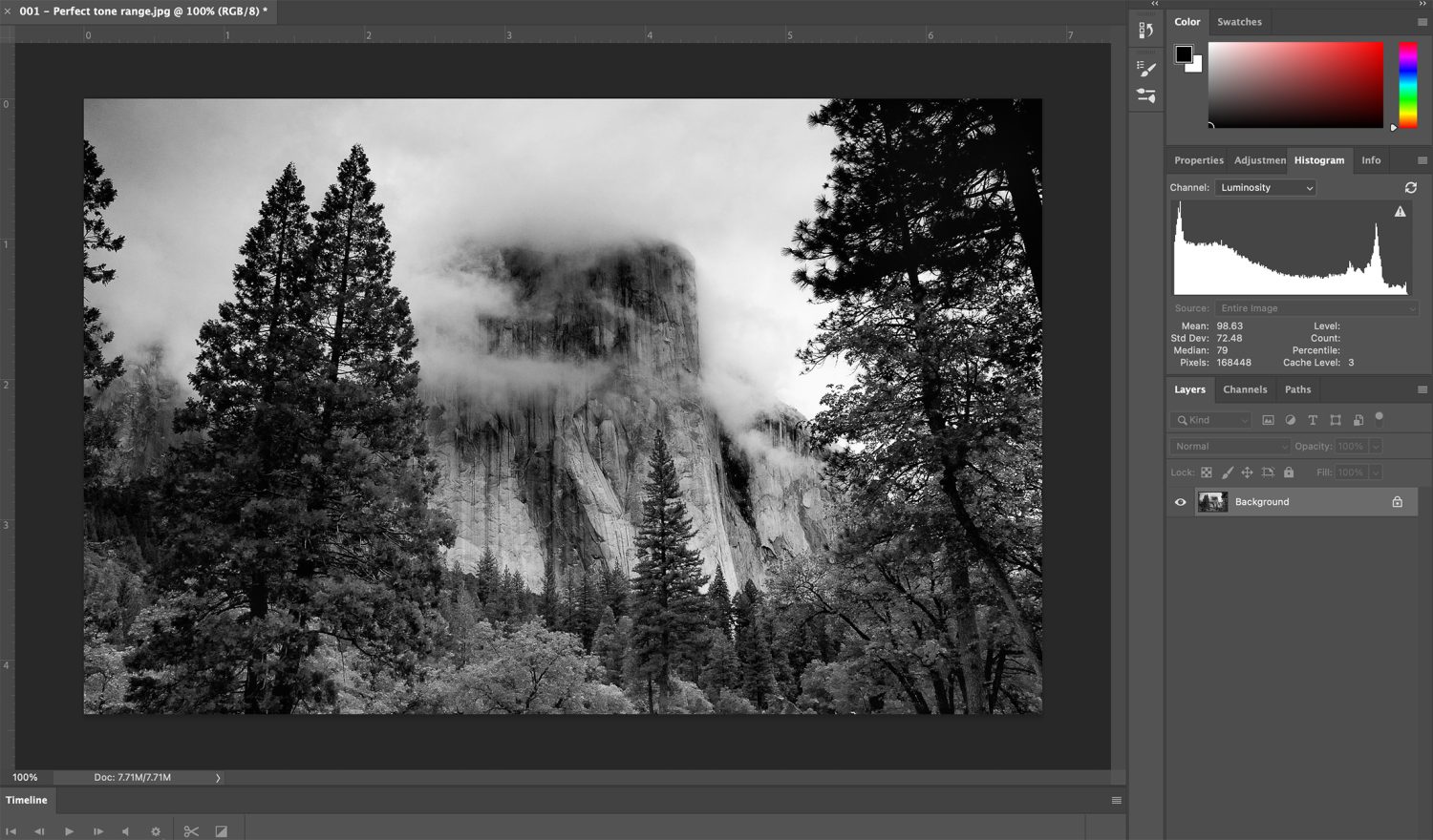
002
If you look closely at the histogram in image 002, you will see that the black tones end just before the graph ends on the left side. The highlights (or whites – if you prefer) drop off just before the chart ends on the right side. There is only minuscule clipping on both ends of the scale. This is acceptable and desirable if that clipping isn’t part of a critical subject area.
Also, notice that the histogram depicts many tonal values across the entire scale from left to right. This means an acceptable contrast range.
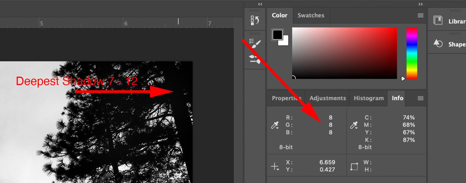
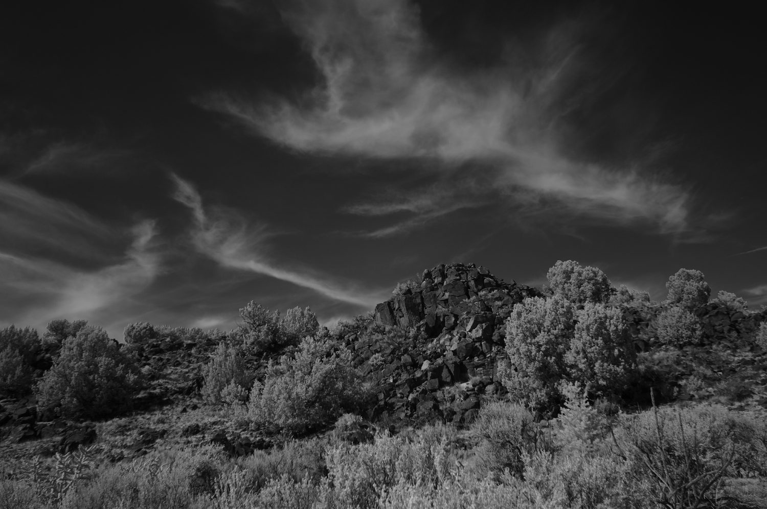
003
To achieve a full tonal range, you want the deepest shadow area to register at about 7-12 on the histogram when viewing that area with the info palette and the eyedropper.
Some photographers believe that it should read 0. After managing the production area of a studio retouching department for three years, I came to disagree with that notion.
When the deepest blacks are set to 0, they reproduce poorly in a photographic print and look unnatural. With the deepest shadows set to 7-12, they will appear natural and deep black.
Typically, your deep shadow areas (7-12) would not be in an important subject area – unless you’re looking to achieve a particular special effect.
004
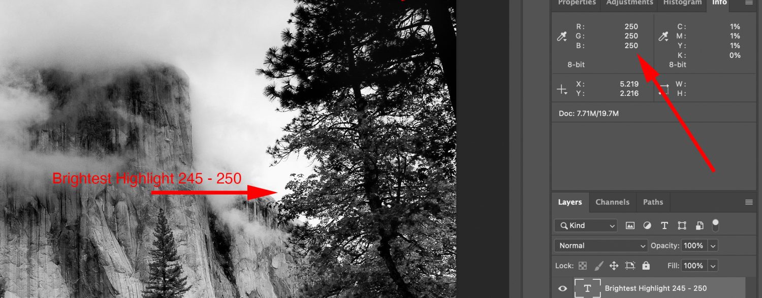
Looking at the other end of the histogram scale (which I was taught are called specular highlights; therefore, I refer to them as highlights, but some folks call this area the whites. No matter what you want to call it- it’s the brightest white area within the photo.) – you want this area to register at around 245 – 250 on the histogram when viewing the info palette with the eyedropper.
Now, some photographers believe this area should be 255- that’s the maximum white on the histogram.
But again, my experience in the retouching studio and working with labs indicated that it was not the best setting, as it completely deleted any tone or detail whatsoever – a very unrealistic reproduction in a photographic print.
005
Here you can see how the various tones map out in this excellent image.
Deepest shadow area 7 – 12 in a non-important subject area.
Brightest highlight (white) 245 – 250 in a non-important subject area
Dark tones with details 20 – 50 on the histogram
Light tones with details 200 > to 245 on the histogram
Mid-tones 51 – 200 on the histogram
Let’s look at some less than stellar examples of contrast and tone in black and white photography.
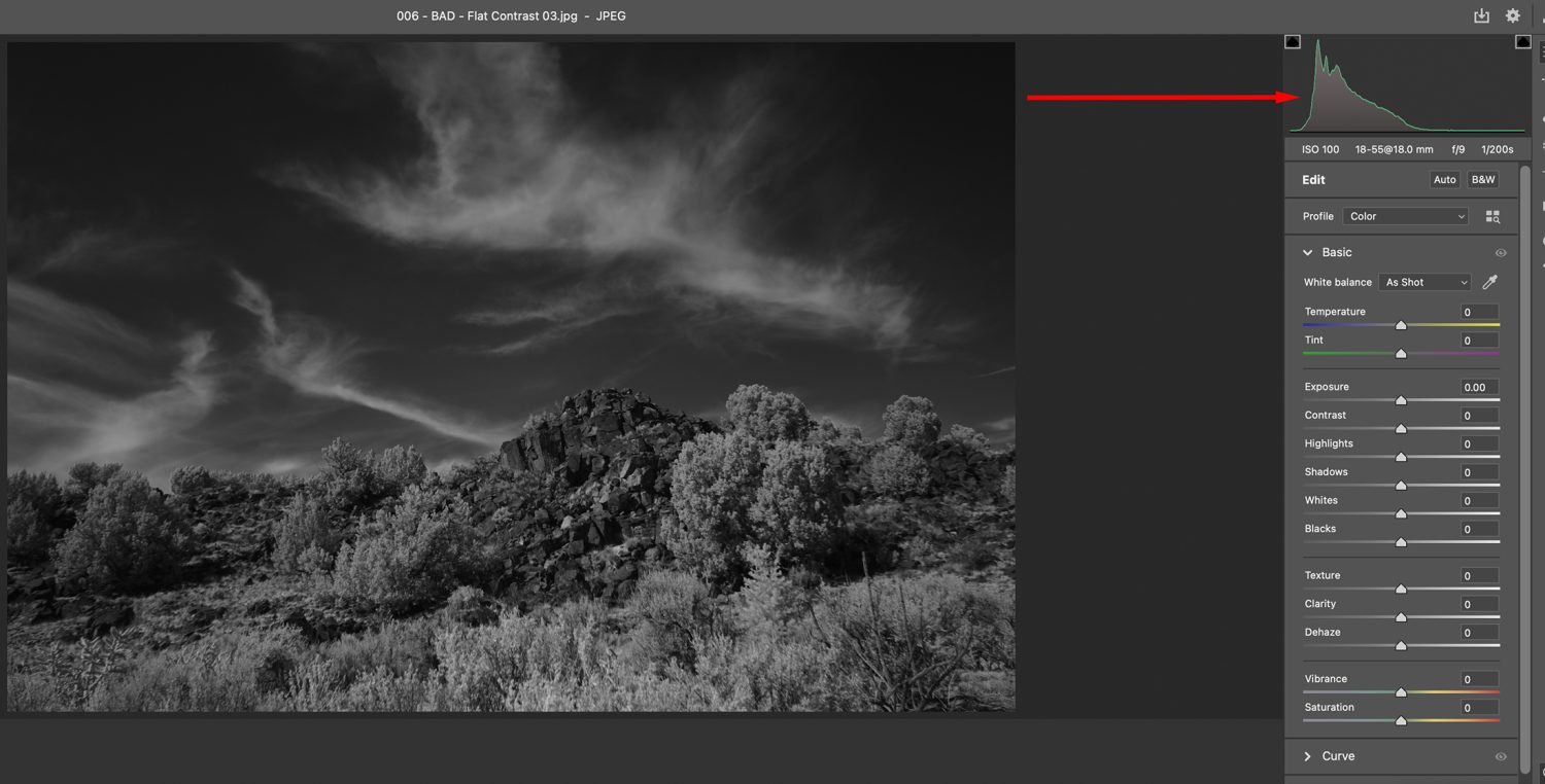
006
This image is flat in contrast and skewed toward the shadows. The appearance is muddy. On a histogram, most of all the tones would be gathered to the left side of the histogram.
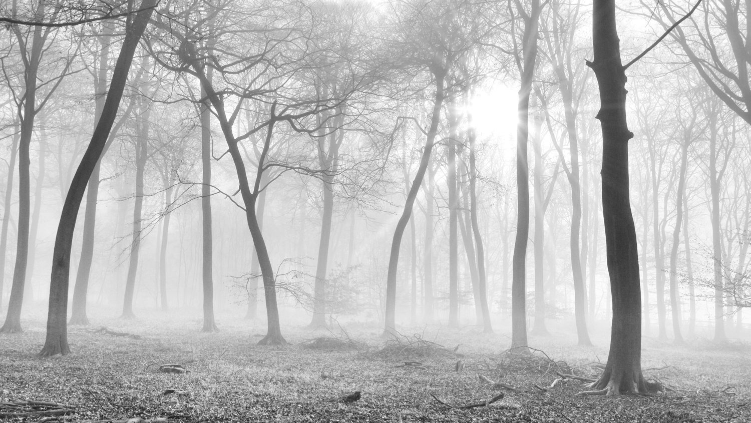
007
In image 007, you can see how this histogram appears. An image such as this could be a full tonal range shot. But you must see some elevation of the histogram on the highlight (whites) end of the scale. This could have been accomplished by whitening and brightening up the clouds. A primarily dark photo with a smaller area of white or light tone is known as a low-key image. This is true of black and white or color.
008
This example (image 008) is also lackluster and flat in appearance, but for a different reason. It, too, lacks contrast. However, in this case, all the tones are gathered on the right side of the histogram.
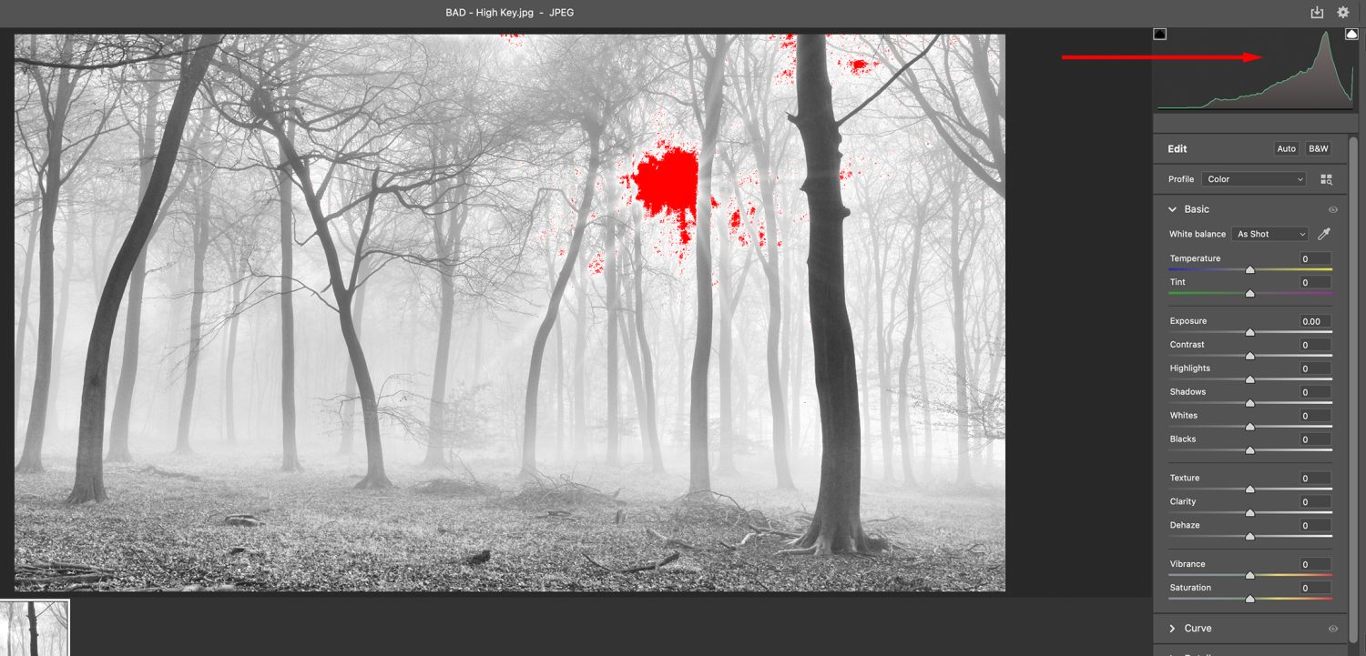
008a
Some folks might claim that’s because this is a high-key photo. I agree, that I think it was an attempt to be a high-key photo. But without a full tonal range, either a high-key or low-key image will appear dull in tone and contrast – feeling incomplete, and that’s not good.
Notice how the histogram in image 008a is the exact opposite of the histogram in image 007.
009
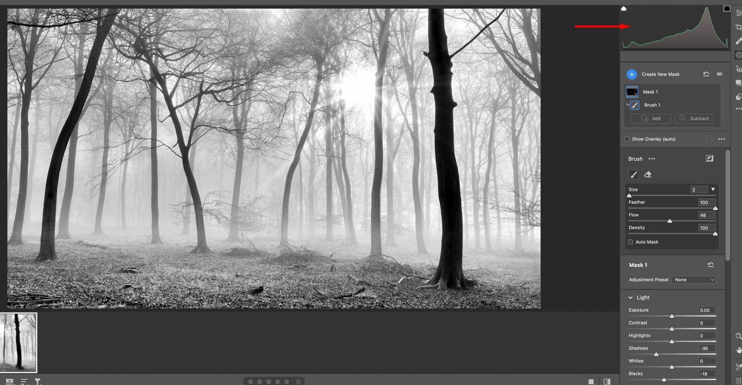
Using the Brush Tool in the Camera Raw window, I darkened a couple of the foreground trees. You can see where the histogram bumped up on the dark end of the histogram scale.
This is now a perfect example of a high-key photo. Study the histogram in image 009. This is how a high-key shot should appear in terms of tone for a full tonal scale, black and white or color photo.
Here is one more example.
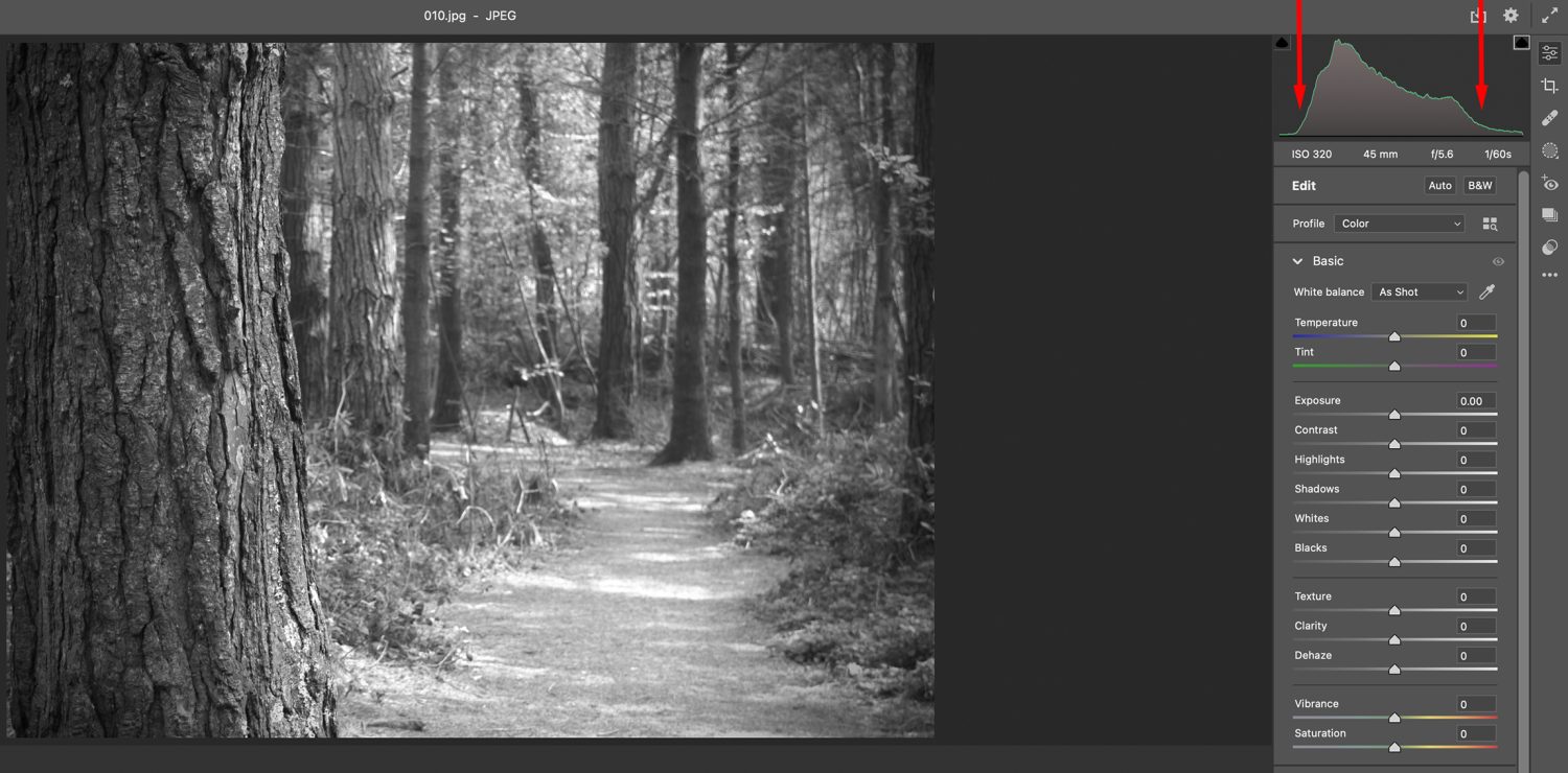
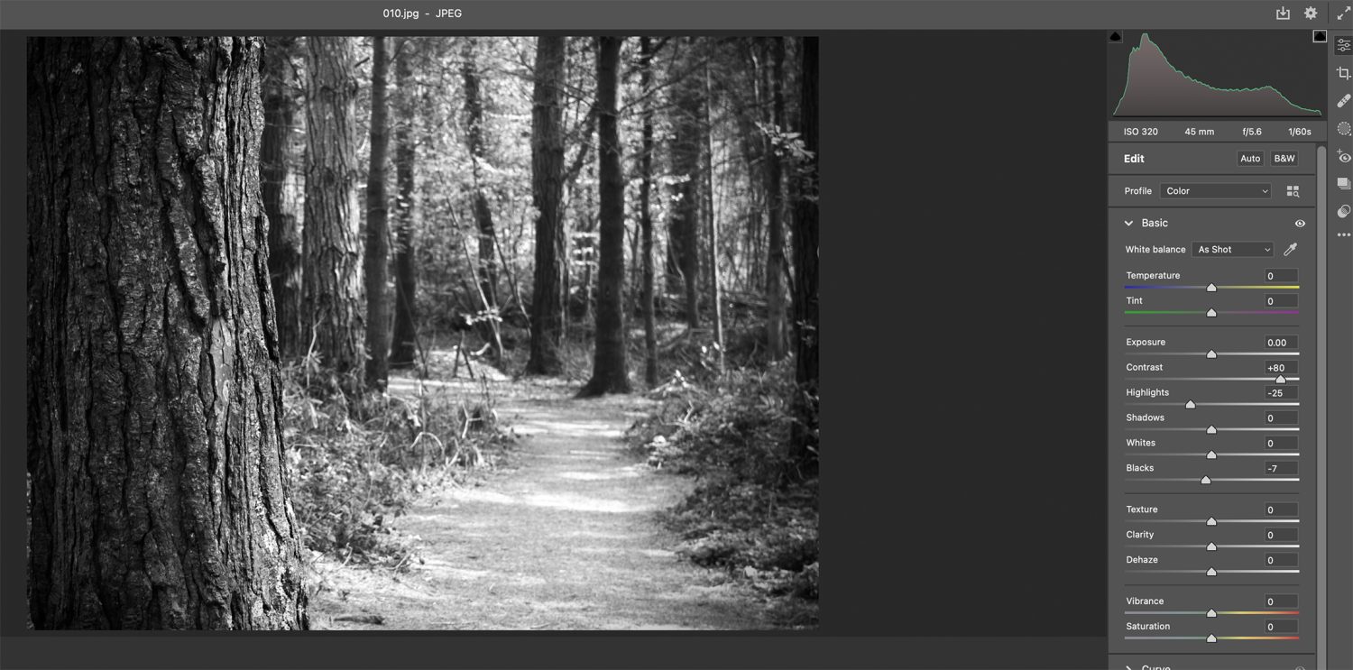
010
This third example is also flat looking and lacking depth and tone. However, we have a third reason different from the previous two examples causing the problem this time.
011
Image 011 shows us that most of the pixels are gathered in the center of the histogram, and there are very few to no pixels on either end of the scale. This is a classic example of a photo (black and white or color) that suffers from low contrast. You want those pixels to reach out to each end of the scale.
012
Fortunately, this is an easy fix with a tweak to the Contrast, Highlights, and Blacks sliders. Avoid going too far and introducing clipping when making a photo edit like this.
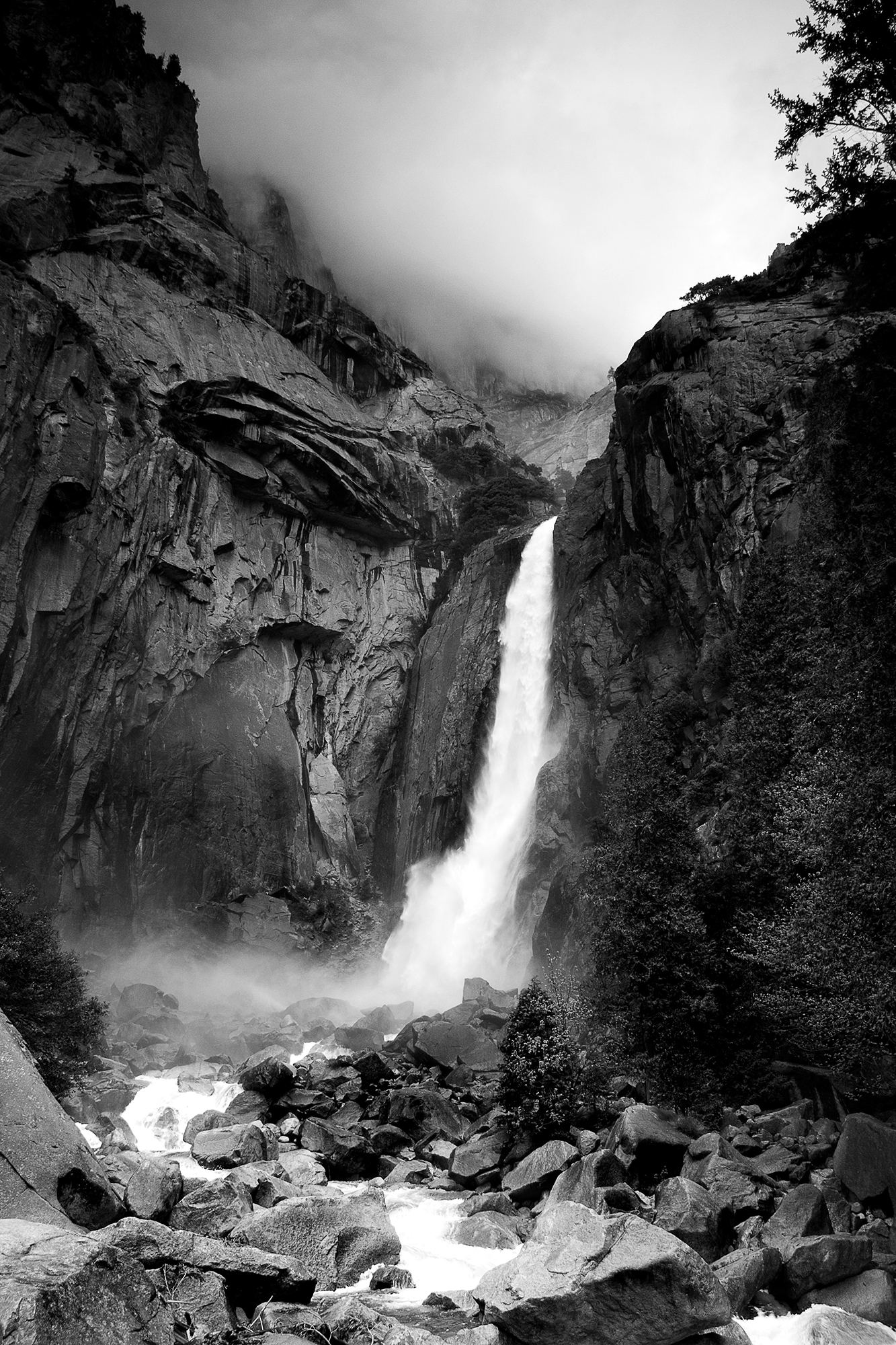
013
This is a beautiful landscape and an acceptable reproduction – IF – it was the intent to reproduce this in high contrast.
014
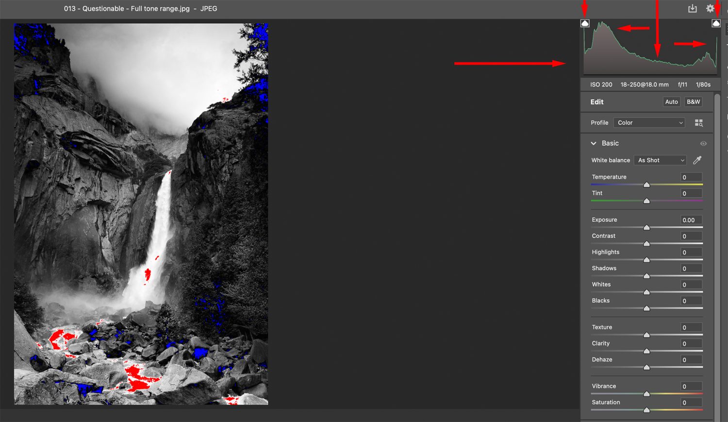
When studying the contrast and tonal range of your black and white photo conversions (color too, for that matter), always have your clipping indicators turned on. In my editing program, they are indicated by diamond-shaped icons located above the histogram.
When you turn these on, you will see the shadow and highlight (blacks/whites) areas that are being clipped off- meaning they have no detail and will reproduce with an unnatural looking pure black or white tone in a photographic print. In image 014, these areas are shown on the Preview image as blue and red. Blue is the blacks, and red is the whites.
A high contrast photo’s histogram will have peaks at both ends of the spectrum and far fewer pixels in the central area. When either end (blacks or whites) is clipped, the scale will not reach down to the baseline before ending.
I love high contrast work. So, I’m not saying this is bad. I’m saying that you need to be in control of the outcome.
If your goal is to produce fully detailed black and white landscape photographic prints with deep rich blacks and creamy, luxurious whites à la Ansel Adams. In that case, clipping isn’t your friend.

015
An essential concept in black and white photography is understanding that the process doesn’t recognize color – only tone, even within a color scene, and this includes film and digital.
If you have the colors green, blue, and red, and they all have the same tone (brightness value), they will all convert to a similar black and white shade of gray, as seen in image 015.
016
This is a super important concept for any black and white photographer.
You must learn how to evaluate how the colors within a scene will translate to grey tones.
Suppose you are into black and white film photography. In that case, this task is more challenging because most of your options to tweak the tones occur when you snap the shutter on your camera. Those options include color filters and the lighting.
Yes, some adjustment is possible in the darkroom. But that option is difficult to come by these days.
Mostly everyone is shooting digital photography.
I do not recommend setting up your camera to shoot in black and white as you lose control of the conversion process of color to grey tones.
I recommend shooting in the camera raw setting and making your conversion with your camera raw editing program.
I use Adobe Camera Raw for my conversions, but there are many other options.
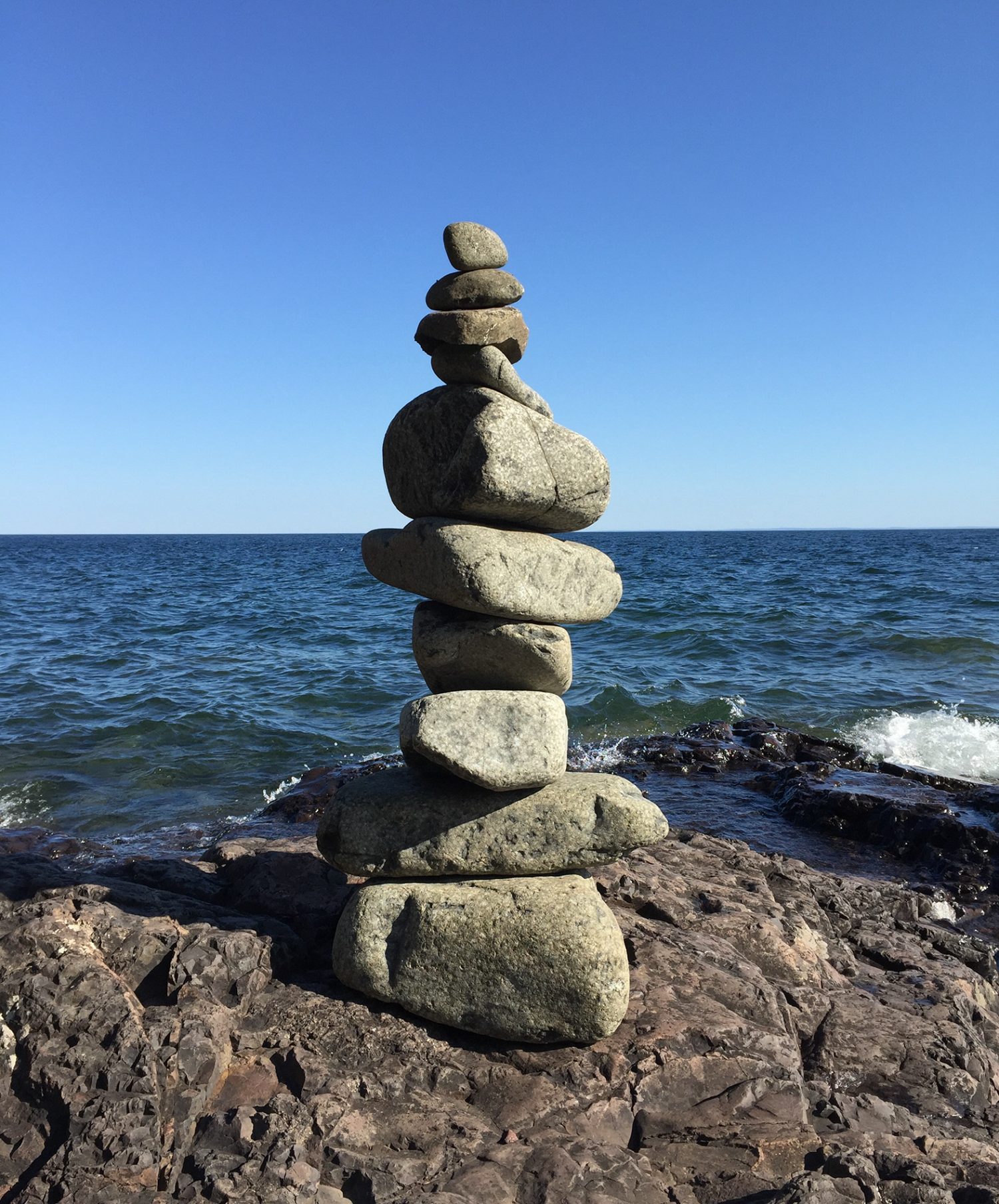
017
Look at this color image. Converting this to black and white will be challenging as the colors and tones are very similar. The subject is stacked rocks. Ideally, this statue of rocks should stand out prominently from its surroundings.
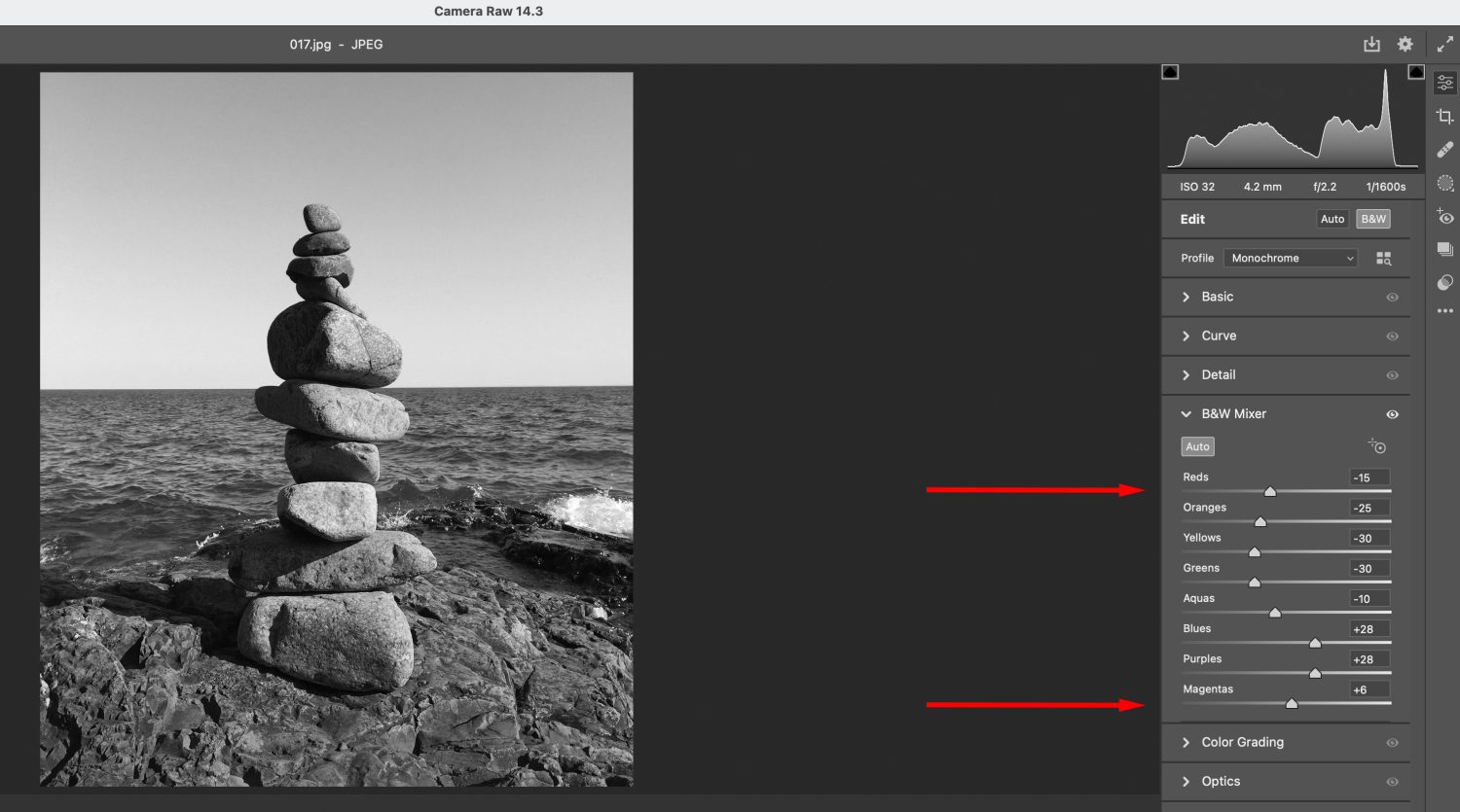
018
You want to do your conversion with any editing options that present you with a series of sliding adjustments, as you see in image 018. This conversion process allows you to adjust each color channel carefully to a specific tonal value.
019
If you use an automated conversion process, you may end up with a shot like 019, where the final product is uninteresting due to the conversion process itself.
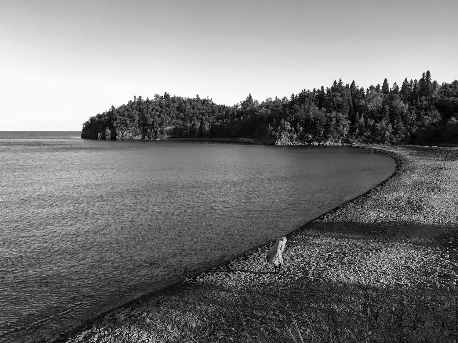
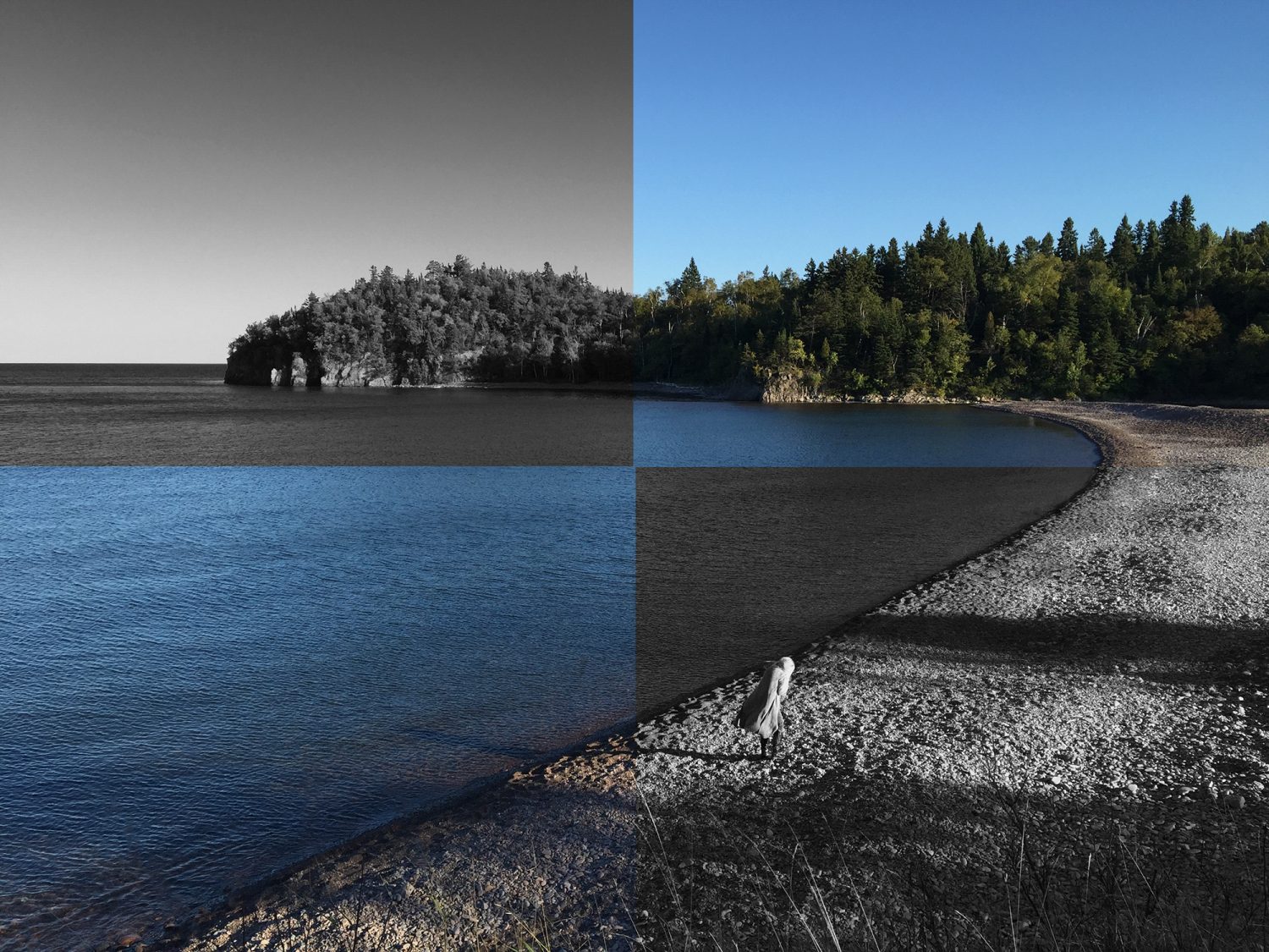
020
Image 020 had every tone carefully mapped out into my composition so that the woman, my subject area, stands out conspicuously and is primary over the surrounding beautiful landscape.
I hope you found this discussion interesting and useful. I look forward to seeing your stunning black and white artwork on the web!
And on a final note, if you want to learn how to produce your own dynamic and share-worthy black and white photos, check out this step by step guide, the Better Black and White Guide. With exact and practical follow-along instructions, you can learn how to create compelling and beautiful black and white images every time. Get the guide here.