Do you want to produce stunning edits in Lightroom [1]?
Edits that will make your photos look amazing?
You can.
Because it turns out there are a few Lightroom secrets that expert photographers use over and over again.
Now, these secrets aren’t complicated…
…but they can make a huge difference to your photos.
Are you ready to take your photography to the next level?
Let’s dive right in.
(Note: All of these instructions assume that you’re already in Lightroom’s Develop module. So if you’re not, head on over!)
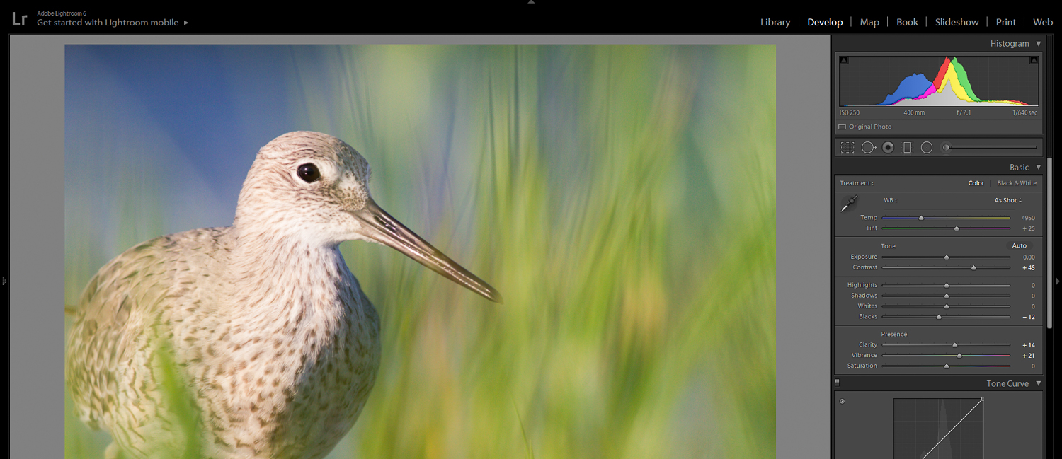
1. Use the Tone Sliders to Make Your Photos Pop
The Tone sliders are the bread and butter of Lightroom.
And while they might seem unimpressively simple…
…they can really make your photos pop.
Now, the Tone panel includes six different sliders:
- Exposure
- Contrast
- Highlights
- Shadows
- Whites
- Blacks
But I just want to talk about two of them:
- Whites
- Blacks
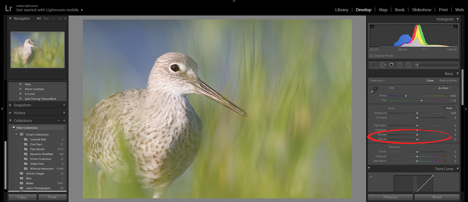
These two sliders modify the extremes of your photo. Drop the Blacks slider, and the darkest parts of your photo will darken.
Boost the Whites slider, and the brightest parts of your photo will brighten.
The two of these together are a potent combination.
You see, most images suffer from a lack of punch. They’re good. But they’re not jaw-droppingly great.
And one of the biggest culprits?
A lack of contrast [2].
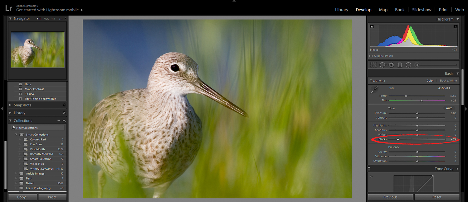
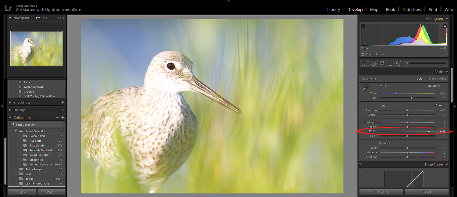
This is great to know, because it’s so easy to correct in Lightroom. In fact, this is often one of the first steps in my Lightroom editing workflow:
Increase the whites.
And decrease the blacks.
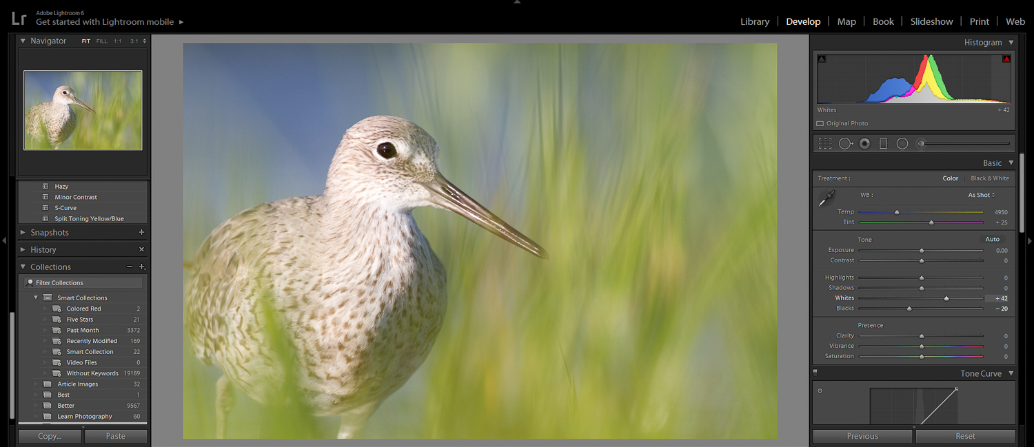
Now, don’t be too heavy-handed on the Blacks. You don’t want to create unnatural looking shadows. The goal is to get it just right.
If you do this, you’ll lend your image that extra bit of pop.
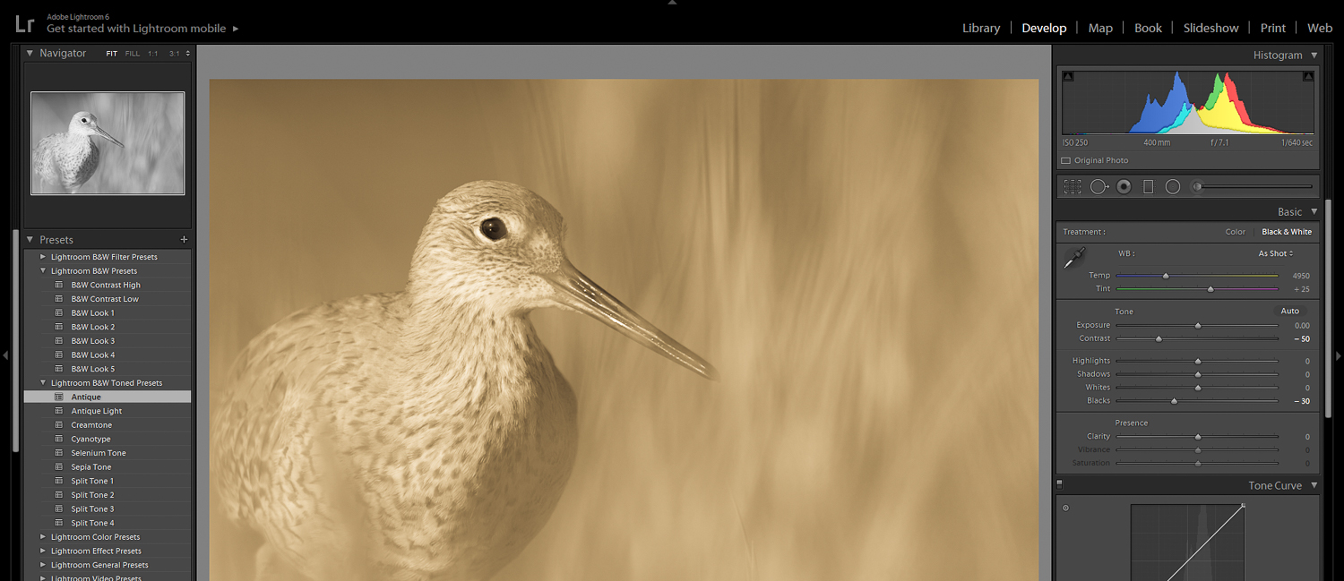
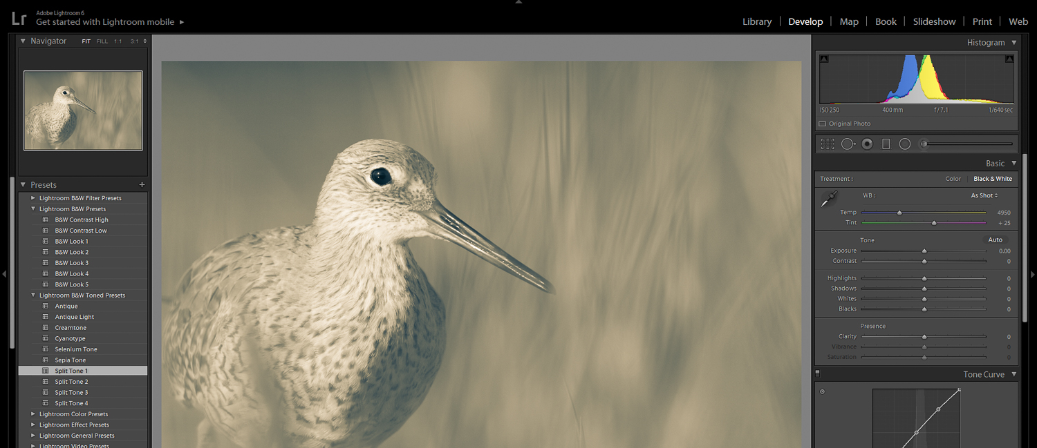
2. Use Complementary Split Toning for a Gorgeous Subtle Glow
Have you ever noticed that professional photography tends to look…special?
There’s something about it, some ineffable quality that makes it look wonderfully polished.
Take a look at the website of Brandon Woelfel [3], professional portrait photographer:
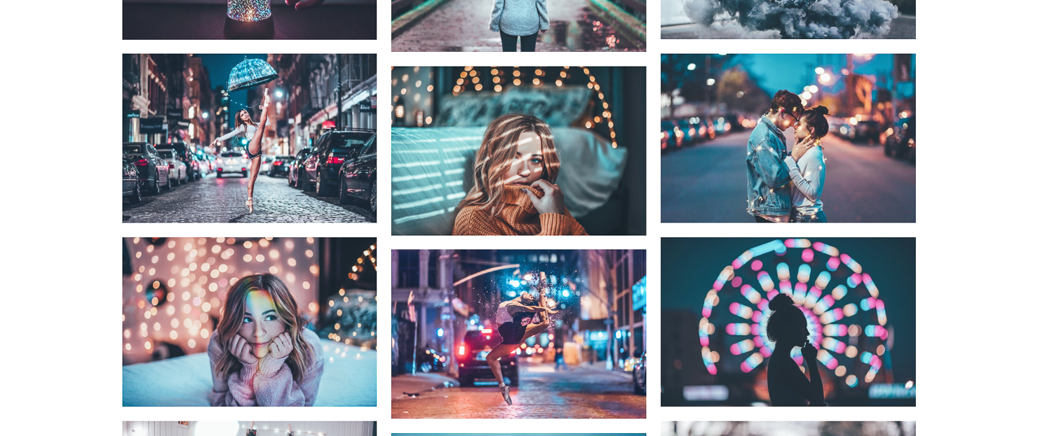
Like his work or hate it, you’ve got to acknowledge: There’s something special about it.
Well, I’m here to tell you:
That something special?
It’s called color toning (also known as color grading [4]).
And it’s really, really simple. All that you do is change the color of the highlights and shadows in your photos–which can be done in the Lightroom Split Toning panel.
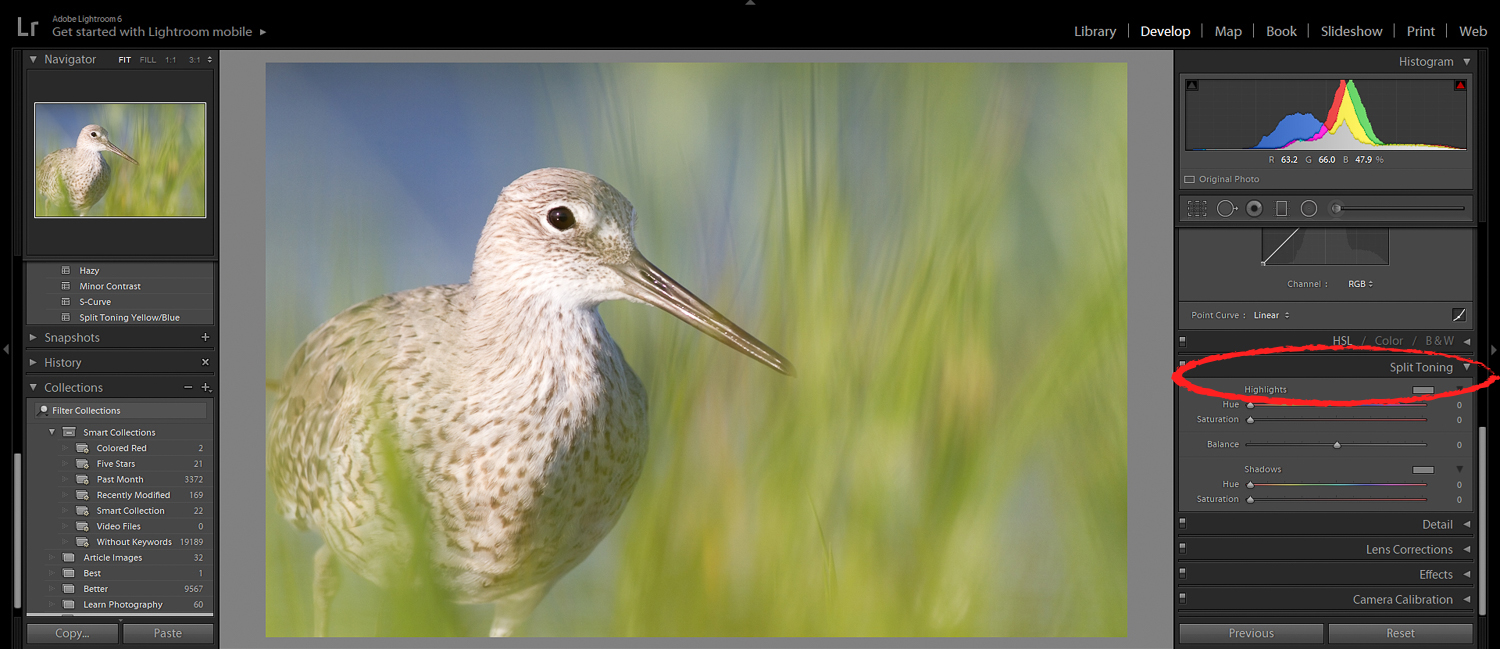
Simply click on the Highlights and Shadows boxes. Then go ahead and test out various split tone options. Watch as the colors of the highlights and shadows changes.
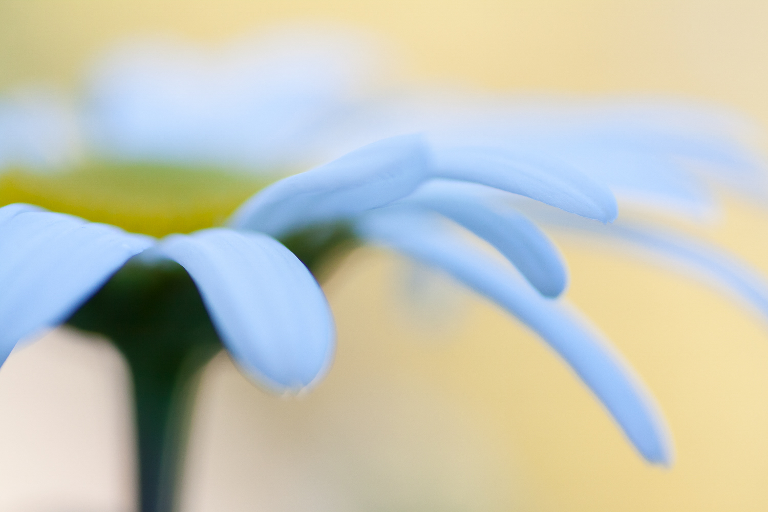
For example, you can make the highlights yellow:
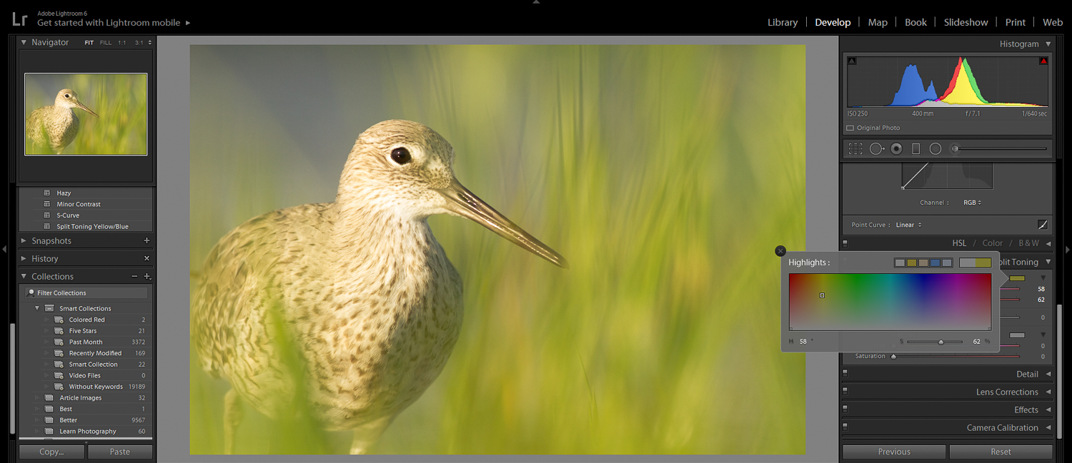
Or the shadows blue:
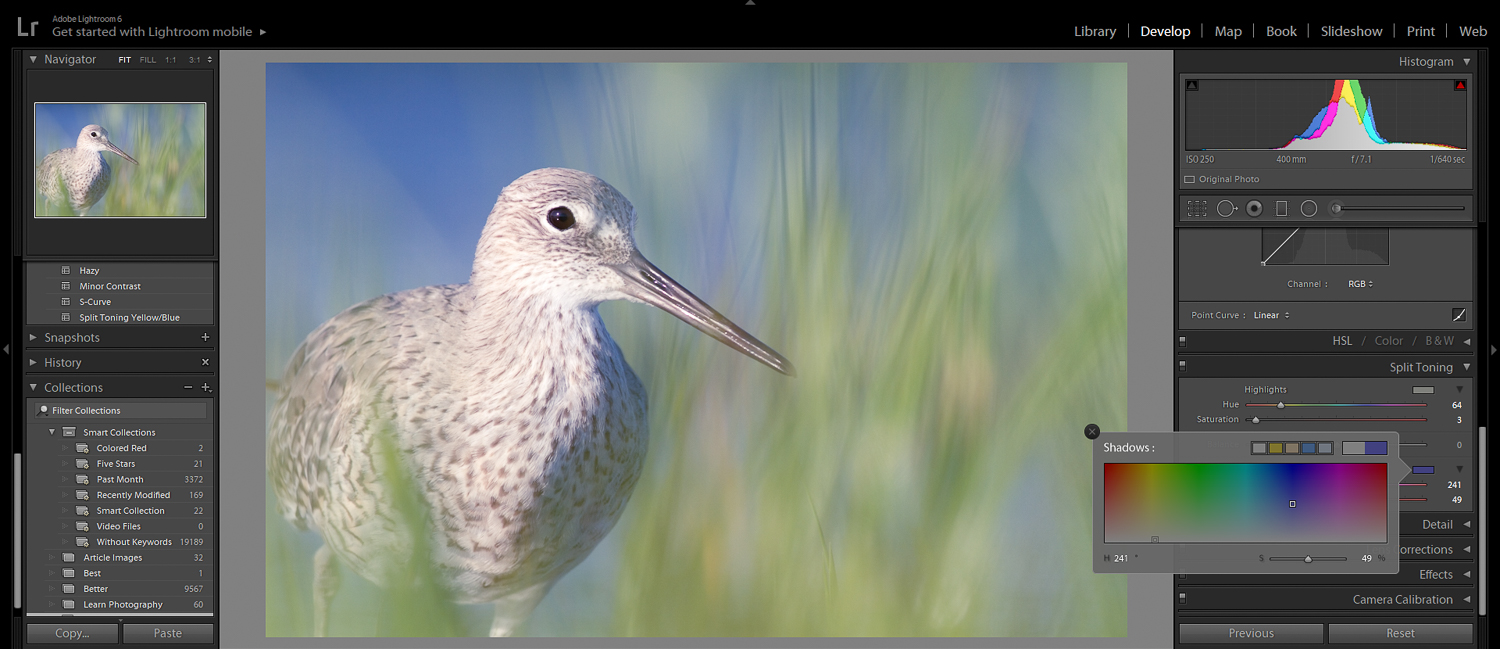
However, the best split toning combinations often use complementary colors. That is, they use colors that sit opposite one another on the color wheel.
Yellow highlights and blue shadows tend to work well together. As do orange highlights and green shadows.
In general, you want to keep things subtle. Try to enhance colors that are already in your photos, rather than creating an entirely new palette.
Split toning is a pretty easy trick–but it can make a huge difference in your photos.
And speaking of colors, if you want to do some more advanced editing:
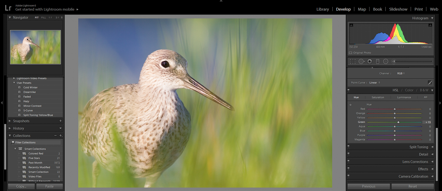
3. Use the HSL Sliders to Enhance Your Colors
The HSL sliders [5] are a super-underutilized tool in Lightroom.
You can find them in the HSL panel, right above the Split Toning panel:
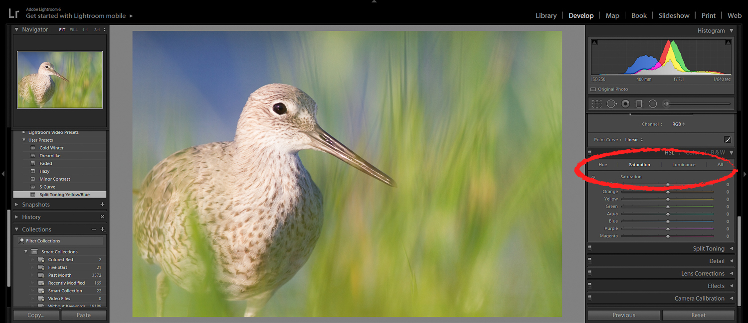
In the HSL panel, you can modify the hue, the saturation, and the luminance (brightness) of individual colors.
Here’s what’s so great about the HSL sliders:
They allow you to subtly tweak the color palette in your photos. You can:
- Take greens and make them bluer
- Take reds and make them oranger
- Take purples and make them redder
(And so much more!)
Oftentimes, you’re stuck with a photo that’s almost there…but not quite. For instance, the colors in the photo might be a bit too messy. They might feel chaotic.
Or one of the colors might seem a bit muddy.
Enter the HSL sliders.
If your colors feel chaotic, you can simplify the color palette–by merging two colors into one.
And if a color feels muddy, you can get rid of the mud with a move of your mouse.
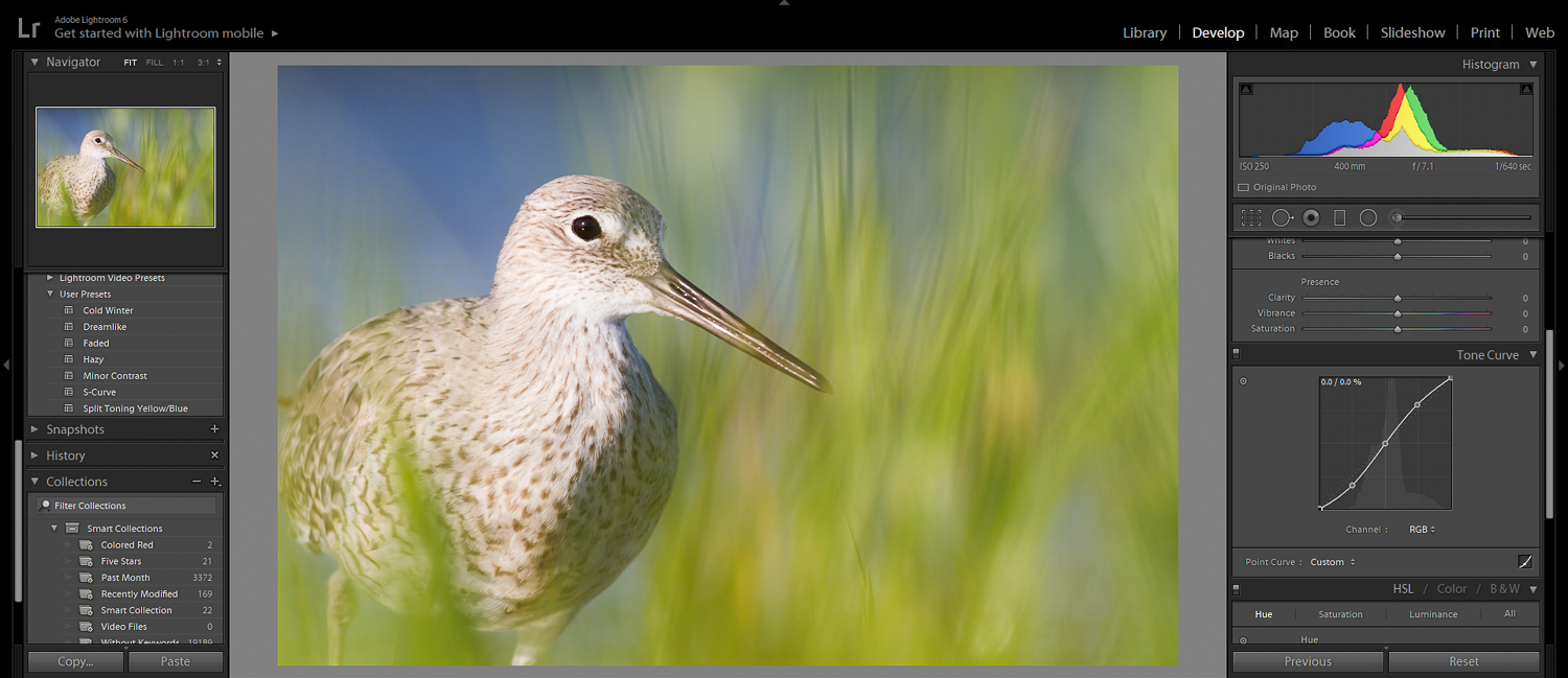
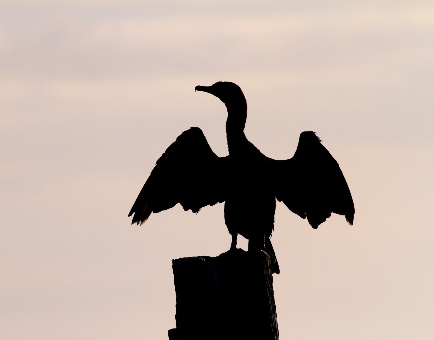
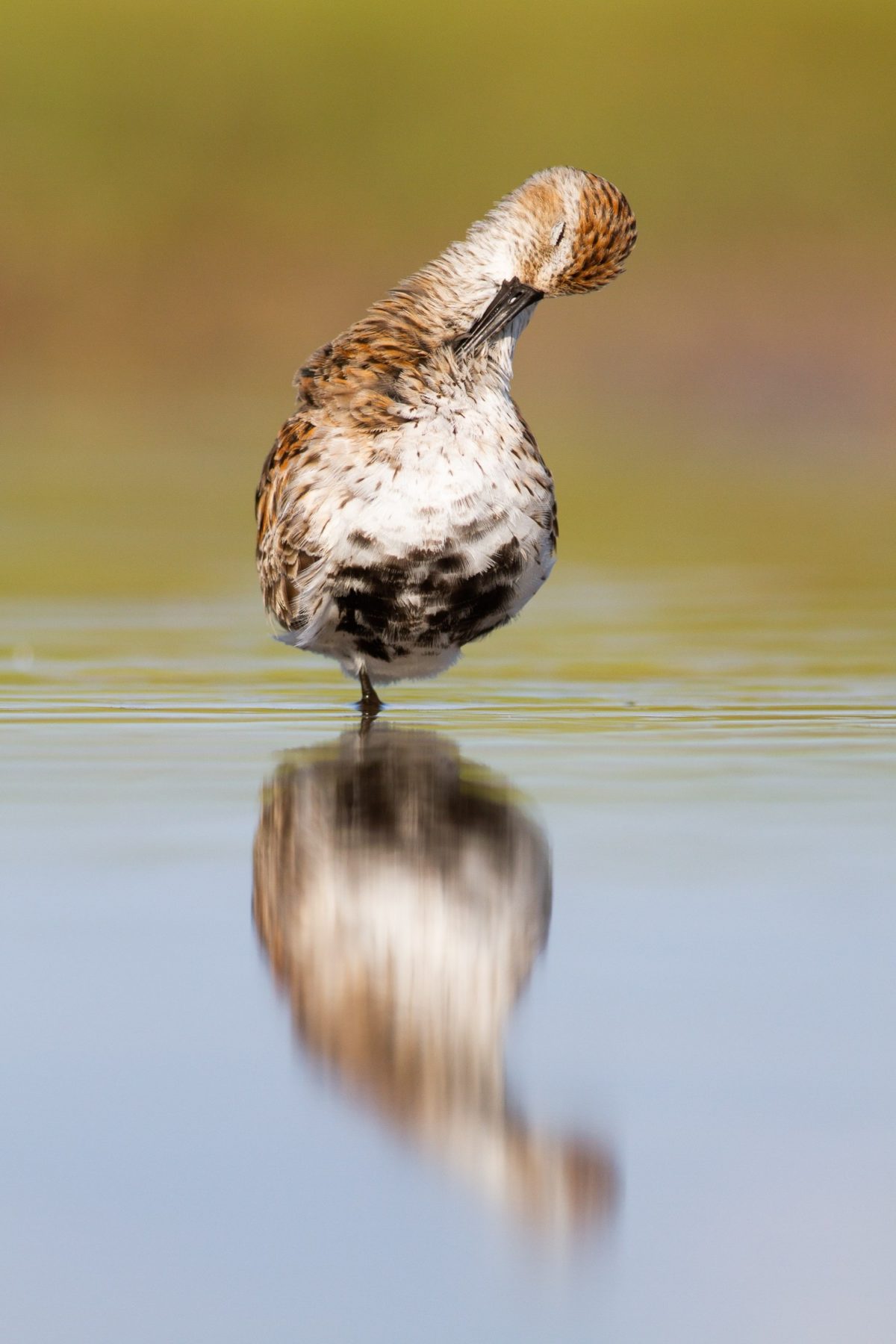
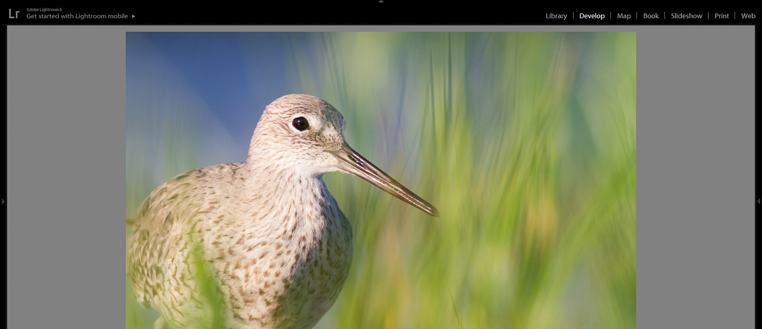
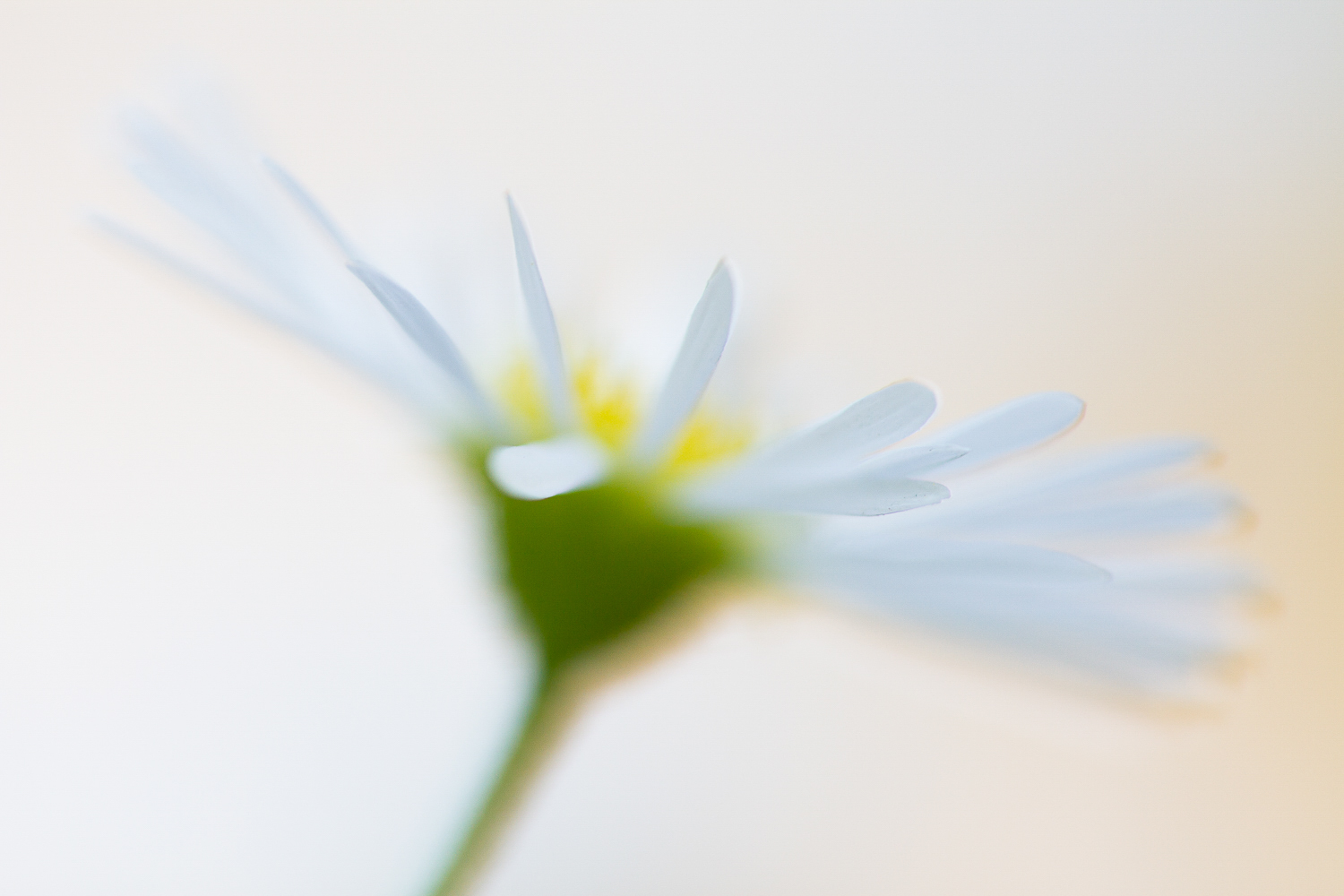
For example, I often find that flower stems are a muddy green.
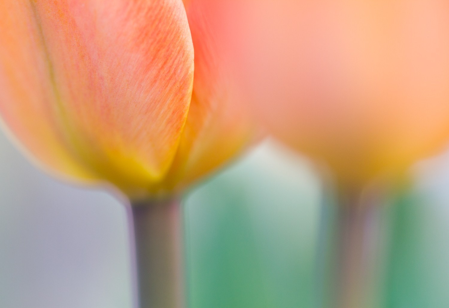
But with a slight push of a Hue slider, I can make that green become slightly richer:
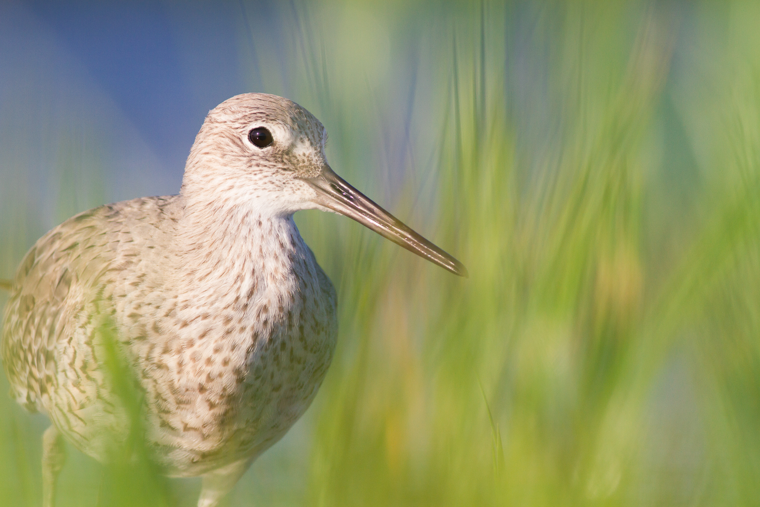
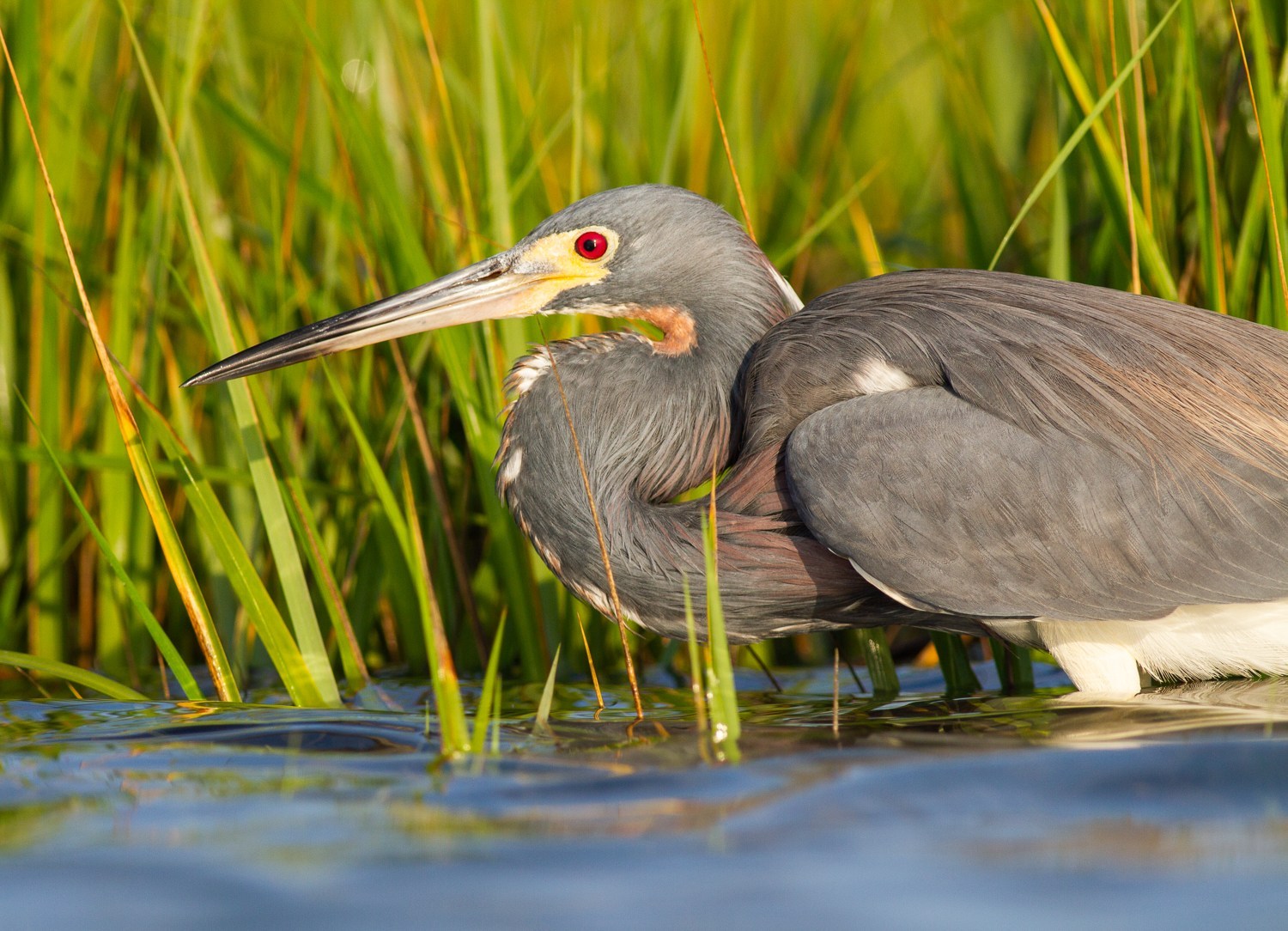
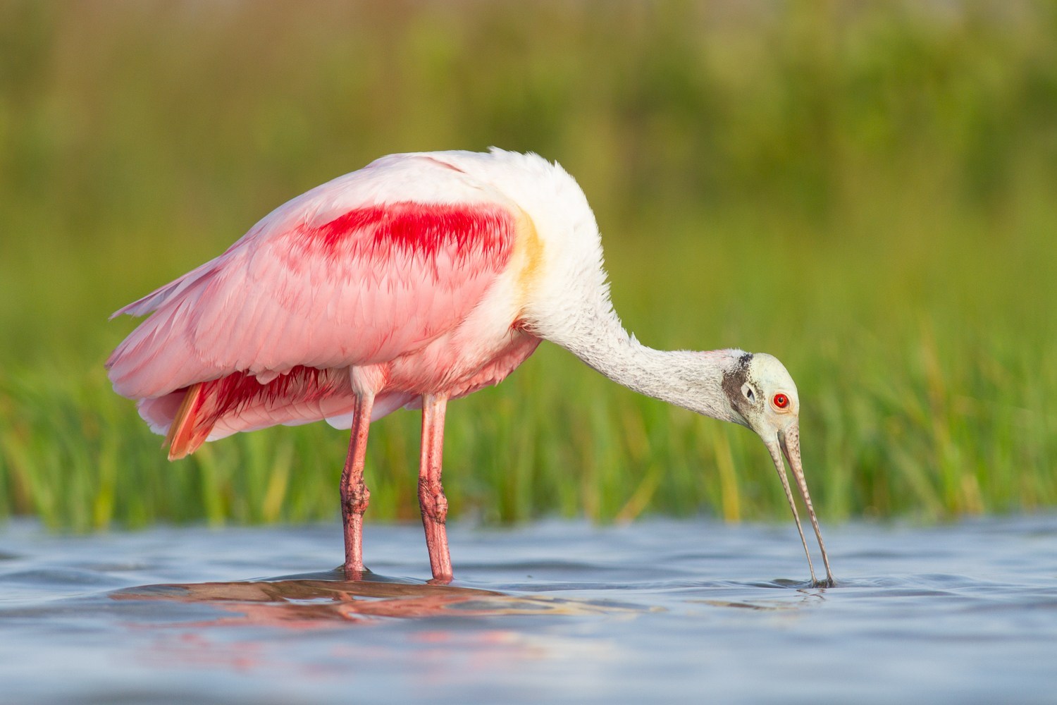
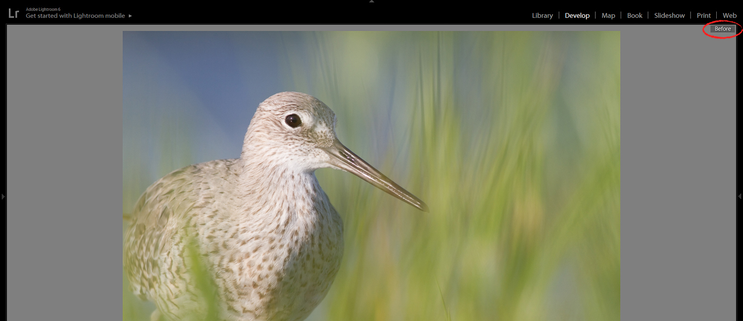
I can do the same to the vegetation around this bird:
The best way to find possible tweaks is to experiment. Play around. You’ll soon find a few tweaks that you’re a fan of–and many that you’re not.
Then you can use these tweaks consistently. As a bonus, your photos will start to have a nice, consistent style.
4. Use the Tone Curve to Add Punch to Your Photos
I’ve talked about adding contrast to your photos with the Tone panel.
But here’s another way to work with contrast–one that allows for a bit more subtlety.
(Which isn’t to say that the first way won’t work. It will. But sometimes your images require less heavy-handedness.)
It’s called the Tone Curve.
You can find the Tone Curve panel right here:
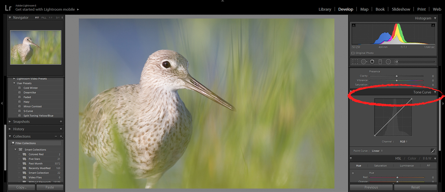
Now, the Tone Curve allows you to change the levels of brightness in different parts of the image. The leftmost parts of the tone curve correspond to the darkest parts of the image. And the rightmost parts correspond to the brightest parts of the image.
By setting points on the Tone Curve, and by dragging upward and downward, you can change the brightness of the corresponding parts of the image.
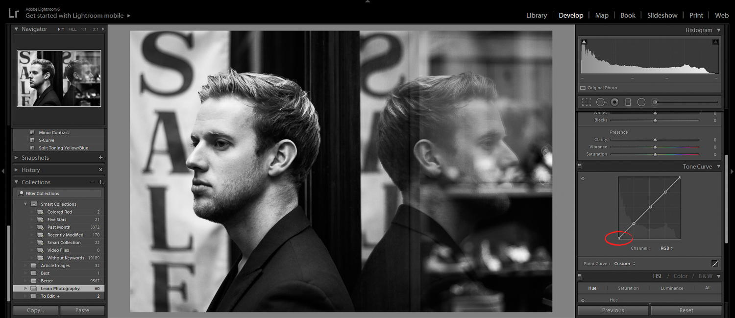
One of the simplest (and most effective) curves is the S-curve. It adds some nice contrast to your photos.
First, click on the curve in the three spots shown:
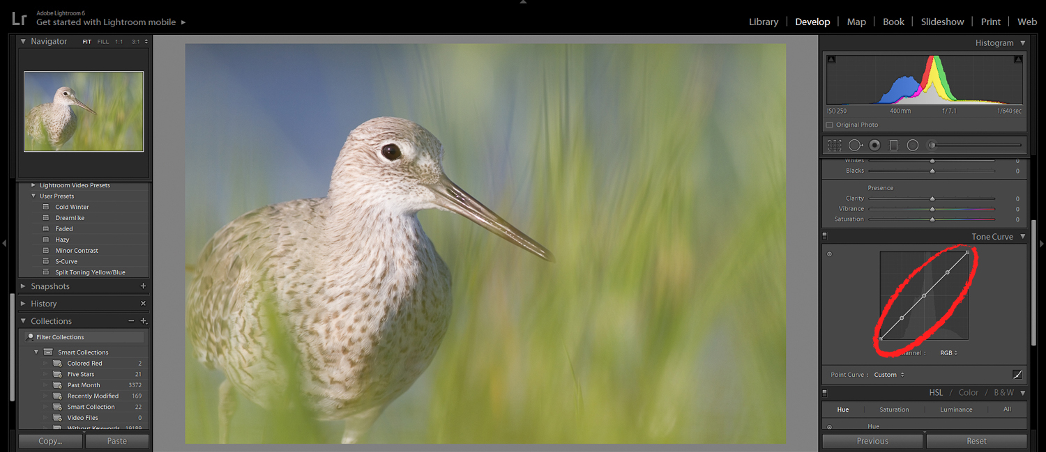
This will set points all along the graph.
Then drag the rightmost point slightly upward.
And drag the leftmost point slightly downward.
This’ll make sure the curve is in the shape of an ‘S.’ And it’ll give you a nice, contrasty image.
But be careful! You don’t want to overdo the contrast.
Some contrast is nice. Too much contrast is not.
And since we’re on the topic of the Tone Curve:
5. Use the Tone Curve to Create a Lovely Faded Look
Portrait photographers love this trick.
And I don’t blame them. Because it really does add a beautiful, aged feeling to photos.
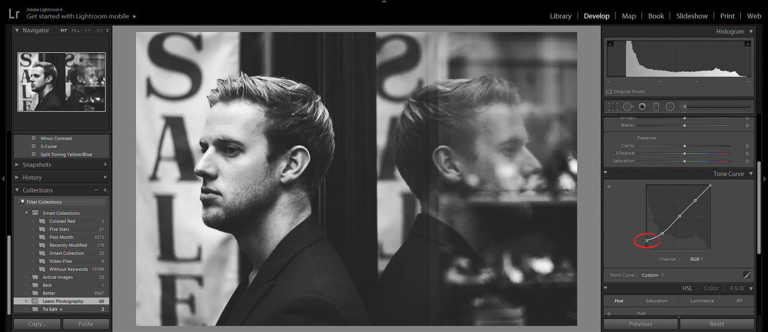
All you have to do is find the point on the leftmost edge of the Tone Curve:
Then drag the leftmost point slightly upward.
Watch your image as you do this. It’ll take the blacks and fade them–so that that blackest points in your image aren’t true black. They’re a dark grey.
Neat, right?
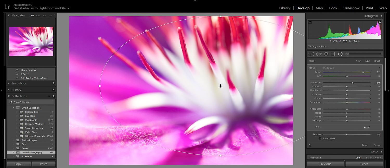
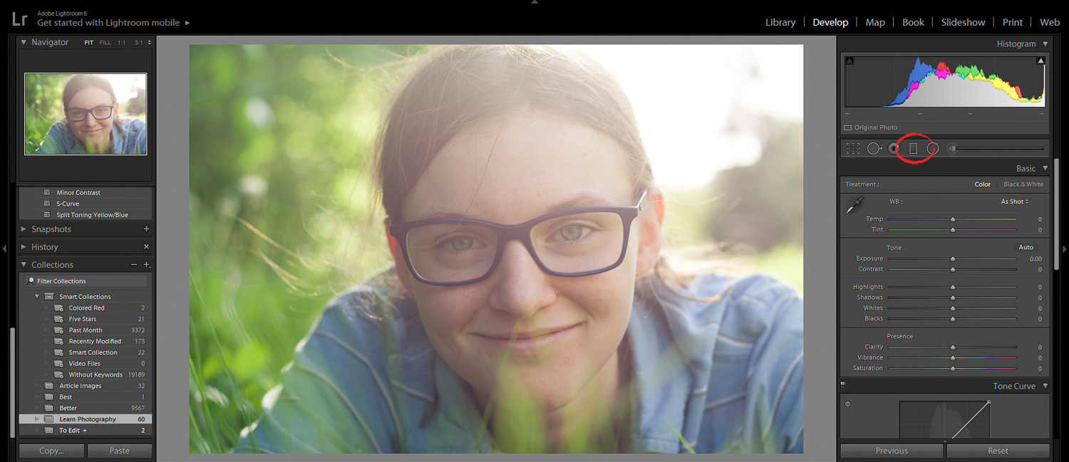
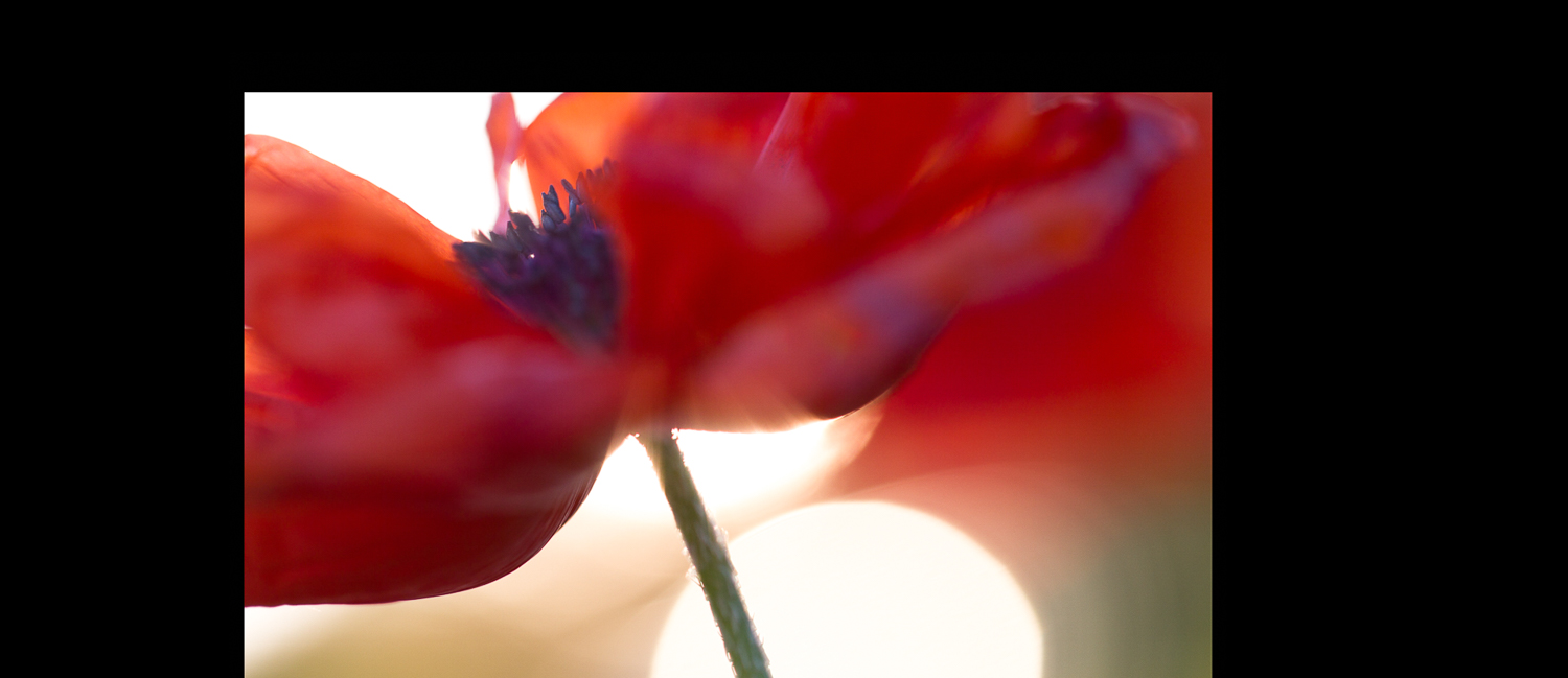
6. Use the Radial Filter to Emphasize Your Subject
Now it’s time for another popular trick:
Using a vignette to enhance your subject.
(A vignette is a darkening of the tones at the corners of an image.)
Vignettes move the eye away from the edge of the frame–and point it at your subject, the focal point of the photo.
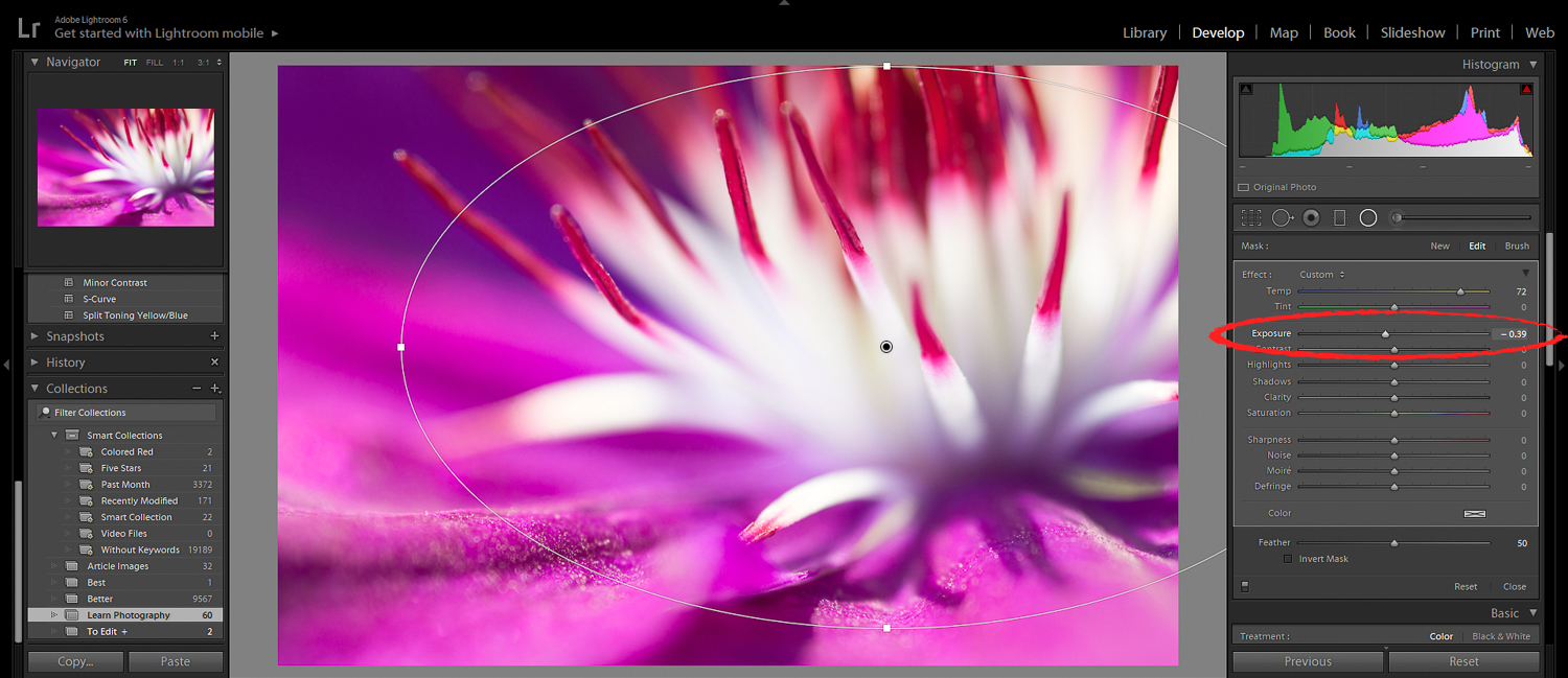
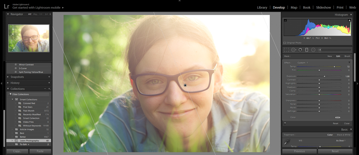
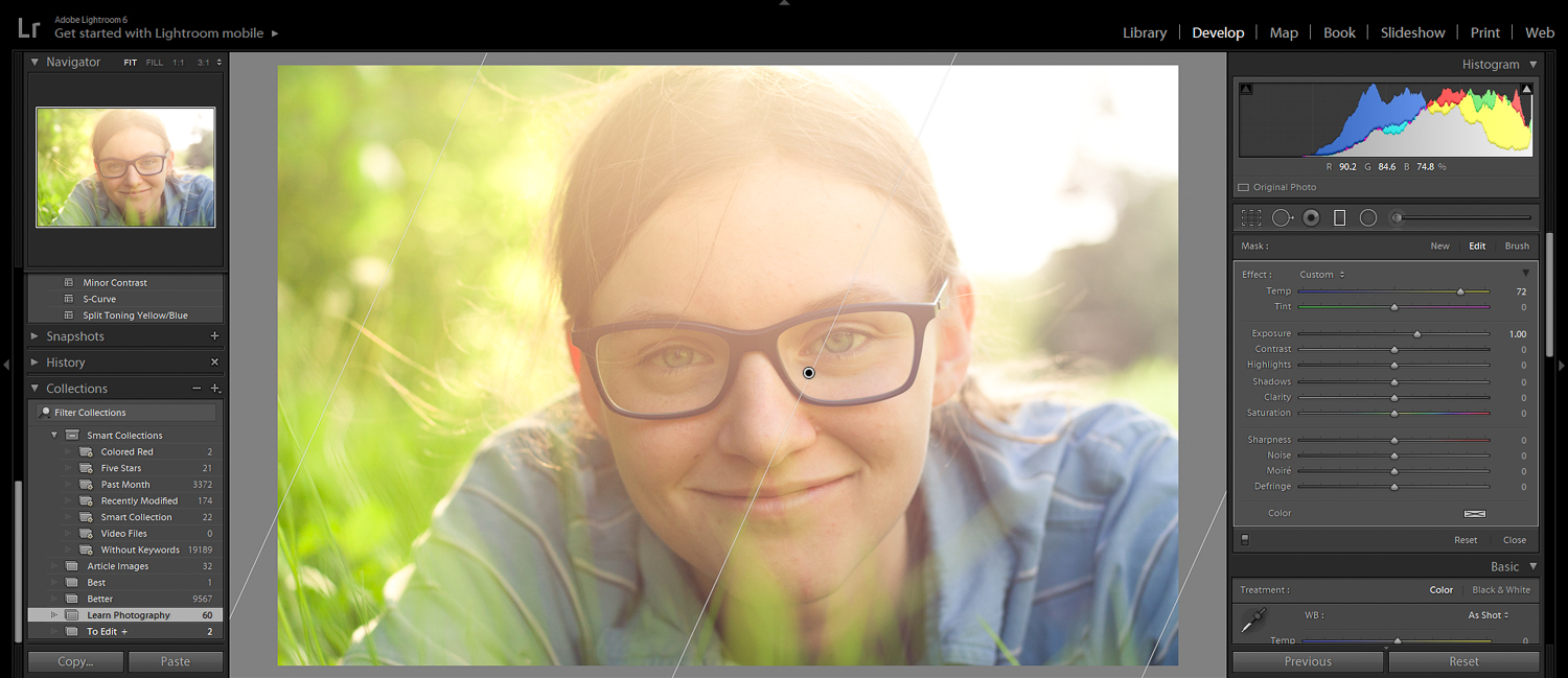
Fortunately, Lightroom gives us a super-easy way to create a custom vignette. You simply use the Radial filter.
First, click to activate the Radial filter:
Then drag so that it surrounds your subject. In general, it’s good to give your subject a bit of breathing room.
Scroll down to the bottom of the main panel, and make sure that Invert Mask isn’t ticked.
Then simply drag down the Exposure slider, until you have a subtle–barely noticeable!–vignette.
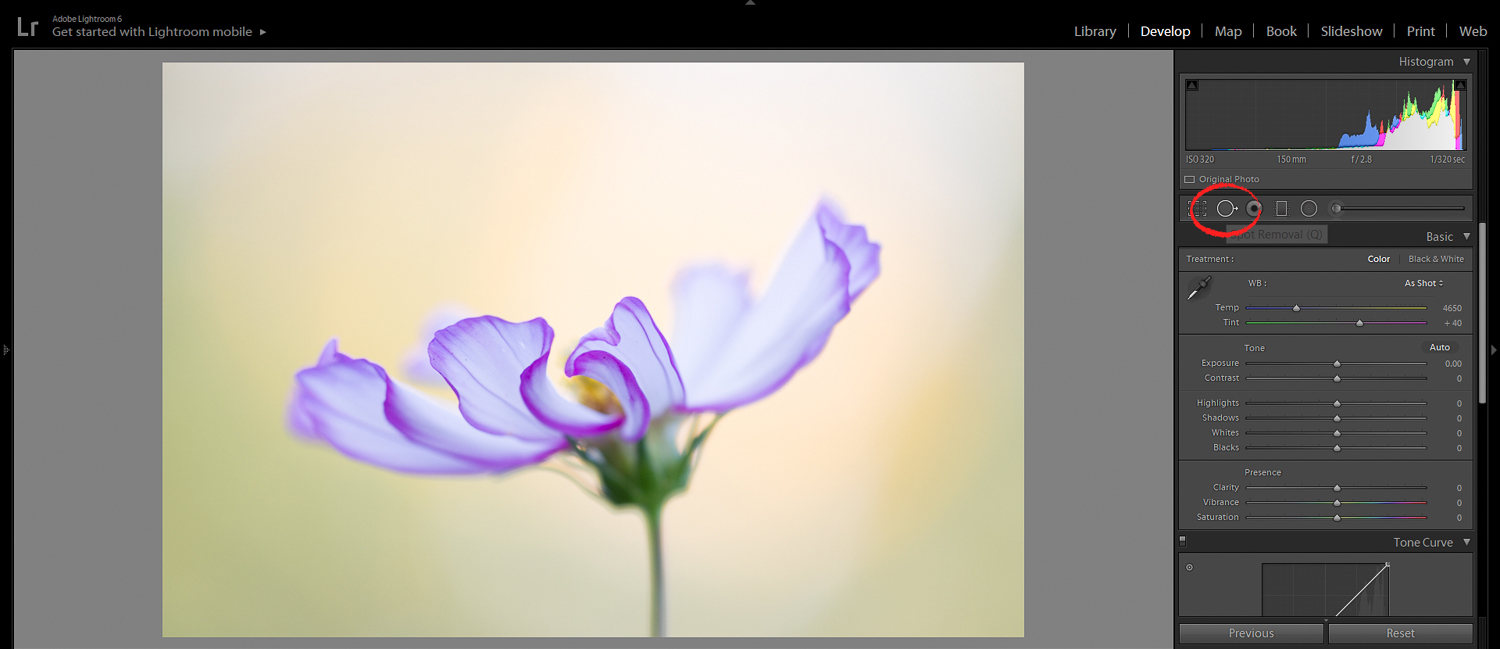
7. Use the Spot Removal Tool to Clean Up Your Subject
If you do a lot of photography, then you’ll understand this frustration:
Subjects are never perfect! In flower photography [6], there is always dirt and blemishes on the flowers. In landscape photography, there are always stray leaves on the ground. In portrait photography, there are always minor skin imperfections to deal with.
That’s where the Spot Removal tool comes in.
Simply click on the Spot Removal icon:
You can change the size, the feather, and the opacity of the Spot Removal brush using the Brush sliders.
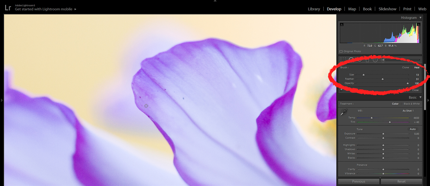
Make sure that the tool is set to Heal. I generally choose a brush size that’s slightly larger than the spot I’m trying to remove. I’d recommend putting Feather to 50 and Opacity to 100.
Then simply paint over the spots…
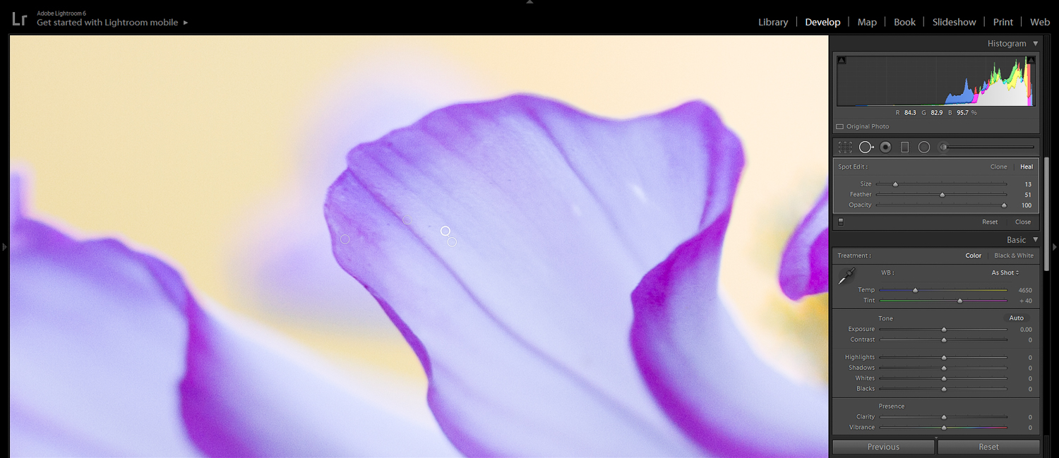
…and watch as they disappear.
8. Use the Clarity Slider to Make Your Photos Crisp
Here’s a quick tip for you:
The Lightroom Clarity slider is a great way to give your photos a little extra pop.
You can find it in the Presence panel:
While the Contrast slider works on all the tones in an image, the Clarity slider increases contrast only in the midtones.
It’s a perfect way to bring out texture in a photo. And it’s one of those general-purpose tools that I recommend you use frequently.
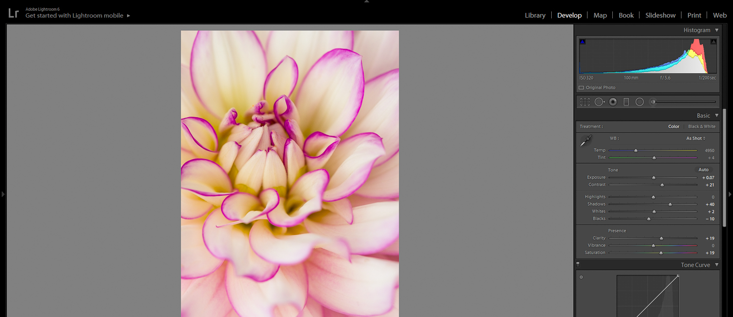
As usual, don’t push it too far.
But a bit of Clarity will make your photo look clear and crisp–which is exactly what you want.
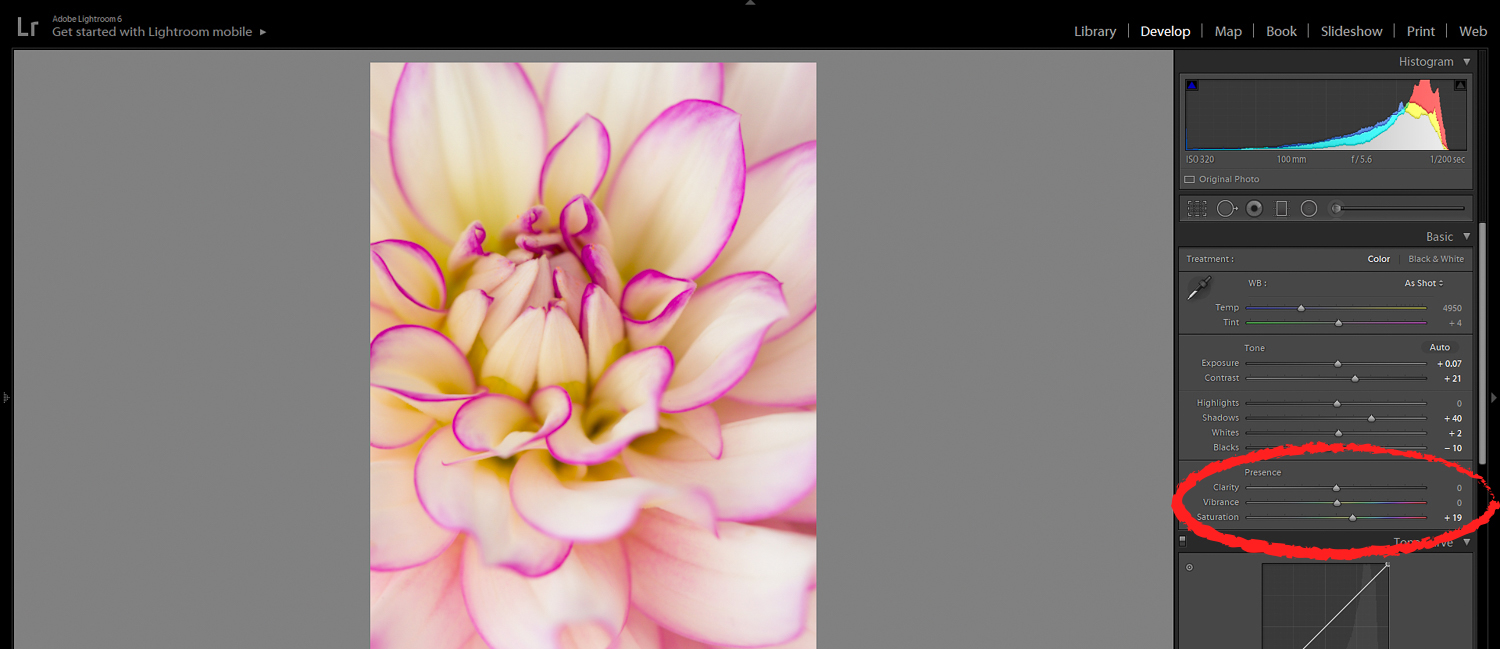
9. Use the Vibrance Slider to Produce Amazing Colors
Time for another quick tip. Because while the Clarity slider is perfect for making photos crisper…
…the Vibrance slider is perfect for boosting color!
You see, when you increase the Vibrance slider, it selectively saturates the image.
Instead of saturating all the colors, it just saturates the more muted colors–that is, the colors that are in need of a boost.
(This is in contrast to the Saturation slider, which boosts all colors equally, and can make images look garish and unpleasant.)
And this looks great. Because most photos really can benefit from a color boost.
So find the Vibrance slider in the Presence section:
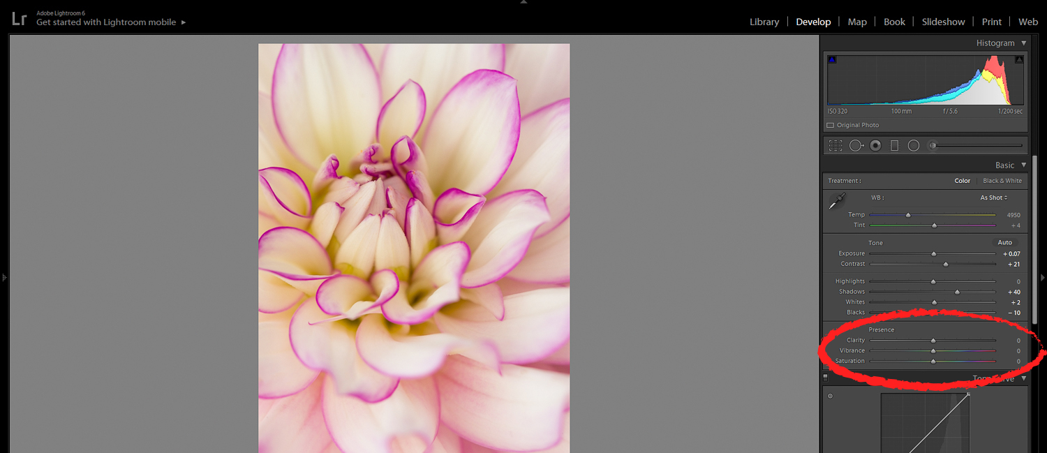
Then shift it to the right.

And watch your photo come to life.
10. Use a Graduated Filter to Add Pizzazz to Your Images
Do you ever feel like your photos are a bit…boring?
You’re not alone. Plenty of photographers have this issue.
But one easy way to enhance your boring images…
…is to use Lightroom’s Graduated Filter tool [7].
The Graduated Filter allows you to carefully place “light” along one side of the frame. And it gives a wonderful artistic look.
It’ll also add some depth to flat images.
Here’s what you do:
First, click on the Graduated Filter icon in the Tools panel.
Next, boost the exposure by around 1.00 (though feel free to experiment with other options).
Finally, click and drag across your subject. This will introduce the “light.”
The farther you drag the filter, the more subtle the look. I suggest dragging until the look is seemingly natural. The goal is to create something artistic, but not fake.
You can always test the filter from multiple angles:
And I want to emphasize: Different angles and settings will give different looks.
You should experiment with changing the temperature and the tint of the filter – and see how that alters your photo.
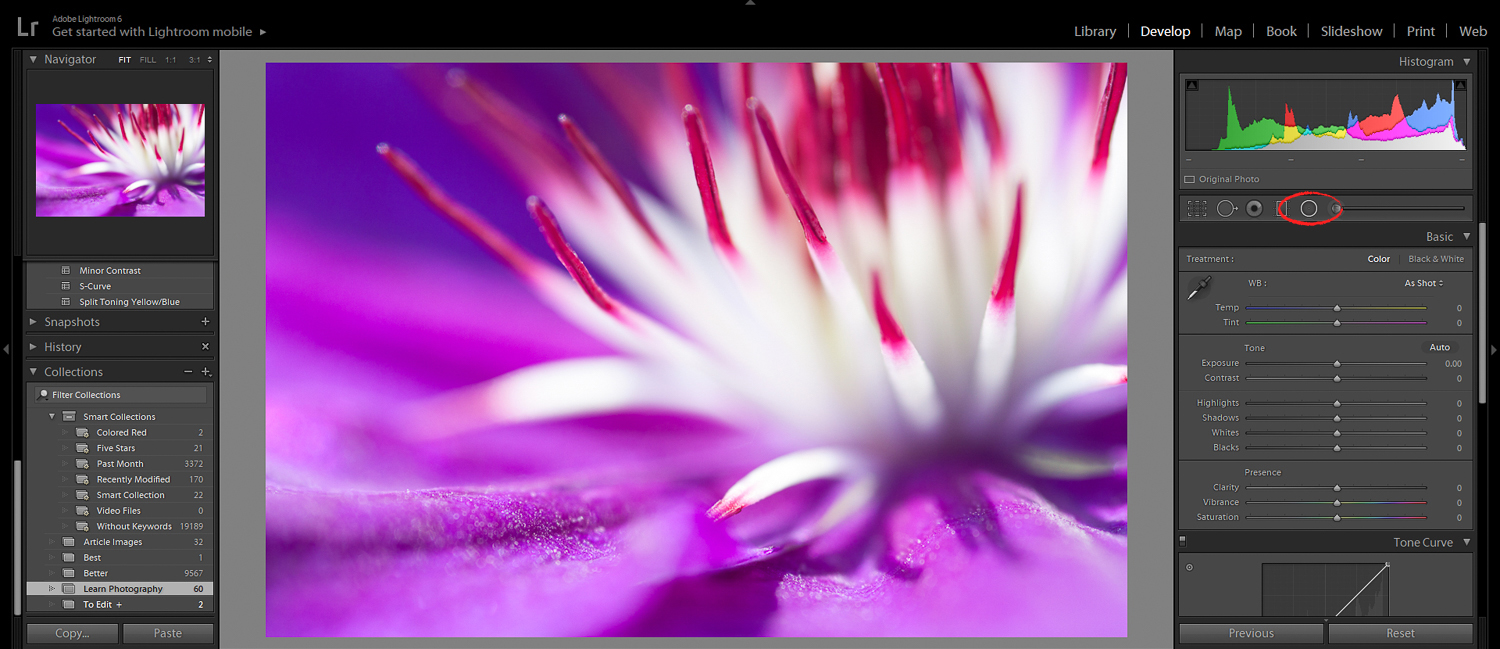
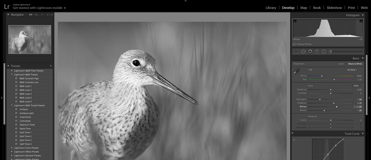
11. Convert Your High-Contrast Photos to Black and White
Black and white photography [8] is all about contrast.
Why?
Because when you strip away colors, light is all you have left. And so low contrast photos just look…flat.
Whereas high contrast photos?
They look amazing.
Whenever you have a high-contrast photo, I recommend doing a quick conversion to black and white–just to see how it looks.
Fortunately, Lightroom allows you to do this with the click of a button.
Simply open the Presets panel (on the left side of the screen).
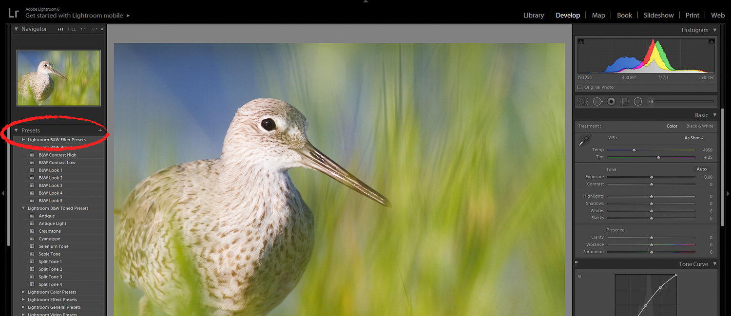
Then open the Lightroom B&W Presets section.
Finally, click on the B&W Contrast High preset.
And watch as your image is transformed.
If you like, you can even hike up the contrast a bit more. Just push the Blacks and Whites sliders to the extreme.
Or, if you don’t like that particular black and white look, there are a number of other useful black and white presets:
And:
Try them! You never know how things will turn out.
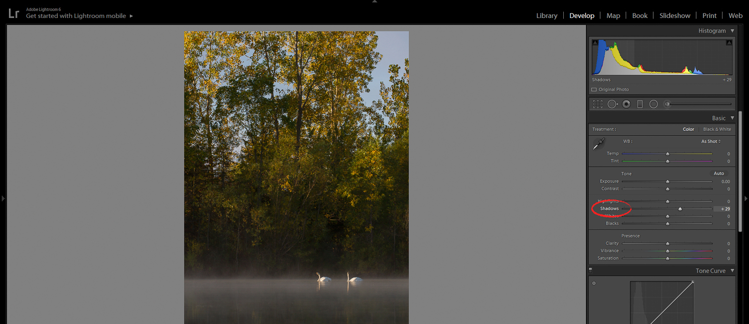
12. Lift the Shadows to Add Detail to Dark Areas
One thing that a lot of photos suffer from?
Not having enough detail in the dark tones.

This will cause images to look a little muddy–a look which you should try to avoid.
But Lightroom offers a quick fix:
The Shadows slider.
It brings up those dark tones (without brightening the whole image).
Simply find the slider in the Tone panel. Then boost the shadows until you can see some details.
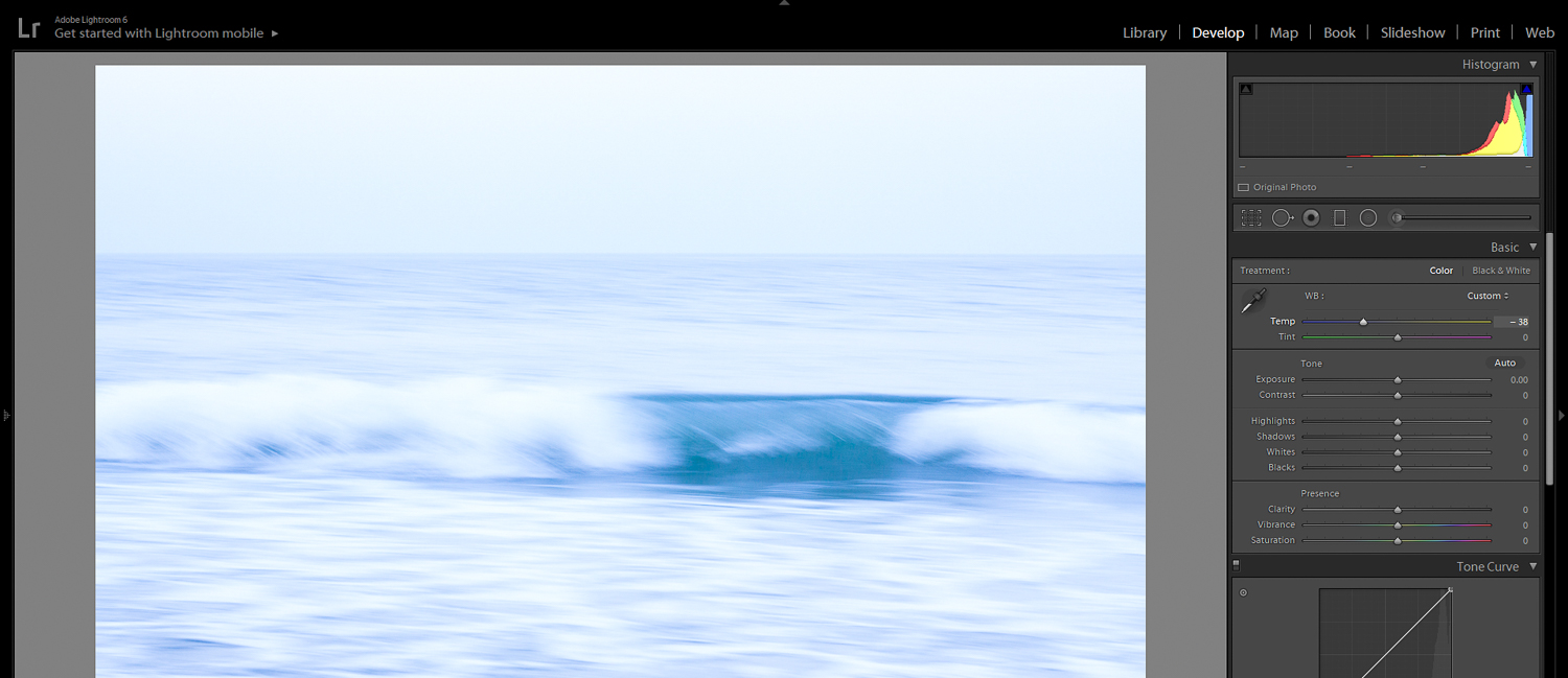
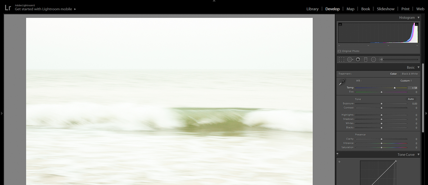
13. Use the Temperature Slider to Give an Artistic Look
White balance [9] is the process of balancing out any color casts in an image. This is generally evaluated by looking at the whites.
Are the whites true white? Are they yellow? Are they blue?
Now, Lightroom offers a way to balance the whites in your photos:
The Temperature slider.
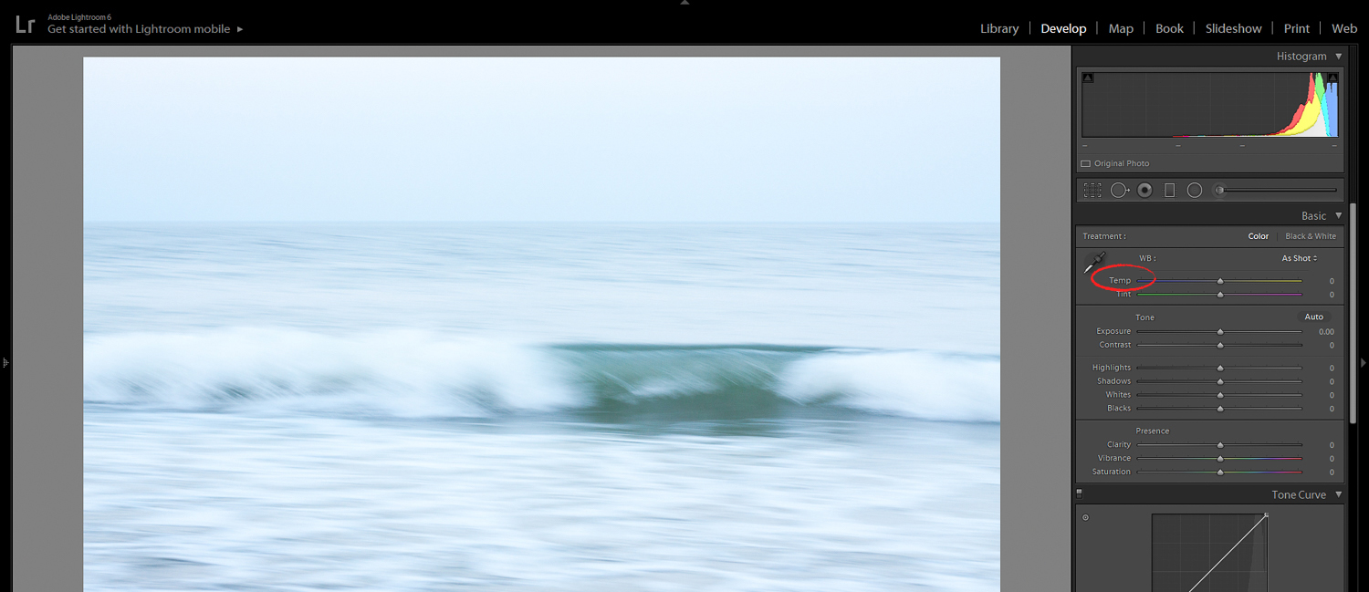
Photographers generally use the Temperature slider to create neutral white tones. That is, tones that look pure white and natural.
However…
You can also use the Temperature slider to create an artistic look. One that emphasizes your feelings when you took the photo.
This is something I highly recommend!
Were you shooting the middle of winter? On a snowy day? Then push the Temperature slider to the left–and create a cold, blue image.
Were you shooting during a sunset? On a hot, dry day? Then push the Temperature slider to the right–and create a warm, summery image.
The Temperature slider is easy to use. But it gives you a lot of control over your final image.
So use it well!
14. Bump Up the White Slider to Add a Little Extra Oomph
I’ve given you a lot of tips for making your photos pop.
But let me give you one more. It’s super quick and easy–and I think you’ll like the effect.
All you have to do…
…is boost the whites.
That is, go to the Tone panel. And push up the Whites slider to +50 or so.
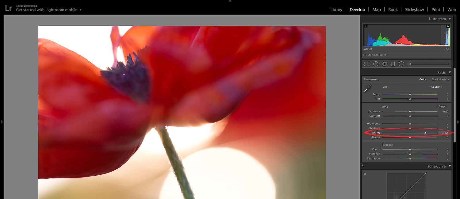
(Of course, the specific amount will depend on your photo. But +50 is a good starting point!)
This’ll take up the brightest parts of your photo–so that they approach pure white.
So if your photo has a white background, this will create a true high-key look.
Even if your photo has no whites, this is still a useful trick. It’ll help the tones in the image come to life.
15. Create Your Own Presets for Fast and Powerful Editing
One of the many wonderful things about Lightroom…
…is its presets [10]!
Lightroom comes with a whole host of useful Lightroom presets [11]. And you can find even more online.
But the best presets?
The ones you make yourself!
You see, Lightroom allows you to create your own presets–and to apply them over and over to your photos. This is extremely useful for testing out different favorite looks. It’s also great for ensuring a consistent style across your photos.
And, of course, presets let you edit really, really fast.
Creating your own presets is simple:
First, edit your photo in a style that you like.
Next, tap on the Plus icon above the Preset panel.
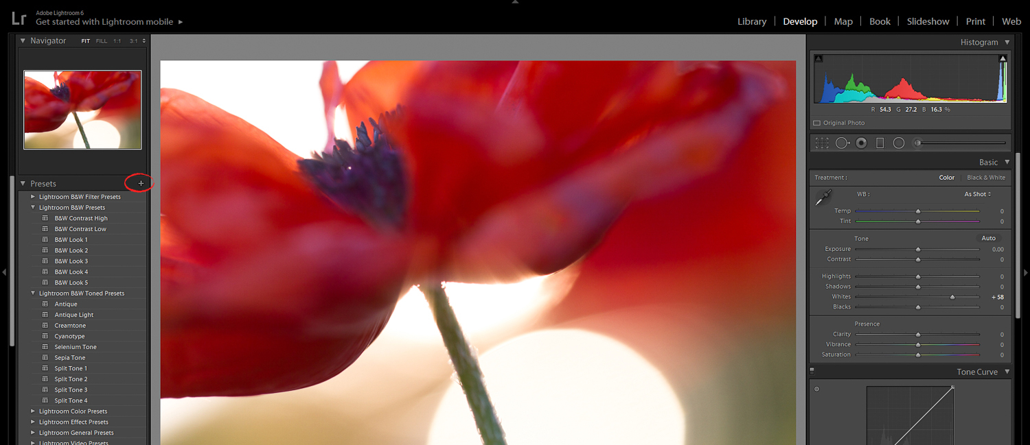
Name your new preset.
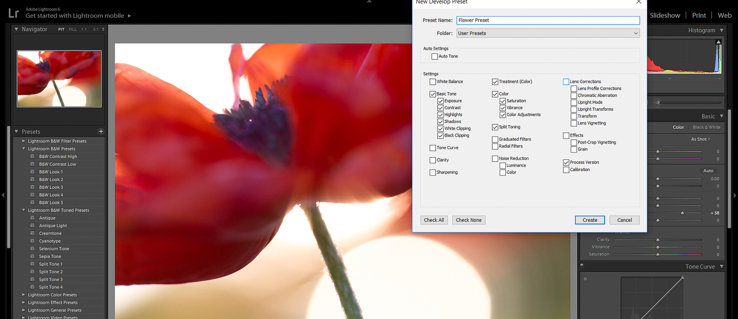
And check off all the settings you’d like to include in your preset! If you want a preset that simply creates an S-curve, you can leave all items unchecked, except for Tone Curve. If you want a preset that gives you orange/green split toning, you can create that, too.
I promise you:
Presets will increase your editing efficiency by a ridiculous amount.
So create some. Right now.
And add to your preset collection over time!
16. Use ‘Lights Out’ to View the Final Image
When you’ve finished editing a photo in Lightroom, what do you do?
You may be tempted to move on to the next photo.
But I recommend you take a moment, and look at the photo in Lights Out view.
Lights Out blacks out the screen–so that all you can see is your image:
I find that Lights Out allows me to carefully evaluate my final photo, away from the distractions of the Lightroom interface.
It helps me see whether there are further changes to be made. Is the image bright enough? Is the image lacking shadow detail? Are the colors muddy?
Lights Out view reveals it all!
To activate Lights Out, simply press “L,” then “L” again.
To deactivate the setting, press “L” one more time.
17. Use the ‘Before‘ and ‘After Function‘ to Avoid Over Editing
Lightroom is amazingly powerful.
Which means that it’s easy to make your photos into artistic masterpieces.
And it’s also easy…
…to over edit your photos.
These are all common examples of overediting:
- Adding too much vibrance or saturation
- Adding too much contrast
- Using too much split toning
- Including a too-dark vignette
Now, it’s a fine line between a beautiful edit and an overedit.
So how do you make sure you never cross it?
Here’s my advice:
Use the ‘Before’ and ‘After’ function in Lightroom. This allows you to toggle back and forth between your original image and your edited image. And it’ll make any overediting really stand out.
It’s also amazingly simple:
Just hit the ‘\’ key! This will switch to the original image. When you hit the ‘\’ key again, you’ll switch back to the edited version.
I recommend you do this for every image you edit–to avoid any overediting issues.
After all, you want your photos to be as strong as possible!
17 Lightroom Secrets: Next Steps
Now that you’ve finished this article, you should have a sense of the many hidden panels, features, and tools that Lightroom offers.
And you should know exactly how to use them–for next-level images!
So here’s the next step:
Start editing some photos. I’ll bet you’ve got some masterpieces in your catalog!