5 Ways to Use Contrast in Your Compositions

When most people think of contrast, bright, bold colors come to mind. But while color is certainly an important form of contrast, there are a number of ways that you can introduce contrast into your images.
Contrast is created when two, or more visible differences are present in a photo. There are many ways that you can achieve this in your photography – through color and tones, of course – but also by introducing contrasting elements into your images.
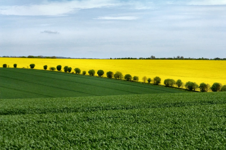
Photo by Sarah Ward
With this in mind, let’s look at five ways that you can use contrast to create bold, eye-catching photos.
1. Color Contrast
As you probably know, contrasting colors can make for beautiful images. When composing your shots, keep an eye out for colors that are at opposite ends of the color spectrum. Someone who’s wearing blue, for instance, would look great photographed against a yellow wall. The colors will command attention, create a visually pleasing composition, and help the subject to stand out.
This is one reason many photographers look to include brightly-colored objects, or props in their photoshoots. In addition to different colors, it’s also worth paying attention to a color’s saturation. While weak colors are lower in contrast, stronger, more vibrant shades have more contrast.
Tip: Bright, overcast days tend to bring out subdued, muted colors. To ensure that your colors come out bright and vivid, take extra care to make sure you get the exposure right.
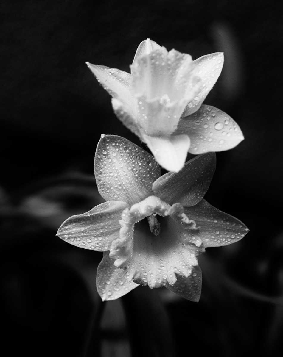
Photo by cahadikin
2. Tonal Contrast
Tonal contrast is the difference between light and dark tones in an image. While tonal contrast is often overlooked in favor of color contrast, it can have a big impact on the resulting photo as well. When we look at a photo, our eyes are naturally drawn to the highlights in the image. By paying attention to light and dark areas in a composition, you’ll be able to use this to your advantage and create photos with clearly defined focal points.
Tip: While many photographers avoid shooting in the midday sun because of the harsh shadows that are often present during this time of day, often – these bold, strong shadows can add beautiful tonal contrast to an image. This is especially true if you’re doing black and white photography, where you won’t be paying attention to colors, just tones when composing your shots.
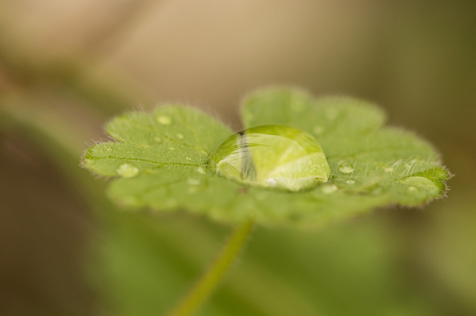
Photo by Ramón Portellano
3. Contrasting Textures
Color and tone aren’t the only ways to create contrast; including different textures in your image is another great way to add contrast to your images. Look for interesting contrasting textures to incorporate into your shots: a delicate leaf resting on a solid stone, for instance – or a smooth drop of water on the surface of a fuzzy leaf.
Tip: Macros are an especially good opportunity to capture images with contrasting textures, as close-ups often reveal a hidden world of patterns – and beautiful textures.
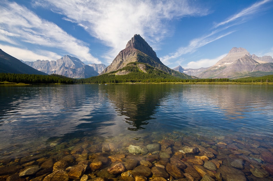
Photo by Jeff P
4. Contrasting Subjects
Contrasting subjects, or objects that contrast with the background can create visual tension that can work quite nicely. Examples of contrasting visual elements could be old and young, timeworn and new, sharp and soft, or jagged and straight – but you can choose any combination that grabs your attention. The juxtaposition of differences can make for an engaging and visually powerful photo. For instance, an image that features smooth, round rocks in the foreground and a rocky, jagged mountain in the background is a great example of contrast.
Tip: A great way to create powerful landscape images is by training your eye to spot elements in the foreground that you can use to contrast with the focal point in the background.
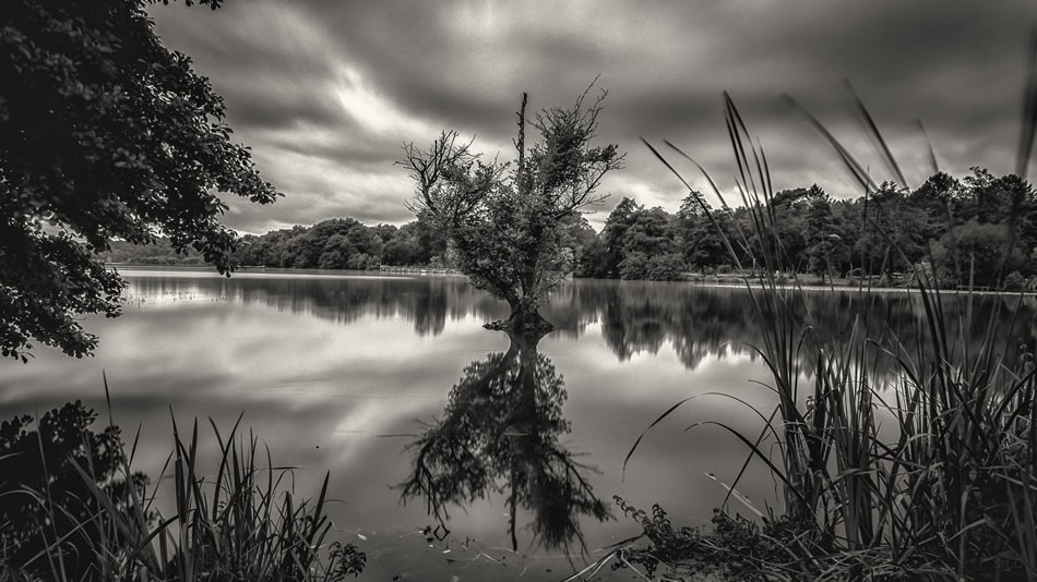
Photo by stephane
5. Contrast in Post-Processing
Finally, you can add contrast during post processing in a number of different ways. While a common way to do this is by moving the sliders to adjust white balance and tone, you can also adjust contrast through dodging and burning – which allows you to add or reduce contrast easily in specific parts of an image, rather than applying it to the entire photo. This lets you darken the background, or highlight certain aspects of the subject to impact the overall effect of the image.
Tip: If you’re planning to do post processing, it’s always best to shoot in RAW since this will give you the most freedom when editing.
Things To Remember
There are no firm rules about what constitutes the perfect amount of contrast in an image. The right amount is a matter of personal preference – and will depend largely upon the type of image – and the desired effect. Just keep in mind that contrast should be used to enhance the overall composition – and use it as needed to direct attention, or define certain areas in the image.
The world isn’t black and white, but contrast can still be found just about everywhere you look. By learning to spot differences – in shades and tones – as well as in compositional elements, you’ll become adept at including contrast in your compositions and will be able to use it to create bold and breathtaking images.
About the Author: Christina Harman
 Christina is a part time blogger and full time photography enthusiast living in Southeast Alaska. She enjoys travel photography and has taken pictures in countries such as Mexico, England, France, and China. She likes sunny days, new lenses and drinking good coffee. You can visit her at Tangled Thoughts.