How to Create a Lomography Effect in Adobe Lightroom
 by
Jane Grates
by
Jane Grates

As we all know, fashion trends tend to revive things from the past, and the photography world is no exception to that rule, which may be one way to explain the sudden surge of “vintage” and “film” looks in contemporary digital photography.
With proper knowledge on part of the user, software like Photoshop or Lightroom can be handy tools for creating effects simulating images shot with old film cameras like Polaroid, Holga, or Lomo. For this reason, we highly recommend at least taking a look at some of those old photographs, if you aim to recreate that kind of effect for your current shots.
Today we are going to learn how to work with Adobe Lightroom to create a good Lomography effect on an existing photo. In order to accomplish this task, we have two possible workflows:
- The traditional way with Lightroom native tools, which tends to be more time-consuming, but the look is more “natural,” since you are applying the changes with an eye to the conditions in the photograph.
- Work your way through the presets, which is appropriate if you need to process a large batch of photographs in a short amount of time.
Lightroom Traditional Workflow
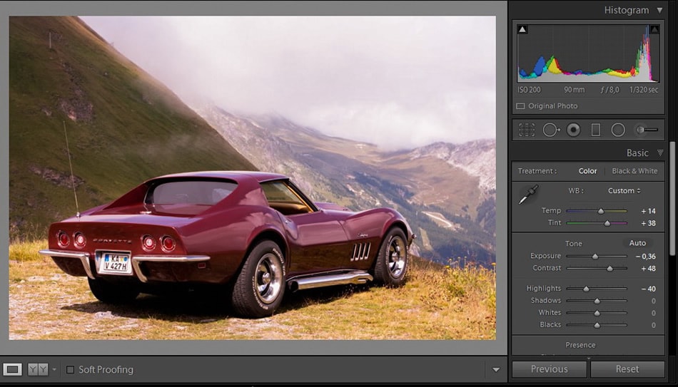
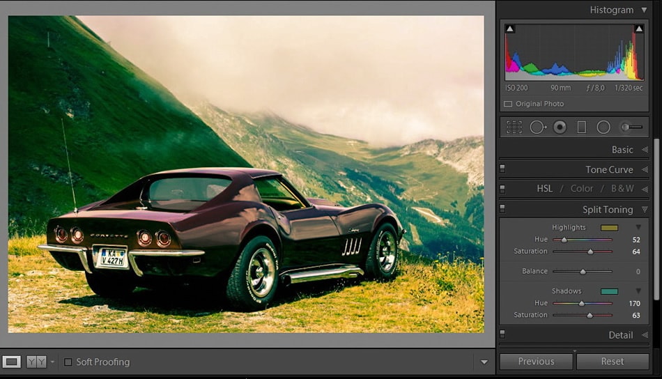
Open up your image in Lightroom and switch to the Develop module. Before considering applying the core of this effect, which is Split Toning, I am quickly going to adjust the basic conditions of this image.
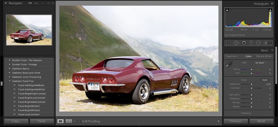
Since I have no areas where I can sample a neutral gray tint, I need to work through the Temp/Tint sliders in order to reach a proper White Balance in my image. The idea is to warm up the image a little bit, so I’ll move the sliders of Temp and Tint towards positive values.
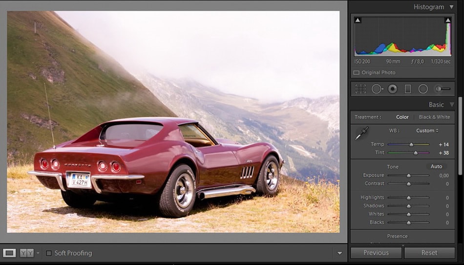
Next, move to the Basic Adjustments panel. In this area, we are going to apply some minor changes in order to get the most we can out of this image. Focus on removing annoying highlights and bring in more detail.
Reduce the Exposure a little bit.
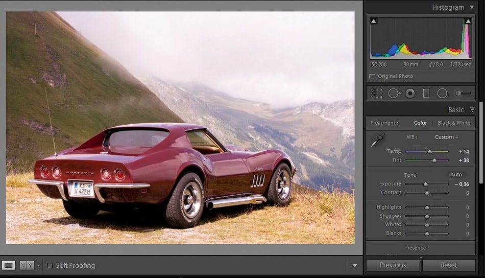
And considerably increase the value for Contrast. This adjustment, in combination with Exposure, will bring in more life to the image rather than giving it a burned feeling from the highlights reflected in the car paint.
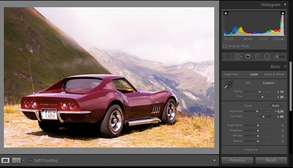
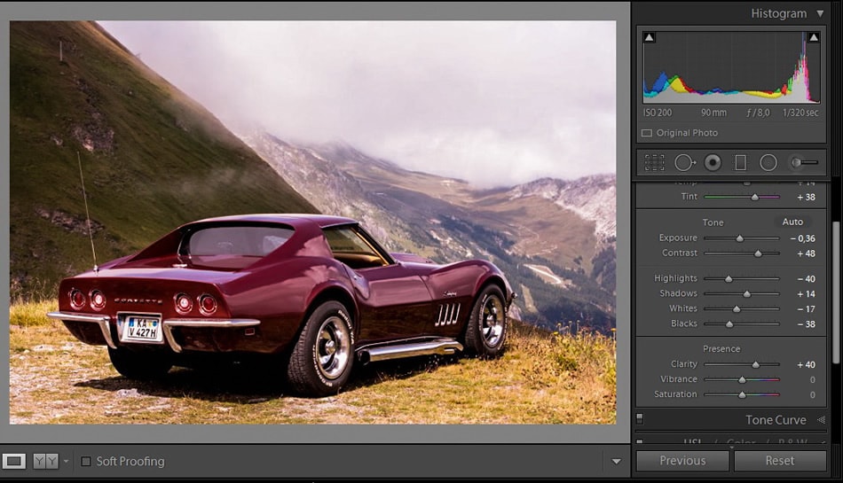
Reduce the Highlights value a great deal. After performing this adjustment, you will notice how much detail starts showing up at the background plane, which in the original file seemed to be washed out by the clouds on top as well as the fog.
Increase the Shadows slider, to produce less darkness in the scene.

Decrease the Whites value at the slider.

Finally, decrease Blacks as well, achieving an overall warming effect.

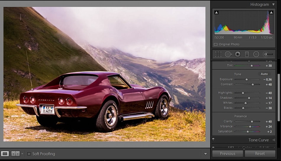
Increase the Clarity slider, but don’t overdo it, as the image will start looking like something reminiscent of HDR images. As a reference value for what can be the maximum value of Clarity within this effect, let’s set it to 50.
Work with the Vibrance and Saturation slider, being especially careful with the Saturation slider. You just want to add a bit more life to your image, and this step can also be considered a sort of pre-cross processing effect.
At the Tone Curve panel, the adjustment is quite simple. See that part where it says ‘Point curve: Linear’? Well, click on Linear and change it to Medium Contrast, that’s all.

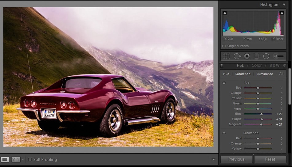
Reinforce some tints with the HSL panel like I did. For this, take into consideration the main hues present in your scene but don’t reinforce tints you plan to treat with the Split Toning effect, as the effect may otherwise be too harsh on the eyes.
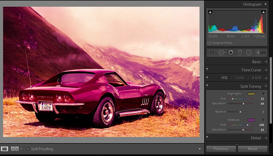
In the next step, we are going to reach the very core of this whole tutorial: Split Toning.
As most of you should now, Split Toning is a very pleasant effect to add in most photographs, changing the overall feeling of a picture in only a few clicks. The main thing for you to notice is what hues are predominant in your scene. For example, in this case violet, magenta and blues are predominant, as are some yellows and greens, although not as much. The car is the main focus in this composition.
Next, I’ll apply a Split Toning adjustment that works on the highlights with a warming effect (in this case a golden tint) and a contrasting hue for the shadows that completely will change the tint of my image.
If for some reason I worked with a violet or magenta tint, the result would not look pleasing (at least to me), as the image would be overloaded with just one hue and you can’t distinguish the elements that are present with a quick glance.
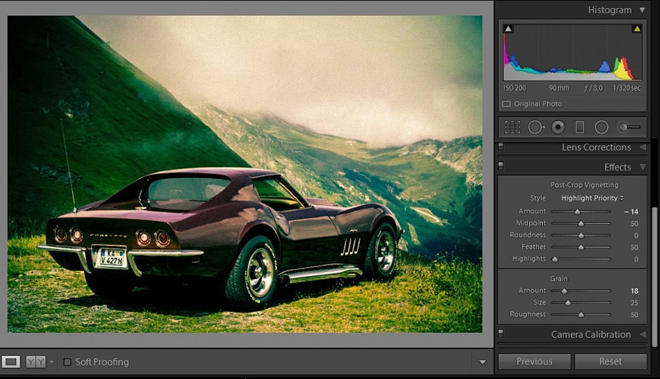
Finally, add a Vignetting effect to this picture and you that’s all you need to create a nice-looking lomo effect in your picture. And please, add a bit of film grain, which always works with these kinds of effects.
Presets workflow in Lightroom
Presets make our life easier. If you are a skilled photographer, by now you most likely have a good library of Lightroom Presets. One of the wonders of working with presets is the way we can combine them quickly to achieve the results we want.
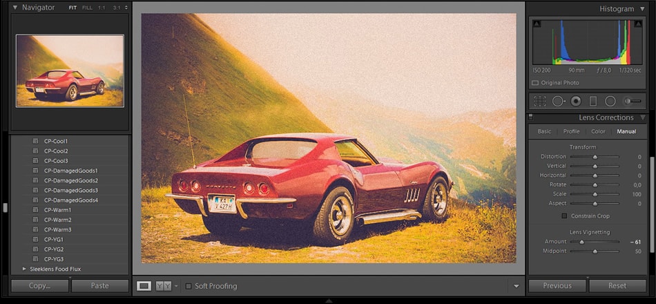
Just add some Vignetting at the Lens Correction panel and that’s all you need to accomplish a good Lomographic effect in Adobe Lightroom. I hope you found this tutorial useful!