Photography Fundamentals: All About Contrast
 by
Jo Plumridge
by
Jo Plumridge

Contrast is one of photography’s fundamentals. Understanding it is crucial to good images. Put simply, contrast is the scale of difference between black and white in your photos.
It is the differing tones of black, grey and white; without which there wouldn’t be any differentiation between light and dark. In this article though, we’re going to look at three different types of contrast – all of which can be used very effectively in your photography.
Before we look at those, a quick note on what high and low contrast mean. An image with high contrast has a full range of tones from black to white, with strong colours and textures.
If you shoot in bright sunlight, you’ll get high contrast with bright highlights and dark shadows. Low contrast images don’t have a lot of difference between light and dark tones and may appear muted, flat or dull. However, they can be very evocative (e.g. images shot in the fog).
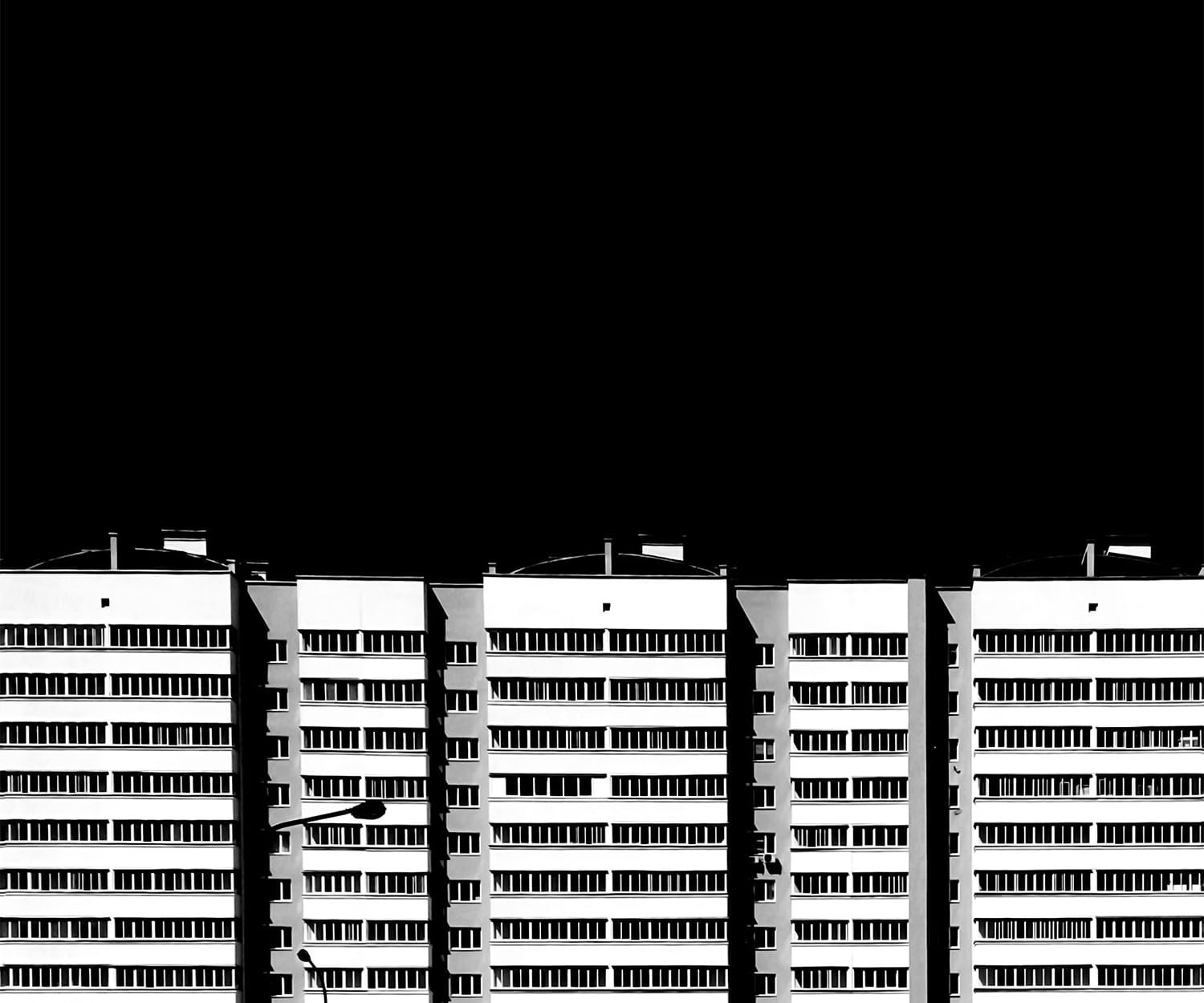
Tonal Contrast
Tonal contrast is created with light tones and dark tones lying directly alongside each other. So, for example, a white flower on a plain dark background in a studio would be a classic example of tonal contrast. Tonal contrast can be a very successful way of guiding your viewer round an image. The eye will be drawn to the light colour in the image (i.e. the highlights) and will then take in the surrounding detail.
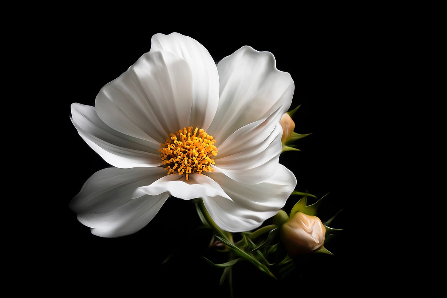
Tonal contrast can be particularly successful in black and white imagery and indeed it’s easier to see it in b&w shots, as there is no colour to distract. A good tonal contrast image will be very simple, so the composition will eliminate distractions.
Colour Contrast
Colour contrast is the idea that colour will have more impact when paired with a contrasting colour. However, you need to be aware of how colours work. Broadly speaking, colours can be split into warm colours and cold colours. Colour contrast works when you pair a warm colour with a cold colour. To give you some examples, the classic colour contrasts are red / green, orange / blue and yellow / purple.
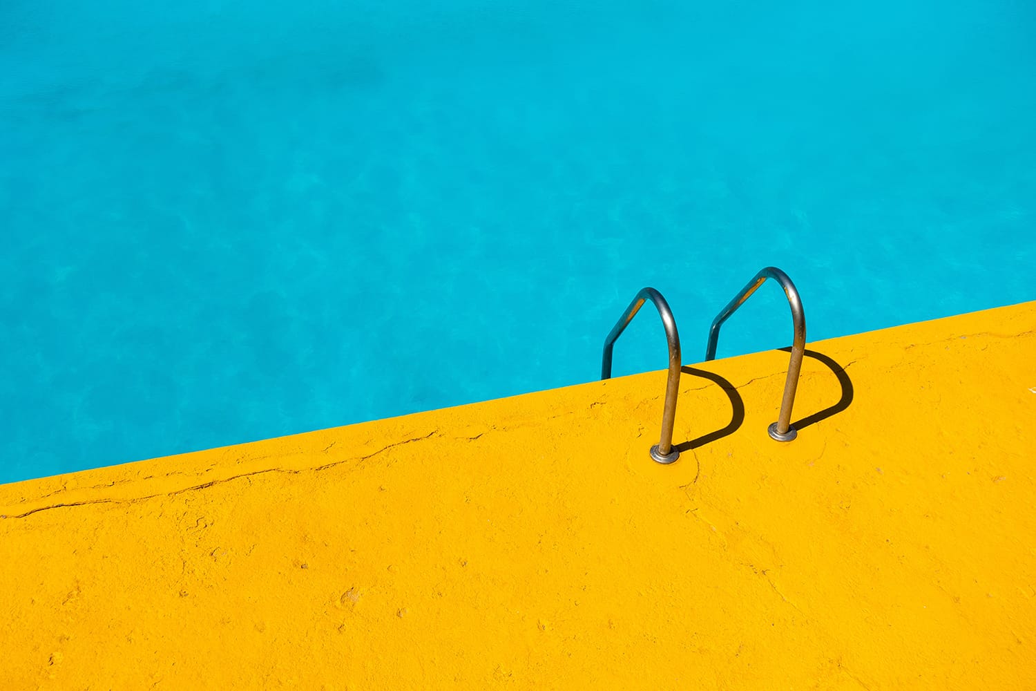
So, how do you go about creating photographs with strong colour contrast? The easiest way, of course, is to create your own. You can buy coloured paper from any craft store and experiment with this, or ask a model to wear particular coloured clothes. You can also find colour contrast occurring naturally in nature.
Flowers and fruit, for example, both have strong colour combinations and you’ll often find complimentary colours therein.
Conceptual Contrast
Conceptual contrast is a more abstract and less obvious form of contrast than tonal and colour. It has more to do with concepts and ideas than actual physical aspects, but is equally effective at adding interest to an image. It helps to add depth and encourage a viewer to engage with your photograph.
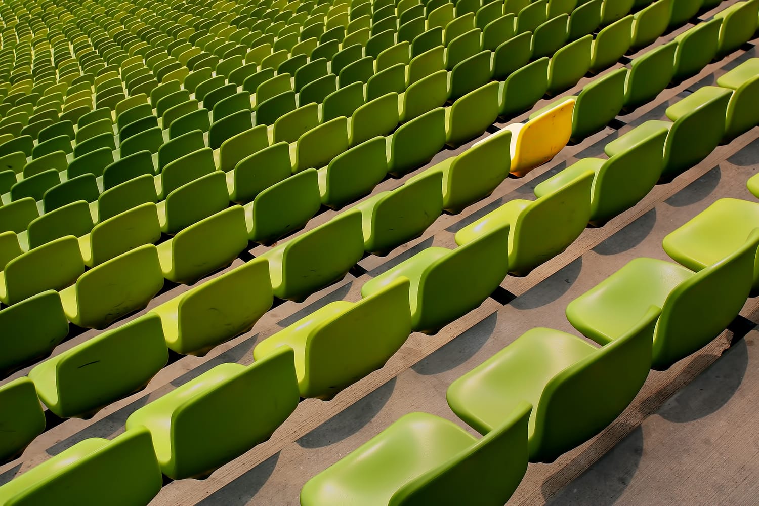
Conceptual contrast is about looking for something that stands out in an image and has a strong tone or colour in comparison to its surroundings. If you look around any surroundings, you’ll almost certainly find something that fits the bill! The skill comes in finding a way to make this contrast obvious to a viewer.
In a way, conceptual contrast is often about using elements of tonal and colour contrast and combining them into a larger landscape. It’s an abstract idea, but one that can really improve your creativity!
About the Author: Jo Plumridge
Jo Plumridge is a UK based photographer, writer and lecturer. She specializes in portrait, corporate and travel photography, and writes photography, travel and comedy pieces for magazines, websites and books. You can see some of her work at her website, or follow her on Twitter.