Six Easy Tools for Better Color Photos!
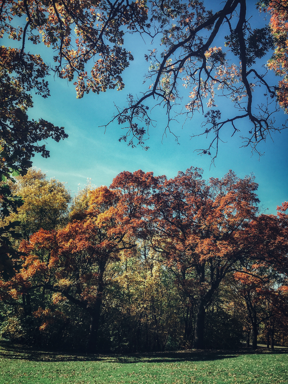
001 – Photograph by Kent DuFault
Color photography represents to some folks as being ‘easier’ than black and white imaging. In some ways, that’s true.
It’s hard not to like the resulting photo when you encounter a scene like the one in image 001. Even if a viewer wasn’t personally there in the moment and you as the photographer did nothing more than frame up a shot and take it.

002 – Photograph by Kent DuFault
But what about when you encounter a scene such as the one in image 002?
In a case like that, the bones for a successful photo are there. But it lacks visual energy on its own.
However, by applying one or more of the six tips discussed in this blog post, you can vastly increase your odds of capturing a stunning photo.
Hopefully, an image that pleases you as well as the casual viewer.
Let’s start with a simple question.
Is it always about bold and saturated colors? Is that the key to success in color photography?
Let’s face it, that is a noticeable difference between images 001 and 002.
I emphatically say, “No,” to that question.
And with that, Let’s go to our first technique.
Minimal Color
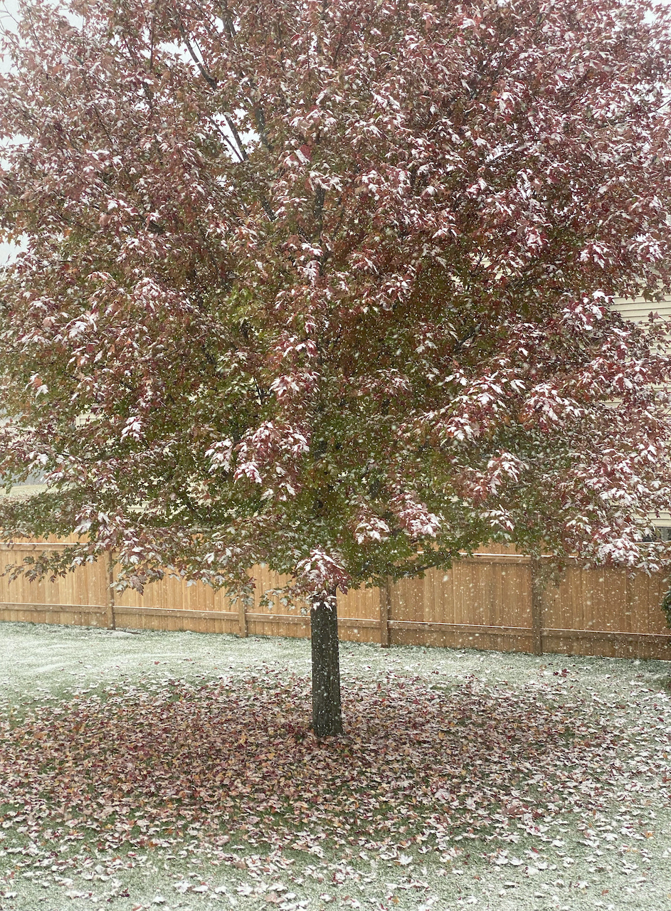
003 – Photograph by Kent DuFault
A critical step in making your images stand out, and I mean all photos (even black and white), but especially color photos, is to give them what I call “a plot twist.”
Think about it.
When you watch a television show or a movie, isn’t the most enjoyable experience when something surprising happens? If you can predict precisely what’s going to happen, that’s just boring.
A photo dripping with color saturation is like a television trope. We know it works, and so it gets used- a lot. But a trope becomes boring when it’s overused.
Minimal color becomes a plot twist (crucial color composition element) when it brings a surprise to the viewer.
Image 003 is an example of this type of color photo.
We know that autumn color is represented in the shot, but it is obscured, and that piques our interest.
Trying to maximize the color saturation in this situation would ruin the mood!
004 – Photograph and editing by Kent DuFault
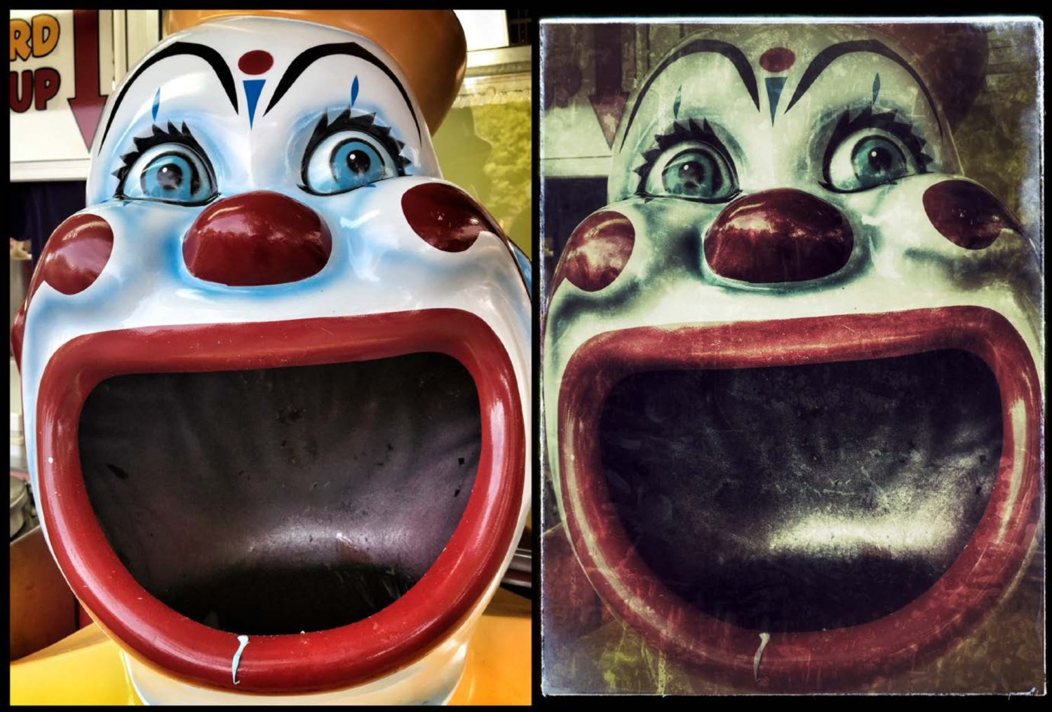
You can use minimal color to steer the mood and feelings of your audience.
Image 004 was taken as an illustration for a fictional story. The story talked about a place called Carnival Town. It’s important to note that Carnival Town was not a nice place in this story. It was rather seedy and filled with criminals.
When I saw this clown face at my local state fair (it was a trashcan), I knew it was the perfect illustration for this moment in the story. (The main character finds a gun hidden in a trashcan at Carnival Town.)
With a few grunge techniques and minimal color, this trashcan in a kiddy ride area at a local fair becomes something ominous- a plot twist!
I did an Internet search using the tags’ minimal color.’ A lot of photos came up that looked like image 005.
This isn’t Minimal Color. This is Monochromatic Color.
Minimal color means low saturation and brightness levels.
Monochromatic color means that all the colors in the photo are from a single hue from a color wheel. (More on this in another post.)
Power Colors
006 – Graphic by Kent DuFault
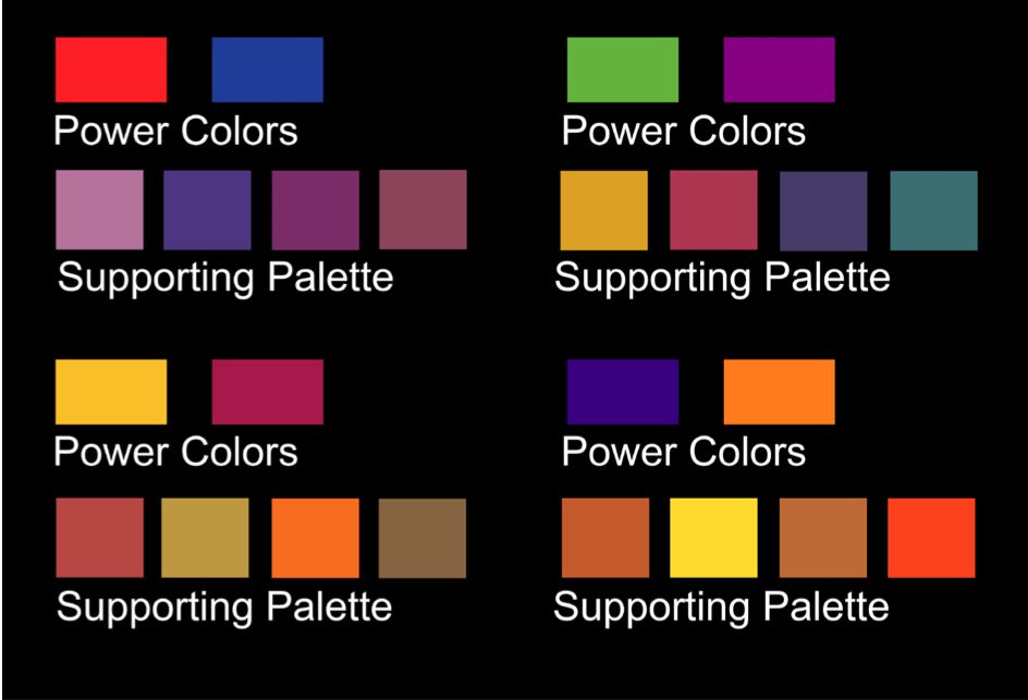
The universal power colors are red, black, white, and yellow. These colors are proven to attract attention faster than any other colors- even in a bustling scene with lots of colors. And white and black are the most potent power colors, followed by red and then yellow.
The secondary power colors are blue, green, purple, and orange.
The supporting palette colors create good color schemes when combined with their respective power colors.
Have you ever noticed how road signs are typically red, yellow, blue, and orange? Yup! Power colors that attract attention!
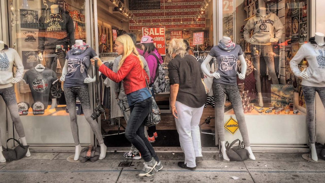
007 – Photograph by Kent DuFault
This photograph is quite complicated in its structure. Yet, the eyes go right to the woman walking to the left. Why? Her jacket is the power color red.
008
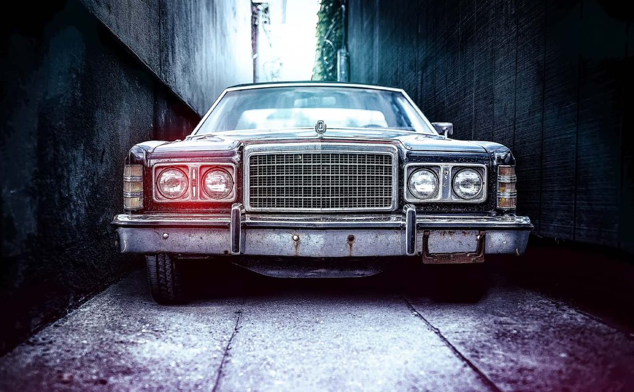
Power colors do not need to be bright or overly saturated to be effective. Close your eyes for ten seconds and open them while looking at image 008.
Where do your eyes immediately go?
They go to the headlights on the left because even a minimal amount of red creates more visual weight.
That light touch of red is still a power color. Did you notice that the color scheme of this photo comes from the supporting color palette?
009
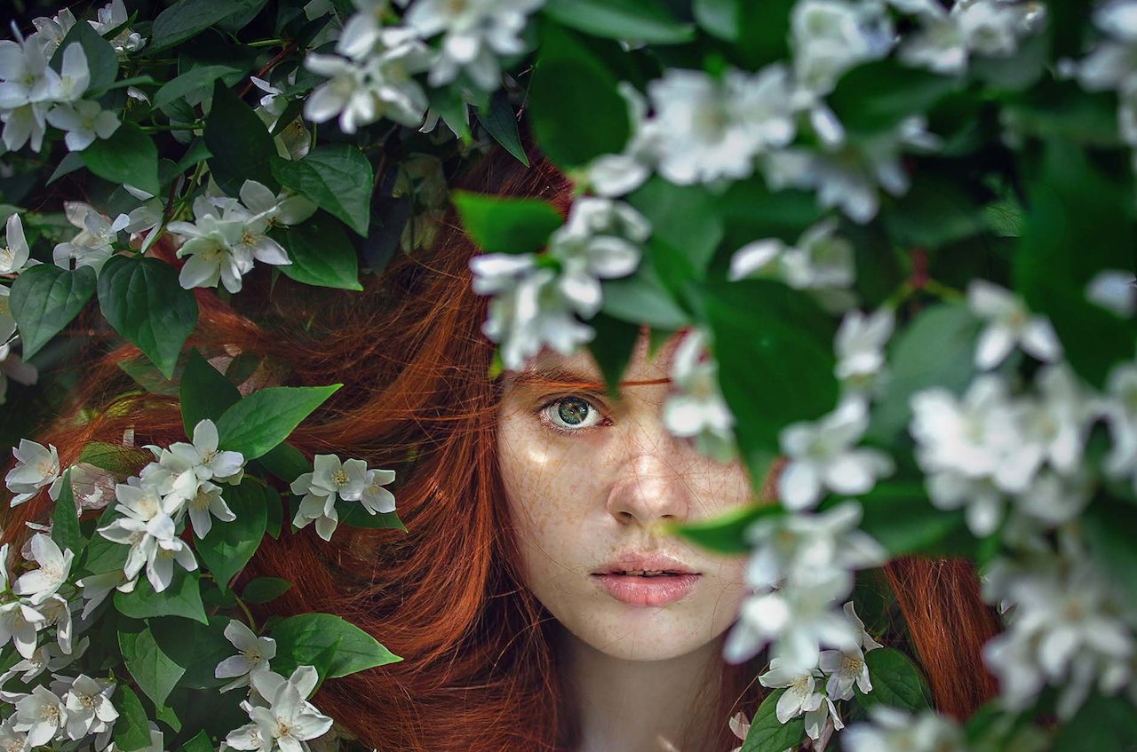
Using a power color isn’t always a slam dunk for success, especially if you have multiple power colors in the same photo.
You need to structure your power colors to work within the composition.
Image 009 has three power colors. They are white, red, and green.
Close your eyes for ten seconds and open them while looking at image 009. What do you see first? You go right to the woman’s eye, don’t you?
There are two reasons for that outcome. The first reason is that the white of her eye is the brightest power color in the shot. White will typically overpower all the other colors in a photo, depending upon the composition. Secondly, the arrangement places the other two power colors into submissive roles as frames.
Unbalanced Color

010 – Photograph by Kent DuFault
To understand unbalanced color, you must first understand balanced color.
I want to clarify that we are not talking about white balance- the task of setting our white balance on our cameras or correcting unwanted color shifts in post-processing. We will have more on these two topics in later posts.
Unbalanced color is about the use of color in photo composition.
Image 010 is an example of balanced color. You have balanced color when no one distinct area of color dominates the scene in the photograph.
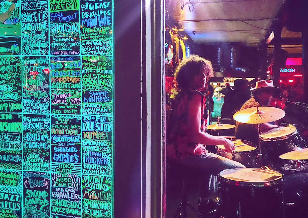
011 – Photograph by Kent DuFault
Image 011 is an example of unbalanced color. The colors in the left one-third of the photo completely dominate the colors in the right two-thirds of the picture.
But the subject area is in the right two-thirds. This seems contradictory to good composition.
Image 011 is an excellent example of asymmetrical counterbalance. The bright neon colors to the left become a focal point. They attract immediate attention.
However, all the other composition tools within the photo stack visual weight toward the drummer, eventually overpowering the neon colors on the left.
One might question, why include the area on the left? Use your hand to cover that neon signage on the left. The photo really loses something, doesn’t it? It loses the story element.
The concept of unbalanced color is the following: One area of your frame dominates in color. However, the rest of your frame contains the subject and has a greater value of visual weight in the composition.
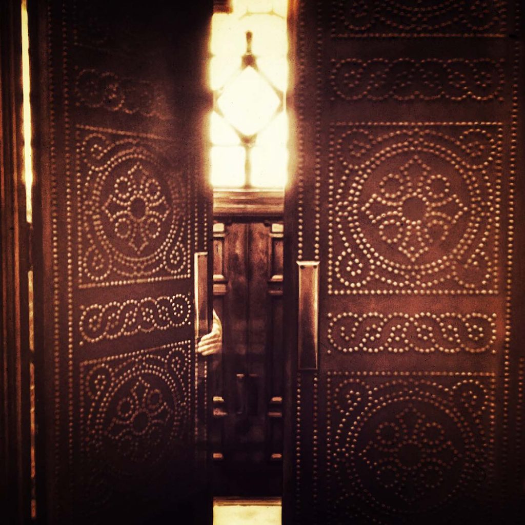
012 – Photograph and Editing by Kent DuFault
Monochromatic color (as we noted earlier) and the Color Wash technique are often mistaken.
What is the difference between the two?
A monochromatic color image will have varying colors, but they are all in the same hue range. (As we saw in image 005.)
A color wash occurs when you don’t change the colors in the original shot; you simply lay a semi-transparent “colored filter” (if you will) over the top of the image.
This can be done by placing a color filter over the lens when taking the shot. Or you can do this step in post-production to have greater control over the level of transparency of that overlaid color.
I prefer creating my color wash images in post-production.
For image 012, I placed a light-yellow color wash over the original in post-production.
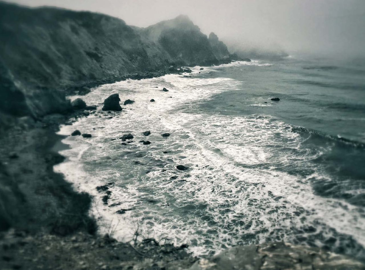
013 – Photograph by Kent DuFault and Editing by Kent DuFault
The color wash in image 013 was also created in post-production. The difference between images 013 and 014 is that in 014, I set the transparency level of the color wash reasonably high.
This means most of the original colors have been washed. In image 013, the transparency level of the wash color was low, and that left most of the actual colors. The color wash is primarily visible in the highlights.
Color Division

014 – Photograph by Kent DuFault
Color division is a concept that I don’t see discussed often.
Whereas color in a leading line helps direct the viewer’s eyes toward something, and color shapes create strong visual weight in a particular portion of a photograph, a color division is a tool where the use of color separates one part of the photo from the rest of it.
In general, that means it diminishes visual weight from one portion of the frame and moves it to another, usually through juxtaposition or placement.
Image 014 uses color division to place the status of the subject area onto the two women sitting on the couch.
Here’s how it works.
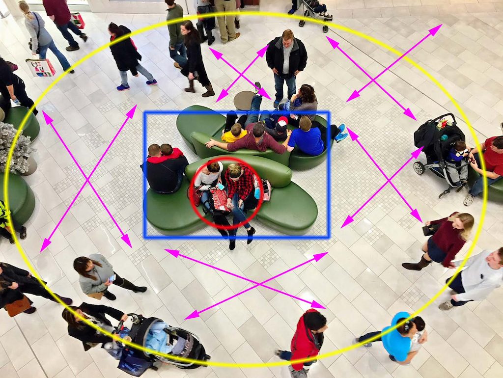
015 – Photograph and Graphics by Kent DuFault
Image 015 uses color division as well as several other tools of composition, all of which incorporate color. However, it’s the color division that makes or breaks this shot.
Let’s examine what’s happening in this photograph.
The subjects are the two women in an intimate conversation on the couch. They are dead center within the frame.
They were interesting, and I felt that the red and black checkered shirt (power color red) would work as a focal point driving a viewer’s eyes toward them.
However, that alone wasn’t visually strong enough.
I observed the green couch. The unusual shape and color of the sofa provided a perfect frame for the two women. However, it still wasn’t visually strong enough.
I also noted that vast crowds of people were moving all around this couch.
What did I need to make this work?
I needed a “color division,” and I saw it in the subject area’s flooring material.
The neutral color of the flooring would create a visual break, a division, separating the women from everything else around them.
All I had to do was wait for the right timing and release the shutter!
Go back and study image 014 again. You will see exactly how the color division worked.
Color Contrast
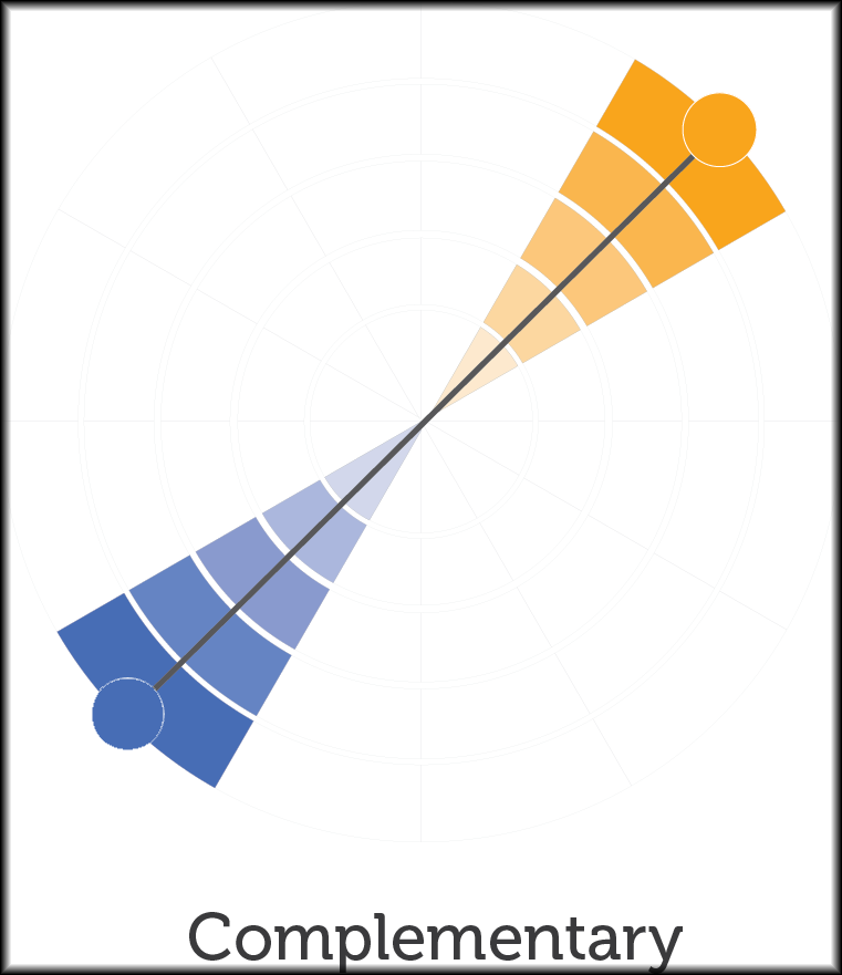
016
Most photographers have heard of using complementary colors in their imaging.
People love sunset at the beach photos. One of the reasons why is that it uses the complementary colors of a golden sunset against an azure blue ocean.
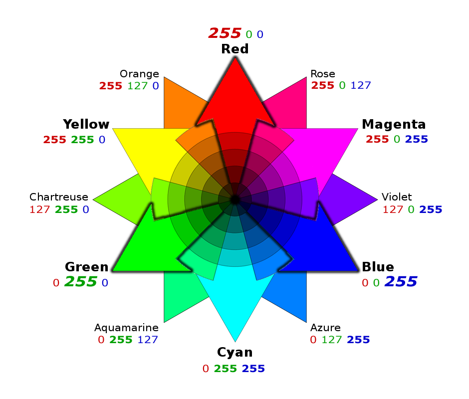
017 – RGB Color Wheel
A complementary color scheme is another way of saying contrasting colors.
The are many combinations of contrasting colors, and any of those combinations can boost the quality of your images. It becomes a matter of seeing them, recognizing them, and then using them.
Orange and blue are just the most common colors used in photography. This complementary color scheme is also often seen in movies and television shows.
For those that don’t know, a color contrast occurs when colors are opposite each other on a color wheel.
There are different types of color wheels. The two most common ones used in photography are the RGB and RYB wheels.
In the above example, color wheel (RGB), red, and cyan are contrasting colors.
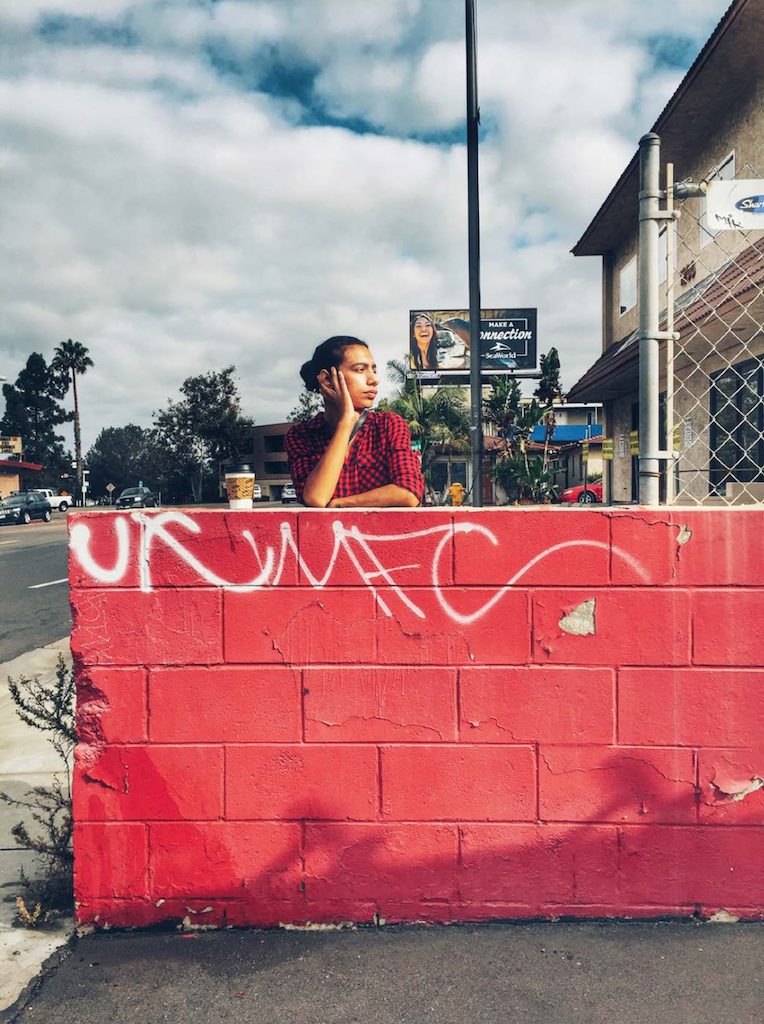
018 – Photograph by Kent DuFault
Image 018 makes use of the contrasting colors of red and cyan.
This is also worth noting. The colors white and black are contrasting colors to all the other colors on a color wheel! (And, they are power colors.)
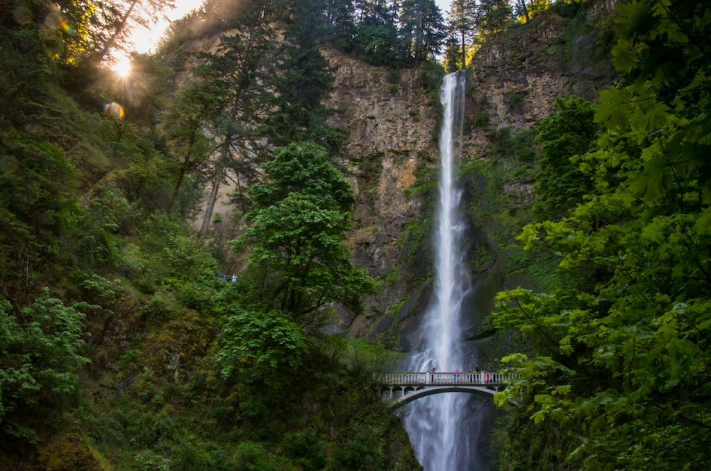
019 – Photograph by Kent DuFault
Does image 019 have contrasting colors?
It does! The waterfall is white, which contrasts with every color on the color wheel!
I hope you find these six color photography tips informative and inspiring. To learn more about how to use color in a rich and vibrant way in your photos, check out Photzy’s guide Creating Rich and Vibrant Color Photography!
Now, it’s time for us to go take pictures.

