Understanding Colour in Photography
 by
Jo Plumridge
by
Jo Plumridge

Photographing in colour always seems like a simple proposition, because we presume that we will be able to capture the colours we see straight into a photograph. But actually, capturing colour effectively is a complex business, as not all colours blend together well.
The key is understanding the colour process and using it to produce beautiful images.
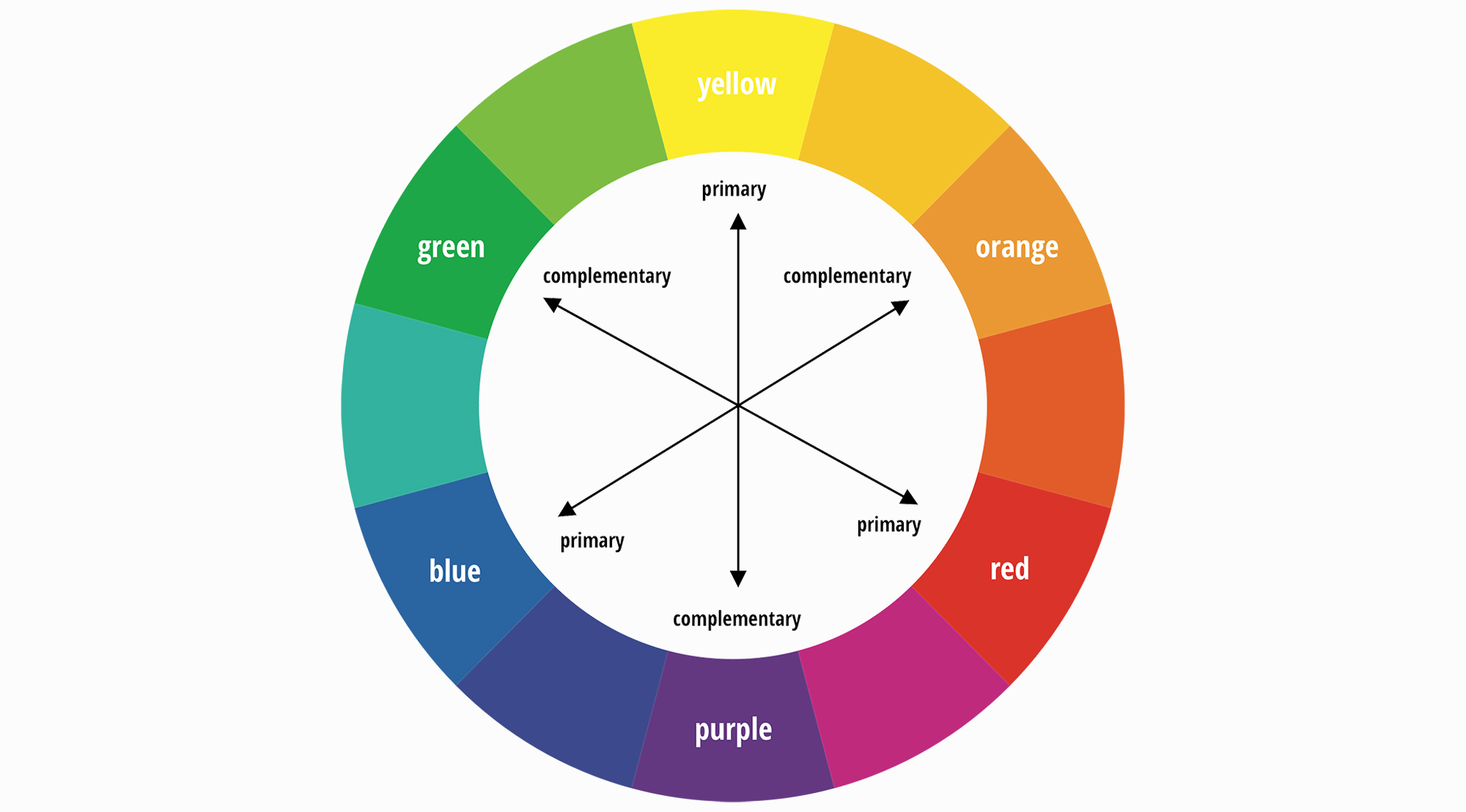
Above we see a simple colour wheel, which shows the primary colours of red, yellow and blue and their complimentary colours. Understanding this colour wheel is key to producing good photographs.
Now, for many photographers, this is an intuitive thing and they are able to feel the compatibility of colours. But it is also a skill that can be learned with practice.
One of the key areas where colour combinations can have a strong effect on your images is when shooting portraits against a coloured background. So, for instance, if you shoot on a green background the skin will develop red tones (green’s opposite on the colour wheel), or if you shoot on a blue background, skin will look more yellow. You need to be aware of this so that you can combat it if necessary – either by using flash lighting or removing some of the colour casts in post-production.

But what colours work well together?
A simple way to start working with colour is to look for colours that belong in the same family (e.g. shades of red and orange). These are known as analogous colour schemes. You’ll often find them occurring naturally in nature and they are harmonious and pleasing to the eye.
If you’re shooting with analogous colours you need to make sure that there is enough contrast between the colours to create an interesting shot.
Once you’ve mastered this, you can move on to working with complementary colours. These are colours that are opposite each other on the colour wheel (for example red and green). This can create a very vibrant scene, but it’s inadvisable to use them in large doses.
A good way to use complementary colours would be to shoot a landscape with a lot of green grass and trees in it, with a few red accents to create a high contrast look.
A final and more complex way to work with colour is to look at triad colour schemes. Triadic colours are those evenly spaced around the colour wheel (for example purple, orange and green).
Like complementary colours, a triadic colour scheme can be very vibrant, so it’s again best to work with one colour dominating and the other two used as accents.
In general, colours work well when you follow these rules, as they will provide a well blended and attractive image. Of course, there are exceptions to this rule whereby using a vibrant clash of colouring can produce an exciting image! But, like all rules, it’s best to learn how to work with colours before experimenting. In summary, colour photography can be far more complex than black and white work as you must be able to feel the compatibility of colours. But it is a task that can be mastered with practice!
About the Author: Jo Plumridge
Jo Plumridge is a UK based photographer, writer and lecturer. She specializes in portrait, corporate and travel photography, and writes photography, travel and comedy pieces for magazines, websites and books. You can see some of her work at her website, or follow her on Twitter.