The Ultimate Guide to Color Theory for Photographers

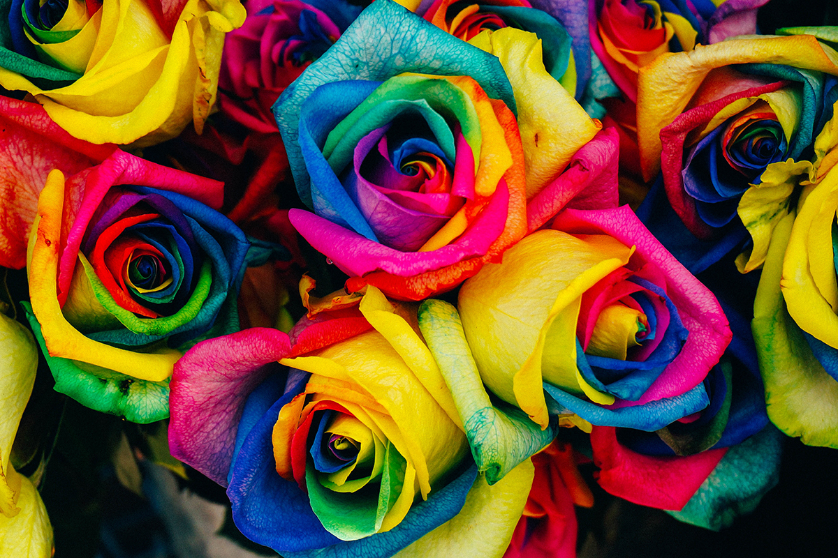
Color is all around us, and when used correctly it can help your images come to life. Color has the power to transform your compositions; from dull and uninspiring to exciting and alive.
However, in some cases, color can negatively impact an image as well, causing it to swim with details and appear distracting, or even unrealistic. While it may be a thin line to walk, being able to use color effectively can help you to take your photographs up a notch, allowing you to create compositions that are eye-catching and exciting.
Developing an eye for color can take time, but it is something that’s worth pursuing with your photography. With this in mind, let’s take a look at color theory as well as some different ways that you can use color to bring out the best in your images.
Understanding Color Theory
There is a lot to explore when it comes to color theory, and how it affects our images, but understanding the color wheel and how the different colors work together and complement each other is a great place to start. Different color combinations provoke different feelings and responses; with some color schemes working together much better than others.
By understanding how different colors work together, you’ll be able to see things differently, and get the most from the colors around you. Here’s a basic look at some different color combinations.
Analogous Colors
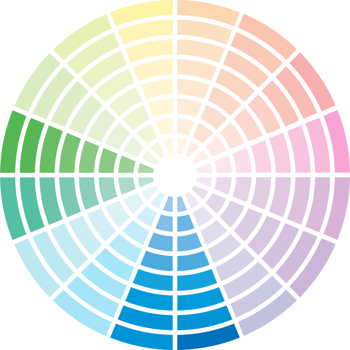
First, let’s look at analogous colors. These are the colors that are next to each other on the color wheel. An analogous color scheme can consist of anything from two colors on up to half the wheel. These colors – think blue and green – can often make for a pleasing and harmonious color combination.
Complementary Colors
Complementary colors are shades that are located directly across from each other on the wheel. Think: blue and yellow or orange and green. These colors are complementary because they are said to work well together. Complementary combinations can create a high-contrast and vibrant look especially when used at full saturation.
Split Complementary Colors
A split complementary color scheme takes two colors that are directly opposite, and another color that’s one of the complementary colors’ analogous color. This type of combination often works extremely well, helping to balance out an otherwise high-contrast color combination.
Triadic Colors
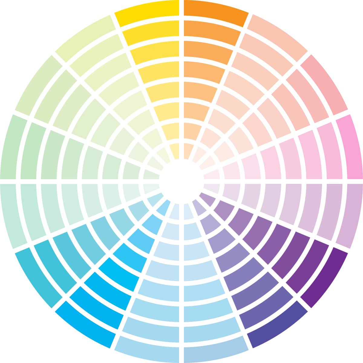
Triadic colors are three colors are equally spaced out from each other on the color wheel. This color scheme is very similar to split complementary colors.
Quadratic Colors
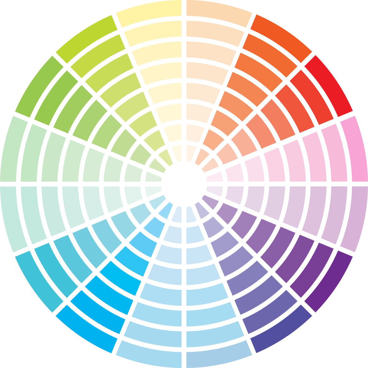
A quadratic color scheme is a combination of two complementary color harmonies on the color wheel. This grouping can also be called a double complementary scheme, because it is the combination of two complementary colors.
Of course, there are many more combinations that you can use as well including monochrome colors, such as a black and white color scheme. Depending on the type of photography you are working with, the harmony of colors you choose to work with will vary. For instance, in most types of landscape photography it can be difficult to influence the resulting colors in a composition – although you do have some control over foreground elements that you may choose to include, such as brightly colored flowers – or the results of your image in post processing. In portrait photography, though, or when capturing macros, it can be easier to create specific color combinations.
Your best use of color isn’t about adhering strictly to the color wheel, rather, it’s about being aware of the colors that you’re using – and their resulting impact, and using this knowledge to help guide your decisions – especially if you’re faced with a composition that you feel is a bit overwhelming, or, conversely somewhat lackluster.
Brightness and Saturation
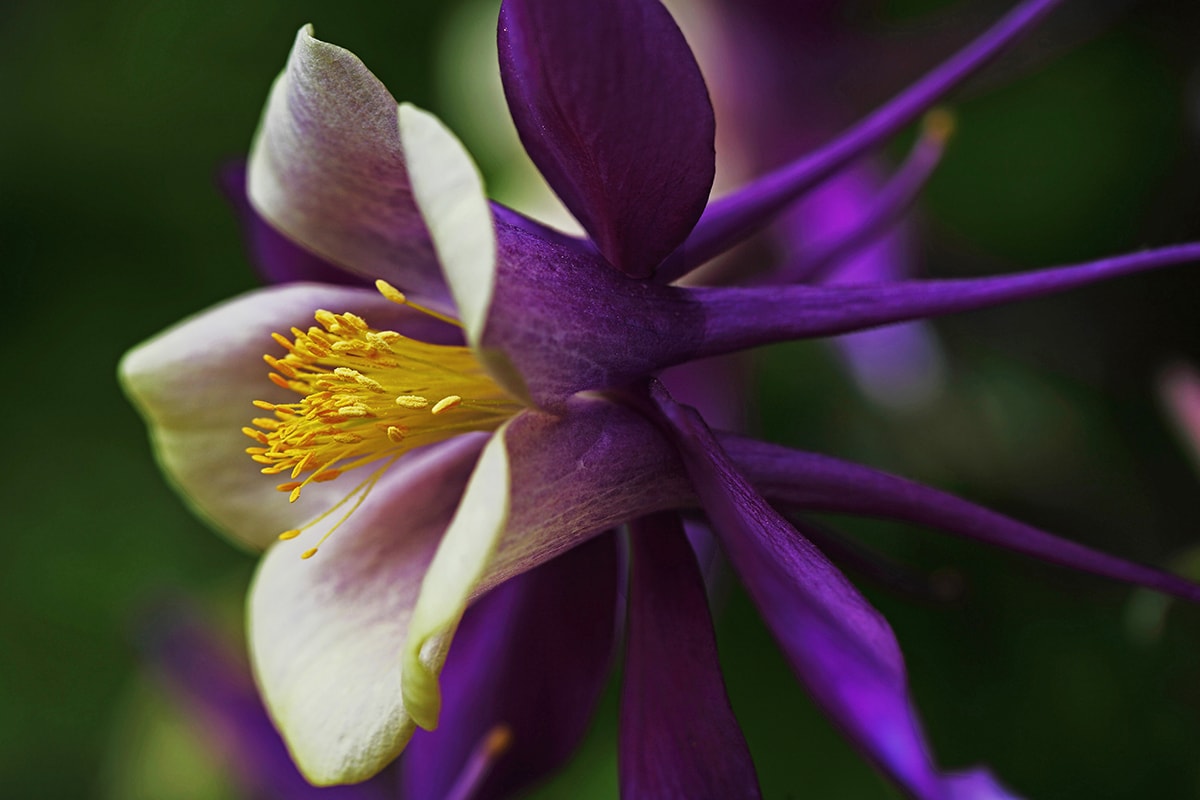
photo by Ian Sane
When working with different color combinations, keep in mind that the brightness and saturation of different colors will impact the harmony of the resulting image. In most cases, you’ll want to pay close attention to the colors in the image that are bold or saturated as these are the ones that will generally attract the viewer’s attention. These colors work well for the subject or main focal point in an image.
Different Colors, Different Moods
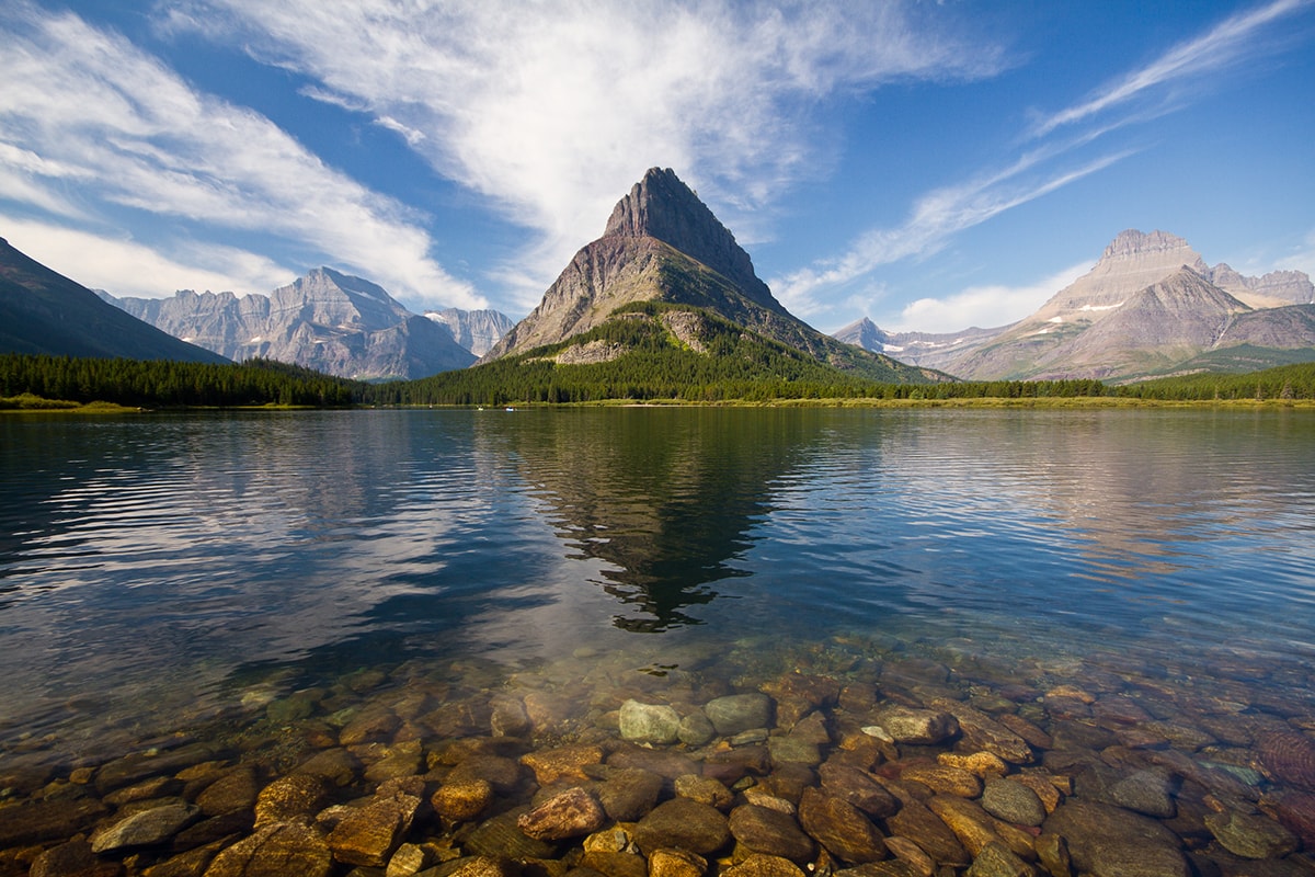
photo by Jeff P
As you probably already know, different colors tend to convey very different moods in an image. Colors that are on the warm side of the wheel – such as red, orange, and yellow – often result in an image that feels in bold or energetic, while colors that are cooler – think: blues and greens – tend to convey feelings of calm and tranquility.
Enhancing Color in Your Compositions
photo by George Shahda
Now that you know a bit about different color combinations and how they work together, let’s take a look at some other ways that you use colors to enhance your images:
-
Use a Polarizing Filter
Using a polarizing filter is a great way to draw out colors especially when used at the right angle to the sun. These filters are often used to enhance the vivid blue of the sky, or to cut through reflections and glare causing leaves, water, or even skin to appear more saturated.
-
Get the Exposure Right
In many cases, adjusting your camera’s exposure can help the colors to appear more rich and vivid. Since your camera’s built-in metering system often chooses to use a lighter exposure, if you underexpose your images, just a little you’ll often be rewarded with a deeper color.
-
Work With the Light
The right lighting will help to naturally boost the colors in your images. For instance, if you shoot on a bright, overcast day, the colors will be more saturated resulting in stronger, bolder images. Shooting on a sunny day, on the other hand, will run the risk of harsh shadows, and potentially washed out images.
-
Watch the Background and Foreground
Always check your backgrounds! Your background always plays an important role in your images and can either enhance or distract from the focal point. Similarly, keep an eye out for foregrounds that you could use to add complementary or pleasing colors to your compositions.
-
Adjust Your Colors in Post Processing
Shooting in RAW will give you tremendous flexibility in terms of drawing out the colors more effectively in post-processing. Just remember to keep the context of the image in mind. In most cases, you’ll want to avoid over processing especially when it comes to nature shots, where you’ll usually want to steer clear of unrealistic color combinations. A good approach is applying brightness and color saturation to enhance the colors in isolated areas in a scene. For example, elements that are receiving direct light, such as colorful flowers or illuminated clouds can often stand to have their brightness and saturation enhanced ever so slightly.
There’s much to learn about color theory and taking the time to delve into the subject can be a fun study that will prove to be rewarding. Keep in mind, though, that at the end of the day, developing your photographic eye, and discovering what works well and what doesn’t is often a matter of trial and error as much as it is about learning theory. With a combination of knowledge and practice, you’ll soon become adept at telling which colors work well together, and which ones don’t and will be able to create pleasing color combinations without a second thought!
How do you enhance the colors in your images? Let us know on Twitter or Facebook!
Color wheel vector art via Vecteezy
About the Author: Christina Harman
 Christina is a part time blogger and full time photography enthusiast living in Southeast Alaska. She enjoys travel photography and has taken pictures in countries such as Mexico, England, France, and China. She likes sunny days, new lenses and drinking good coffee. You can visit her at Tangled Thoughts.