10 Ways Visual Weight Can Help You Create More Compelling Compositions
Visual weight is one of the most important factors in photography that can make your photos more appealing.
A photo with unbalanced visual weight might appear less attractive, and viewers might miss some important details as well. For example, a very colorful element in the middle of a rather bland scene will immediately draw the viewer’s attention because it will have more visual weight.
On the other hand, a photo with well-balanced composition feels more attractive and harmonious.
In this tutorial, we’ll discuss the concept of visual weight and how it can help you create more balanced photographs with better composition.
Techniques to Create Balanced Photos with Visual Weight
The following concepts should help you better understand visual balance. Keep in mind that these are just guidelines (not hard rules) to improve your compositions.
You can always break the rules; in fact, we encourage it! But remember that you can only break the rules you know and understand. But first, you need to understand the different types of balance that affect your photos.
Symmetrical Balance

Also known as formal balance, it’s the most obvious and simplest method to compose photos. According to the symmetrical balance concept, you need to arrange your subject matter right in the middle of your image, unlike the golden rule of thirds.
Most of the time, such images are created in the horizontal format because this way, you can display symmetrical elements more easily.
Asymmetrical Balance

Also known as informal balance, it usually allows you to create more interesting and creative photos. But at the same time, it’s also a little more difficult to achieve.
You can use different compositional methods such as the rule of thirds to place your subject matter off-center. It allows you to achieve a more harmonious and balanced feeling in your photos.
Elements that Impact the Visual Weight
The element that draws the viewers’ attention immediately before anything else holds the highest level of visual weight. The following are some of the factors that affect this.
1. Size
The size is probably the most obvious factor because the bigger the main element in your photo, the more visual weight it will hold as compared to the smaller ones.
Hence, the bigger objects draw more attention. Generally speaking, making the biggest element of your photo the main subject is best. To make it appear more visually balanced, you can support the main subject with smaller components.
2. Contrast and Tone

In general, the darker elements of your photo hold more visual weight than brighter ones. If your photo’s tone is light, you need to make sure that there are no distracting objects and shadows. It becomes even more important in B&W photography.
The same goes for elements that have high contrast. You can grab the attention of your viewers by highlighting a dark object on a light background or vice versa.
3. Texture
Textures and patterns can be points of interest because they often appear more interesting visually. You can use strong textures to balance an off-center subject matter, but you also need to look for textured backgrounds to keep the main focal point on your subject.
4. People and Animals

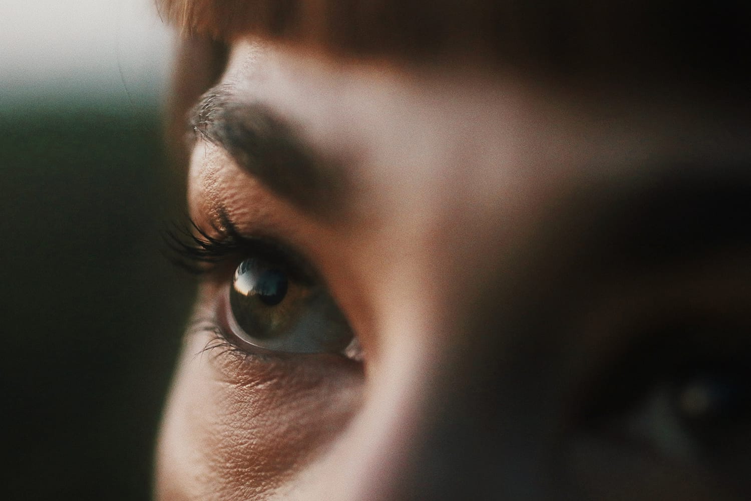
Eyes most probably hold the highest amount of visual weight, and that’s why viewers are attracted to people and animals in photos more than anything else.
This factor can make or break your photos because other people or animals will be distracting if your main subject is also a living being. On the other hand, if the main subject is a person standing isolated in a landscape, it will appear more interesting and appealing.
5. Focus
Elements with a sharp focus always hold more visual weight than out-of-focus areas. You can use this to minimize the effect of unwanted objects in the photo. It’s a good idea to blur the distractions by using depth-of-field to direct the viewer to the subject matter.
6. Isolation
If your main subject is isolated in your photo, it will hold the highest weight and appear the heaviest than other objects. For example, an isolated rose in the field of sunflowers.
7. Negative Space

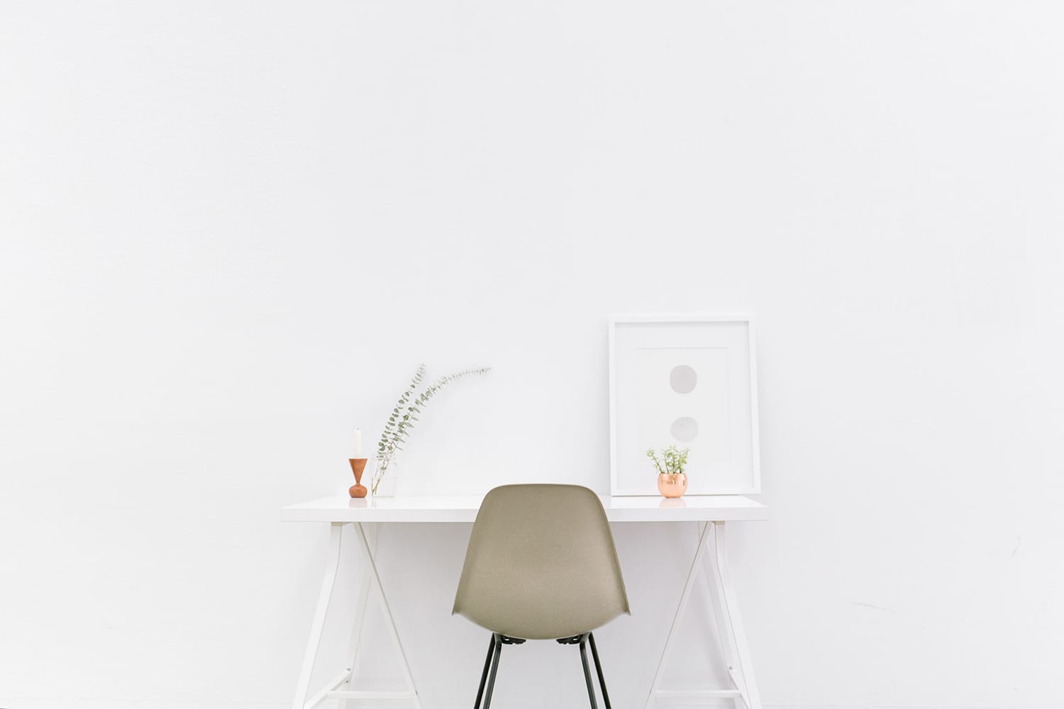
Negative space is yet another very important factor that can affect the visual weight. You can use it to balance out single or multiple smaller elements on one side of your photo. You can consider negative space as a single larger element with the least visual weight.
8. Location and Orientation
According to the general rule, the farther the subject from the center, the more visual weight it will hold, but of course, it’s not universal.
You can counterbalance a big object that you place closer to the center of your photo with a smaller element by placing it at one side of your image.

The object that you place on the upper (also right) side will hold more weight than the object that you place on the lower side (also left). That’s because our brain is trained to perceive implied linear perspective this way. Moreover, vertical objects hold more visual weight than horizontal ones. Similarly, diagonal orientation appears to have more visual weight than both horizontal and vertical orientations.
9. Shape
The shape of your subject also impacts the amount of visual weight they carry. Complex shapes mostly have more weight than simple ones, and you can place a subject with complex shapes to make it stand out with the elements in the background with simpler shapes.
10. Quantity
You can use multiple small elements to balance out one larger object, and you can also use repetition of things as well to achieve the same – for example, a fruit basket with multiple grapes and one apple.
Final Word
If everything appears perfectly balanced and pleasant in all of your photos, then after a while, it would seem a little boring. To create a special effect and make your subject more prominent, you can always use the concepts mentioned above.
Our mind undoubtedly appreciates balance but a little randomness, drama, and tension are also good from time to time. Not only does it add more flavor and character to your photos, but it also allows you to unveil and learn innovative ways to achieve more creative photos.
We hope this guide about visual weight will allow you to take your composition game to another level.
