5 Trends in Logo Design for Photographers
We live in complex times. And with all of that complexity, consumers tend to look for the simple. This is probably why the trend in website design is clean, sleek and simple. And the same can be said for logos.
What designers seem to want to convey to people is that a business can provide what they want – a product or a service – in an organized, uncomplicated, streamlined way. At the same time, a logo must convey the “culture” of the company.
For example, consider the logos of Rolex vs. Toys”R”Us. Both maintain simplicity but project a drastically different culture.
As a photographer, you want to do the same thing. And trends in logo design for photography seem to be following the same general trends of businesses in general. So, if you are just starting out, or if you are considering a design change, you might want to consider these trends.
1. Flat Designs
This trend has been around for a couple of years, and it seems to have come from designers’ understanding of the need for simplicity. These are two-dimensional, simple and flat, but then color and/or bold type will accompany that. Shadows and textures are used far less because they “complicate” things.
Kimberly Coughlin Photography
From her own blog, here is how Kimberly Coughlin describes her work:
I shoot primarily expectant mothers, newborns, babies, kids and families but I also do events and find them incredibly fun! Another of my specialities is birth photography and I am humbled, honored and overjoyed to document the arrival of your special newborn.
She has chosen the perfect colors and typography for her niche.
2. A Hand-Made Look – or Not
Logos that have a hand-drawn “feel” convey simplicity but also warmth. Photographers who specialize in people, life events, etc. will want to convey that personality.
Kim Lora Photography
On the other hand, photographers who focus on corporate or business photography will not want a hand-made look. That personality must be sleek and sophisticated – more business oriented.
While the logo below still has somewhat of a vintage feel to it, it features more straight lines than the one above. If I were in the market for a more corporate photography studio, I may be drawn to this company because of its logo.
Hosoren Photography Logo
3. Use of Negative Space
Photographers are artists. And they want to show their artistic “bent” in their logos. One current design trend, using negative space, can do just that. Here’s a example of how this could be done:

Negative Space logo on DepositPhotos
4. Camera or No Camera?
Putting a camera in a photography logo just seems natural – after all, that is the business you are in. If you choose to do this, be certain that the camera you use conveys the type of photography you do – fun and playful perhaps for kids and families, or sleek and simple for more sophisticated events or businesses.
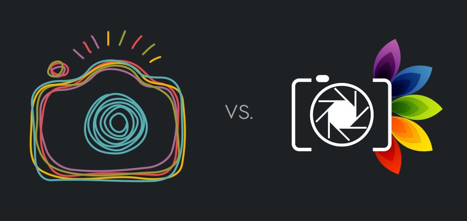
Playful vs. Business photography logos
5. Monolines
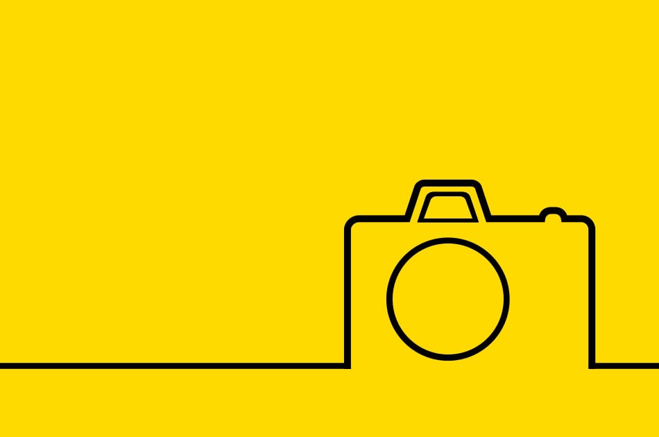
Simplicity is again at the forefront with single thin lines, all of similar weight and thickness. This gives a logo a sleek look. Some lines can appear complex, but, broken down, they are really clean and simple. The additional appeal of monolines is that they can have a look of home-made, and, from a psychological standpoint, they instill a sense of trust and honesty.
Using a single color for the monolines also keeps it simple. These designs are appealing and can be either playful or sophisticated:
Some Additional Thoughts
As an artist, you probably have creative and strong ideas regarding the “image” you want your logo to convey. And you may very well be able to design it yourself. If not, however, and you choose to use a graphic artist to create your logo, be certain that you spend plenty of time with that designer before s/he begins crafting it.
- Your designer must have an intimate understanding of your brand and how you want it portrayed. If, for example, your focus is on wedding photography, you do not want a logo that “screams” playfulness. That type of design will obviously be for child photography.
- It’s also a good idea to develop a persona for your typical customer and convey that to your designer. This, of course, can be accomplished by insisting that the designer studies your portfolio very carefully. Good designers will insist upon this anyway.
Consider a logo that can be dynamic, that is, it can evolve without changing its essence. You may want to change colors or even typography as you expand your business; you may want to have several variations that will appeal to different types of customers, and place those variations on your business cards. You may want to have multiple websites that showcase each aspect of your photography through portfolios, with logo variations to match.
Above all, you know who you are – your logo should reflect that, no matter what current trends may be.
