The 5 Worst Landscape Photography Errors to Avoid
Landscape photography is quite the wide-ranging niche in photography. At times, it can show vast and seemingly limitless spaces within the world, but other times, it can show microscopic spaces. It all really depends on the mood of the photographer!
Much of the time, photographers tend to focus on scenes depicting nature, yet they sometimes focus on entirely manmade features or disturbances within the landscape.
The whole point of landscape photography is to present little or no human activity at all in the scene. As such, the philosophy behind this type of photography is the showcasing of a pure and unadulterated depiction of nature. Popular subjects for it include landforms with a strongly defined shape, ambient light and even the weather.
The best way to turn an otherwise great attempt at landscape photography sour is by making a major mistake. Here are five of the worst landscape photography errors to avoid at all costs.
Funny-looking Horizons
While some people can hold the camera straight, other photographers seem to be really challenged in that respect. Keeping the horizon level is particularly difficult when you’re trying to shoot a landscape from a very unusual angle, though that shouldn’t discourage you from experimenting with unusual angles!
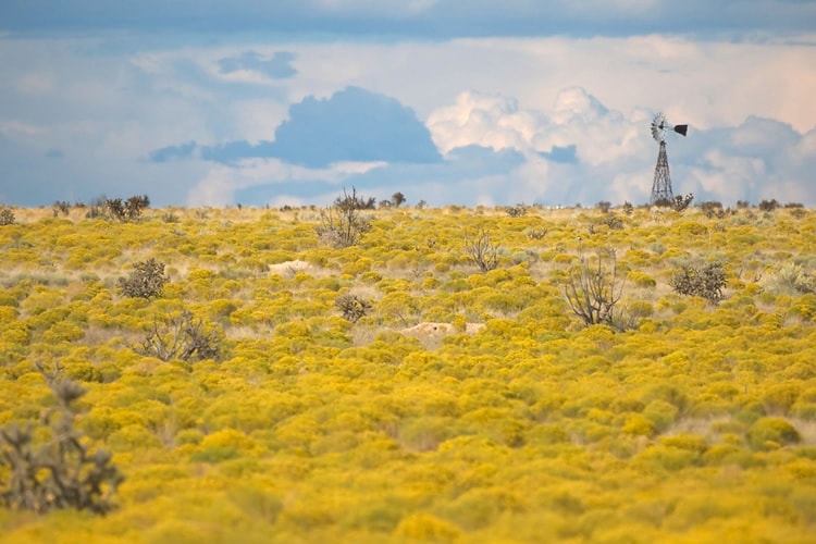
image by theilr – notice that the horizon is straight.
Instead of wasting your time with post-capture editing, get it right the first time by using a level to determine when your camera’s on an even keel. Examples are a small spirit-level that goes into the camera’s hotshoe and a bubble-level on the tripod you’re using.
Your camera, if it’s new enough, might even come with a built-in digital level that you can display either in the LCD screen or viewfinder.
Blurry Images
Blurry images should naturally be avoided like the plague no matter what type of photography you’re doing, but it’s doubly important with landscape photography. Many landscape photographers tend to use a small aperture as they keep the sensitivity low in order to get the most amount of detail. That leads to utilizing a slow shutter speed.
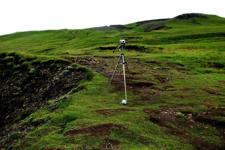
image by CGP Grey – using a tripod is a must!
However, this typically causes camera shake. Rather than putting up the sensitivity, thereby introducing some noise, the desirable answer is mounting your camera on a tripod. It’s a good idea to tighten the locks to minimize any slippage during the exposure, but it might also be useful to put a weight on the tripod, weighing it down to make it that much sturdier.
Light That’s Dull and Flat
While professional photographers (read: those paid for taking pictures) will usually wait however long it takes to get the correct light for a shoot, photography enthusiasts and amateurs alike just don’t have this luxury since they’re usually shooting before or after work or on weekends. As such, that means shooting in whatever light conditions, which creates the problem of dull and flat light in shots.
To cope with light that’s dull and flat, you may want to switch over to shooting monochrome pictures. While you do have to fit the nature of the light, you can still utilize a sky that has some heavy clouds instead of a giant mass of either gray or white with no features.
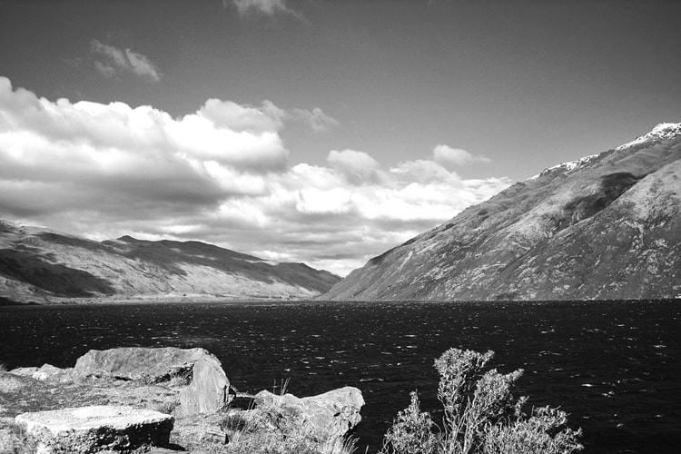
image by epcp – monochrome photos surely pop out details like clouds and skies better.
When your camera’s on monochrome mode, remember to shoot RAW files or JPEG/RAW files simultaneously. This will let you observe how your scene appears in black and white although you still have to convert a full-color picture.
Bad Composition
As you probably know already, Composition is one of the most important aspects of good photography. Landscape shots, therefore, need meticulous consideration, even though it can be tempting to just start shooting away. It’s recommended that you gaze around your scene to determine the best shooting angle. You’ll recognize it when you can honestly say that it makes the very best of the subjects available and provides foreground interest, too.
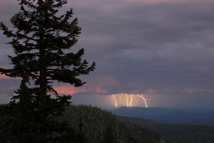
image by Jeremy Howard – great use of the rule of thirds here.
Here’s a tip: Your landscape shot will be the absolute best it can be when you incorporate the famous rule of thirds. Basically, you should split your scene up into three equally sized rows and columns for a total of nine rectangles. Your goal ought to be to place key elements of your scene either at the intersections or along the lines.
Today, lots of cameras come with a rule of thirds grid view that you can see on the camera’s LCD screen.
A Foreground That’s Totally Empty
An empty foreground doesn’t look attractive in a landscape picture. In general, a viewer is going to ignore the unattractive areas of a picture and instead focus his eyes on areas that are rich in details. Therefore, it ought to come as no surprise at all that a foreground that’s utterly dull and lacking in features will act something like a barrier in your photo. An empty foreground is going to make the viewer feel as though he is much too far away from the point of interest in the photo.
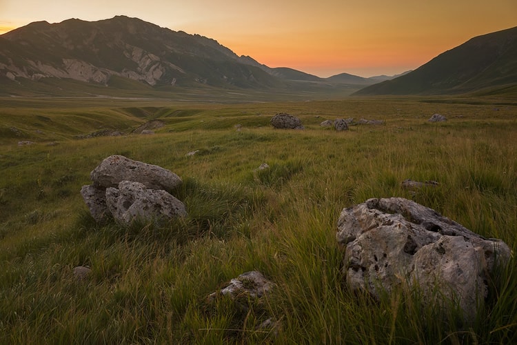
Image by Daniel Zedda – the rocks in the foreground make for a very interesting photo.
Luckily, something like this can be quite simply corrected just by putting something interesting in the foreground for the human eye to gaze at. Some examples of super-simple-yet-effective foreground details can be shells on the beach, even a group of flowers or some rocks with interesting shapes.
A final note: Putting things in the foreground works better when they actually lead off toward your main view. Overall, items of interest have to be in the distance, middle and close to your scene.
Commit These Mistakes and Ruin Your Landscape Photographs
It’s that simple: If you make even just one of these mistakes, your whole landscape shot will be ruined…so don’t make even one of these mistakes! Please. We’re begging you.
There’s nothing quite like having a nice landscape shot all lined up, only to damage it with one aspect that’s totally off. Whether that’s your horizon, light or composition, just one thing that’s not taken care of properly will make things look odd. And what could be worse than having a nice landscape ruined by a mistake that you had the power to fix?
What’s your take and experience with landscape photography? Is it your cup of tea? Why or why not? Tell us all about your thoughts on it via Twitter or Facebook!
