Old School Photographer Discovers the Value of Lightroom Presets
 by
Kent DuFault
by
Kent DuFault
I’m going to date myself. I cut my teeth in photography using Tri-X film and Kodachrome slides. Younger photographers may not recognize that I’m talking about film photography.
Photograph by Kent DuFault – Door County, Wisconsin 1974
The opening photograph to this blog post is a shot I took in 1974 in Door County, Wisconsin. I was fourteen years old.
I printed it myself in a makeshift darkroom that I set up under the stairwell to the basement of my parent’s home.
I have witnessed many changes in the world of photography: shooting modes (there used to be only manual cameras), auto-focus lenses (when these first came out, I could manually focus faster than the auto-focus!), and of course digital photography, which brings us to our topic for the day.
The idea of Lightroom Presets or Photoshop Actions was one digital change that I had difficulty embracing. I wondered. How is it conceivable to automate post-processing when every image is different? Even ones that are taken consecutively.
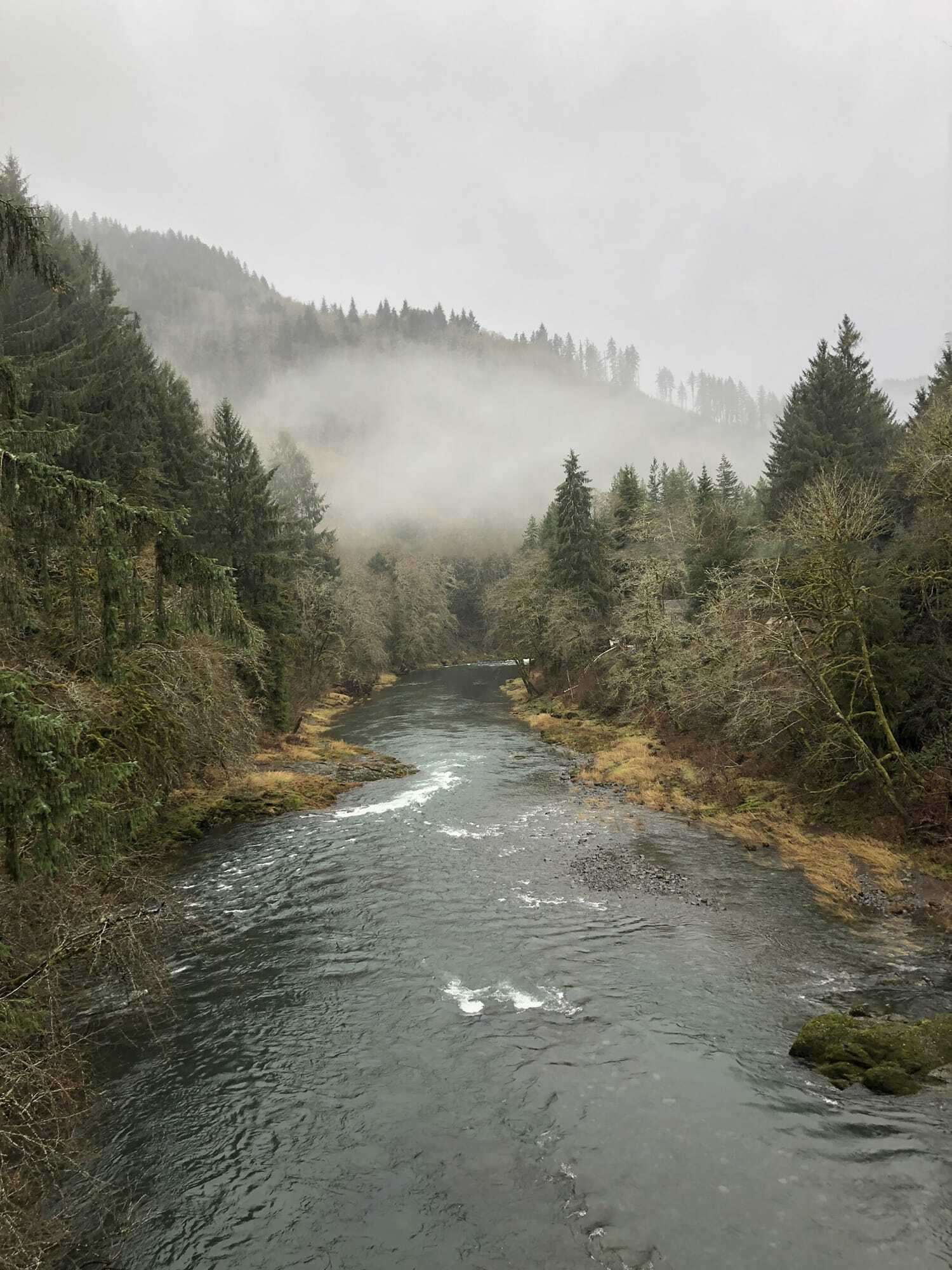
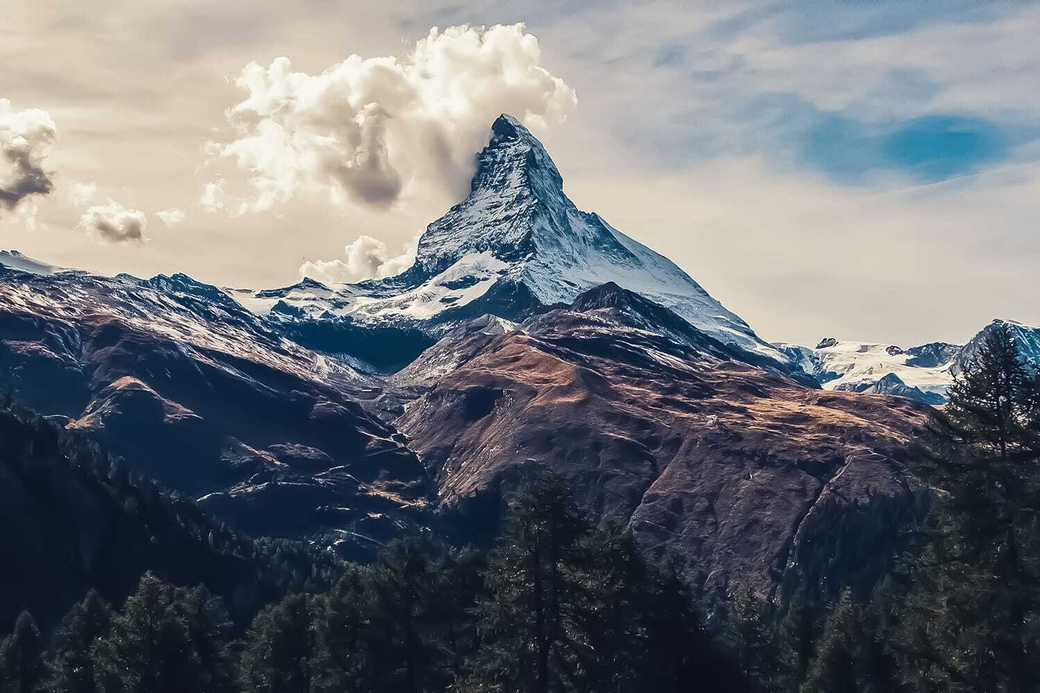
Photograph by Kent DuFault – Wilson River, Tillamook, Oregon
This photograph opened my eyes to the brave new world of Lightroom Presets. My long-awaited dream vacation to Oregon was clouded over (quite literally) by less-than-perfect photography weather.
My old film mindset said, “Oh, this is a bust. There’s nothing you can do.” But I shot pictures anyway.
That evening, as I sat in my hotel room, a voice in my head said, “Why don’t you try some Lightroom Presets on these pictures and see what happens.”
I did, and this is what happened.
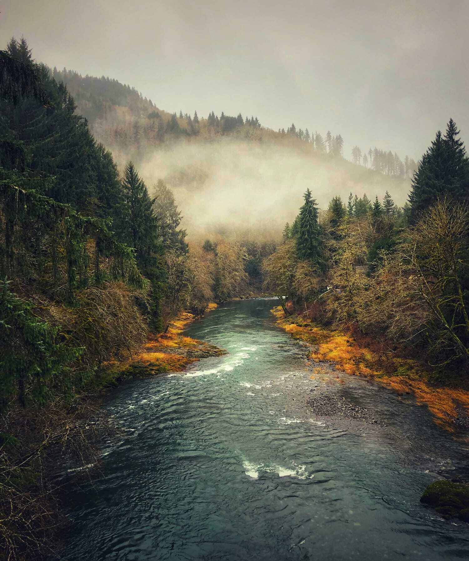
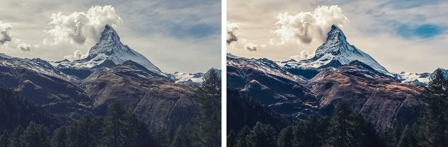
Photograph by Kent DuFault – Wilson River, Tillamook, Oregon
This image has become one of my best-selling stock photos of my entire career. Here is what I learned that fateful day about Lightroom Presets.
- They are not necessarily a final product, nor were they intended to be. They provide a jumping-off point, and then you’re free to fly wherever you want. Sometimes, one click will get you where you want to be. Other times you can tweak the results until you’re delighted.
- Presets offer a dose of creativity on steroids. You can quickly see a broad stroke of effects before choosing one. And there are literally hundreds, if not thousands, of options. (Depending upon how many Lightroom Presets you’ve imported.
The boost in creative options has offered me something as a photographer that I didn’t have previously…
I don’t have to write off any image and place it in the trashcan due to bad lighting.
Suppose my composition is good and my exposure decent. In that case, Presets can add the necessary component to make any image viable for sale or to place in my portfolio!
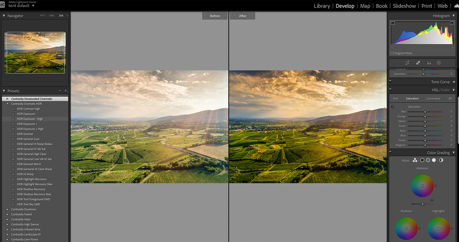
Let’s look at some examples of how these revelations can create better photos.
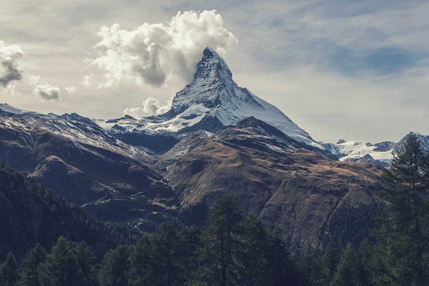
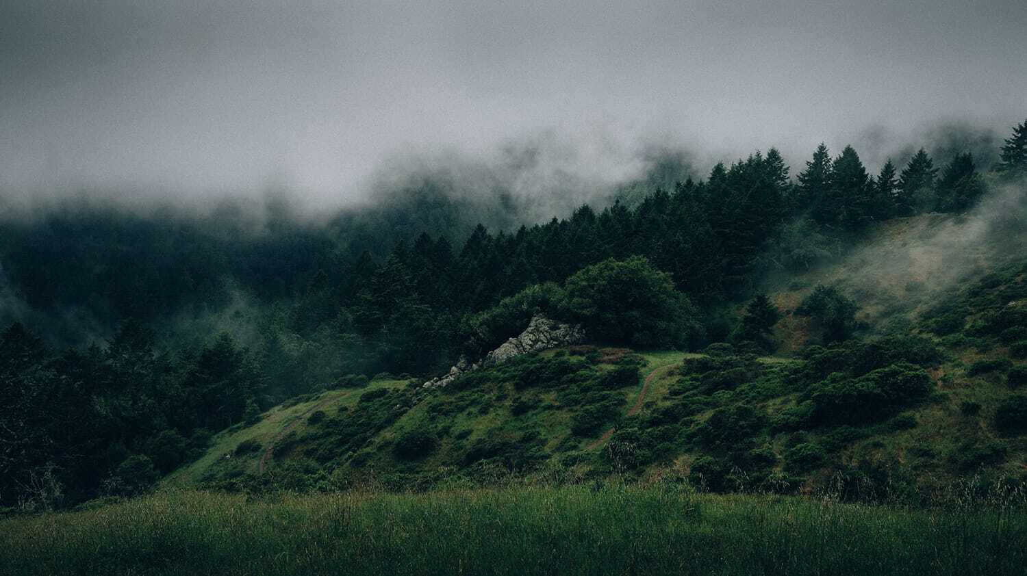
001
What an incredible mountain vista that was ruined by haze and a poor time of day when taking the shot.
This photo lacks contrast, color saturation, and sharpness.
002
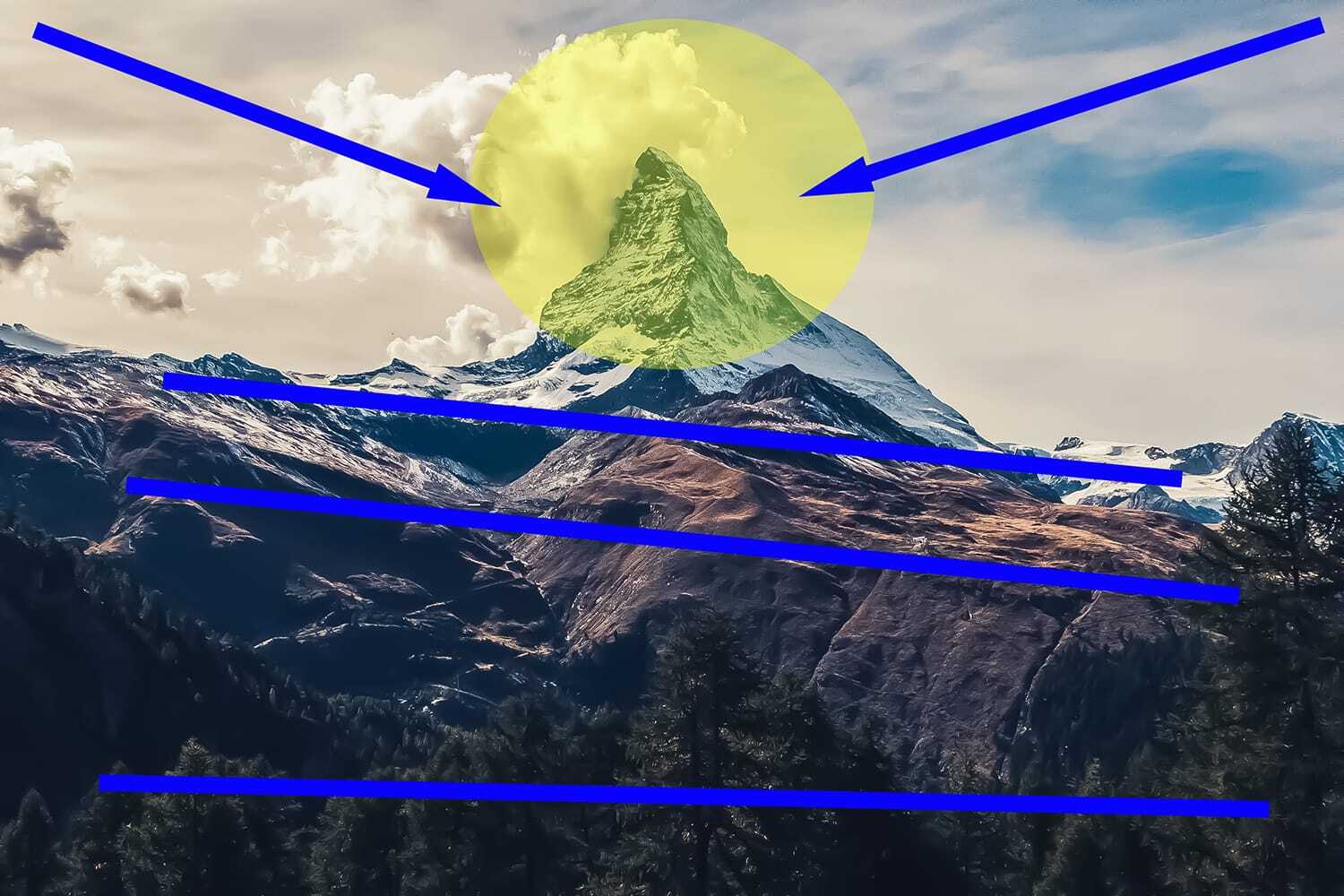
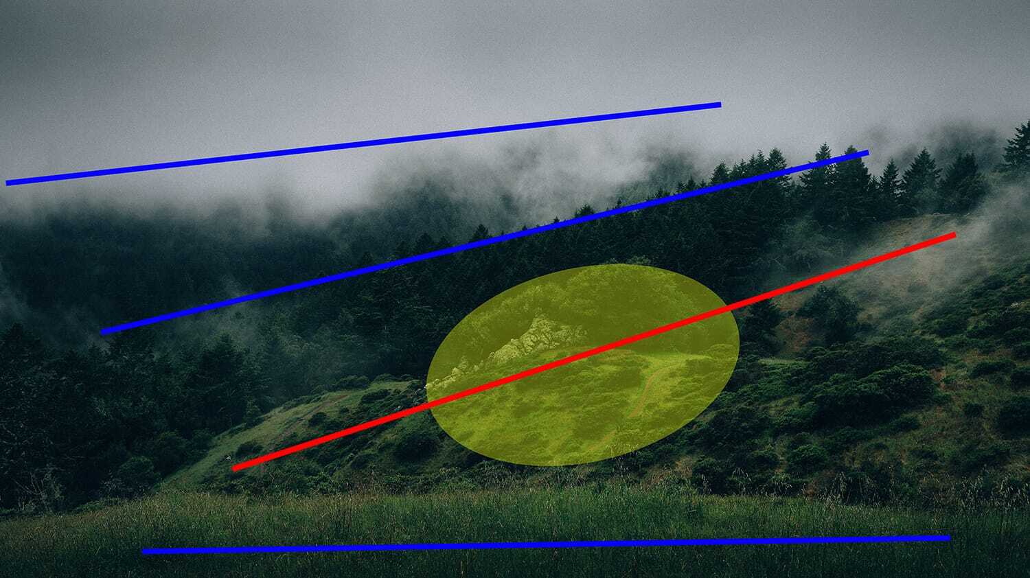
A fantastic technique to start editing any photo with Presets is to first develop a visual plan. How do you want a viewer’s eyes to travel through your image and come to rest? This resting area is known as the subject area.
The yellow oval is my resting area. I want the blue lines to be a layering effect. I would like the areas under the blow arrows to push the eyes inward toward the peak.
003
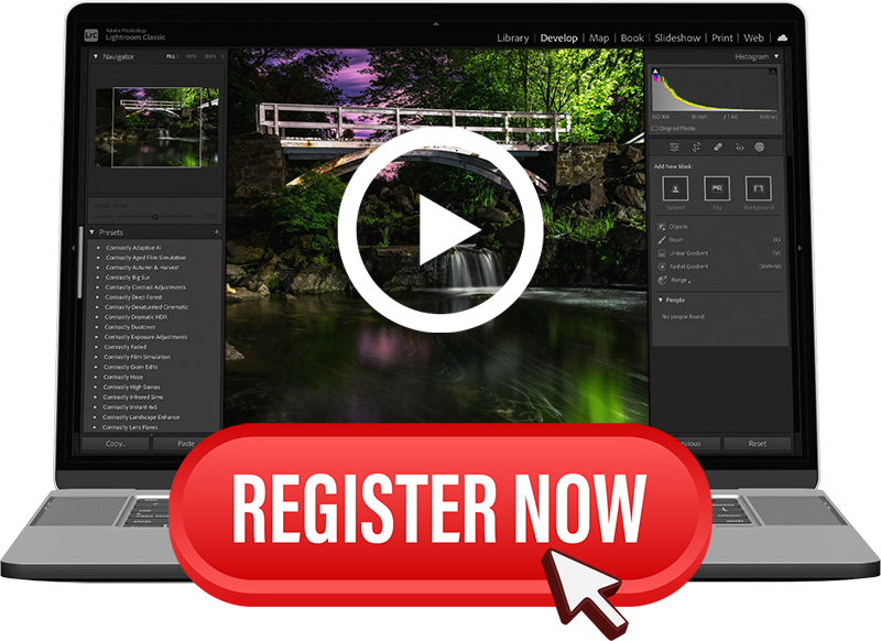
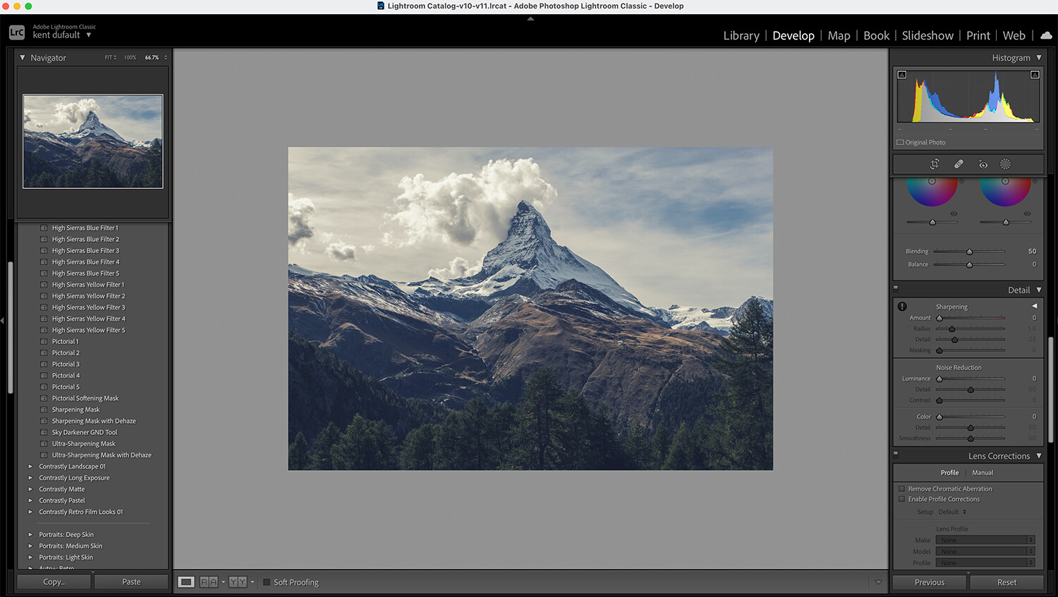
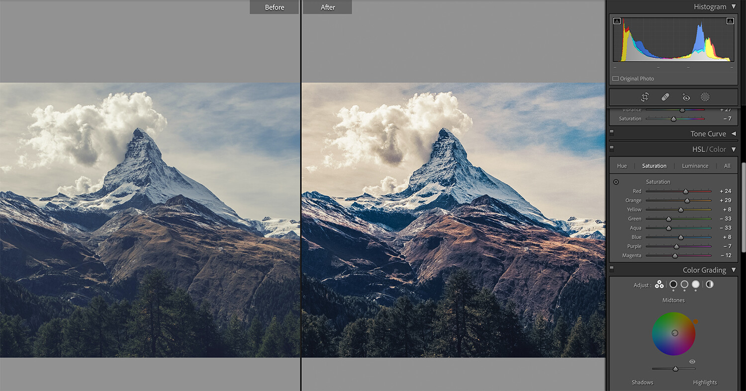
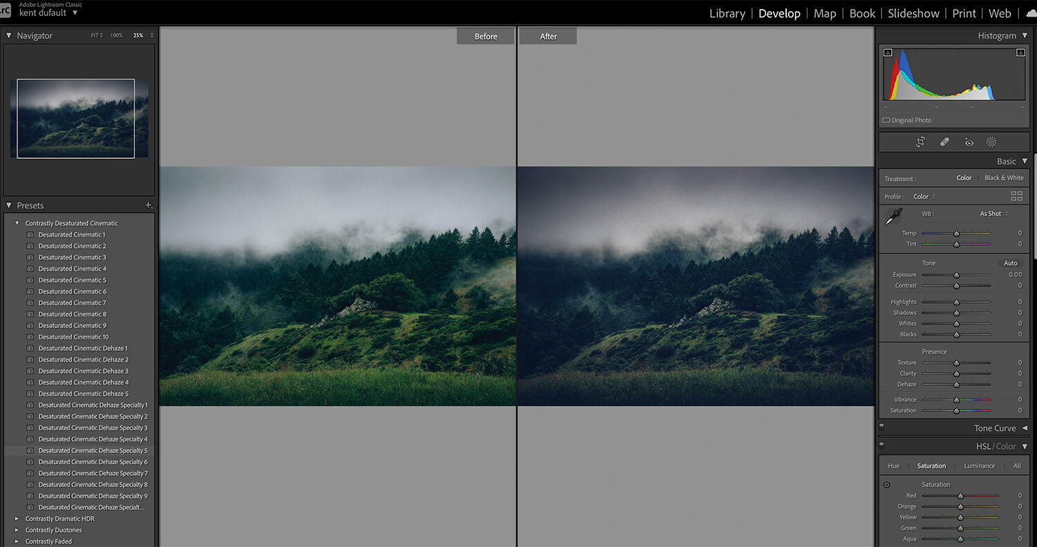
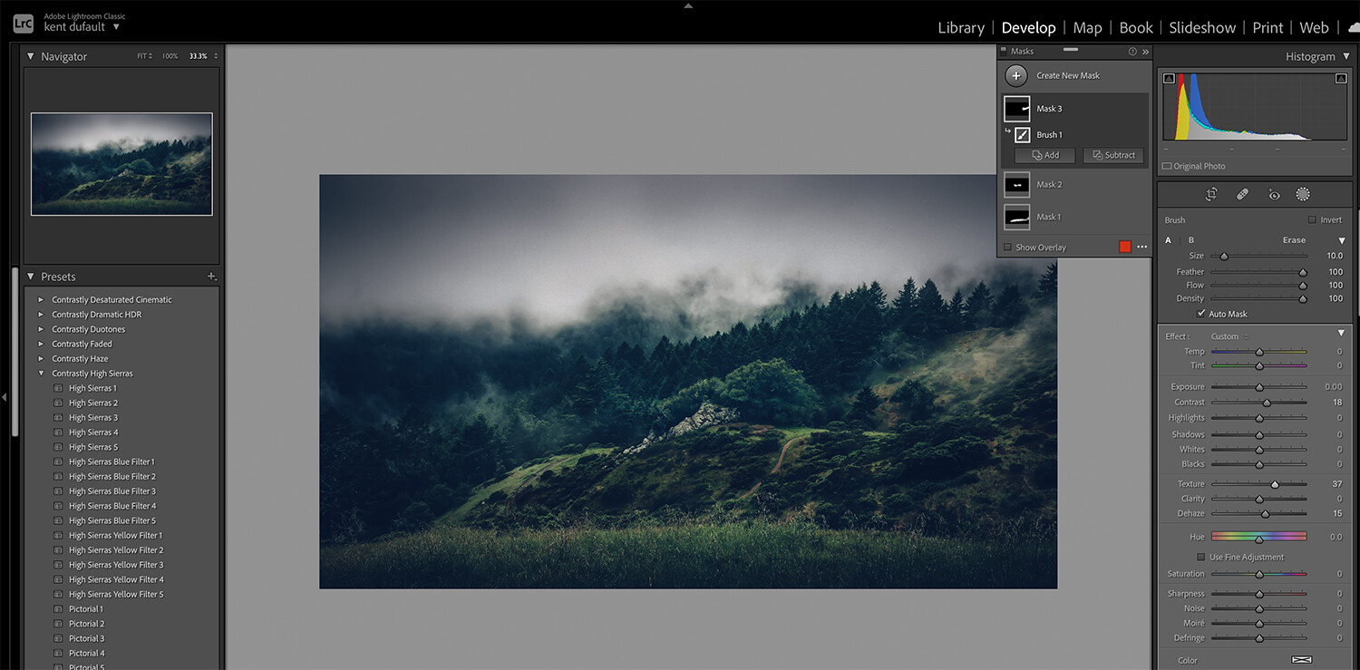
Here’s the image in Lightroom with my collection of Presets on the left. It’s a good idea to spend time playing with your Presets so that you know where to start once you’ve identified the problems with a particular picture.
004
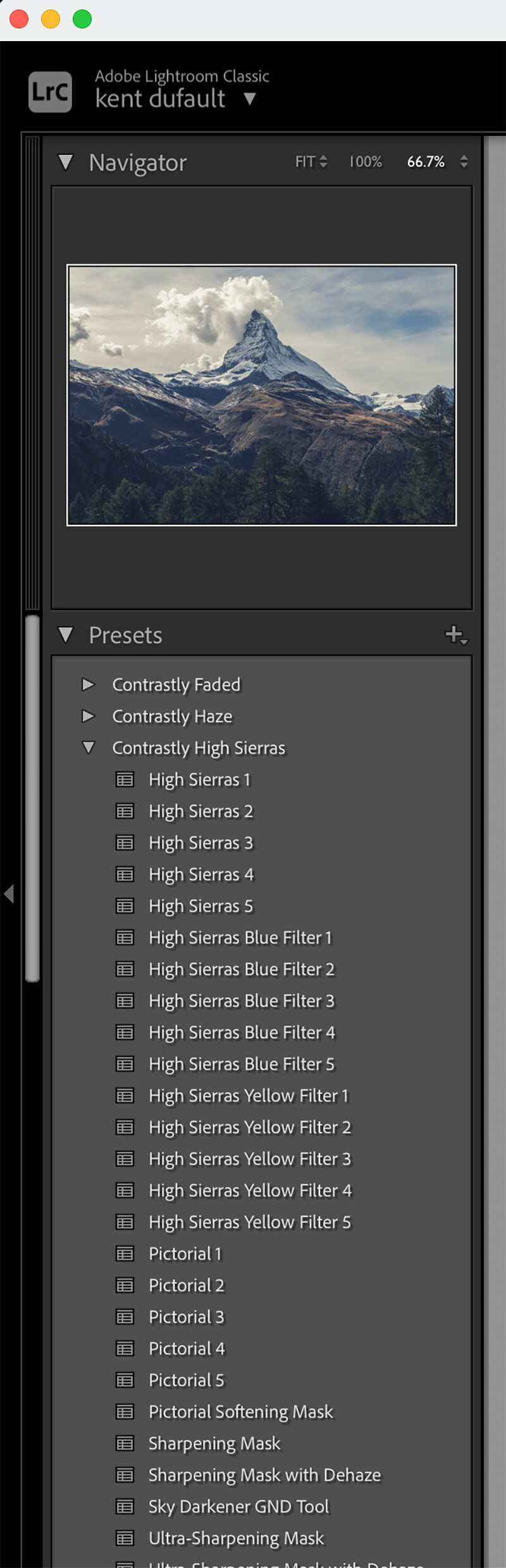
I’m starting with the Contrastly High Sierras set of Presets. These primarily affect contrast.
005
I set up my Preview screen for a Before and After view as I want to see the changes as they are applied. I also monitor the Tools on the right side of the screen to see which ones change after using a Preset and how they changed.
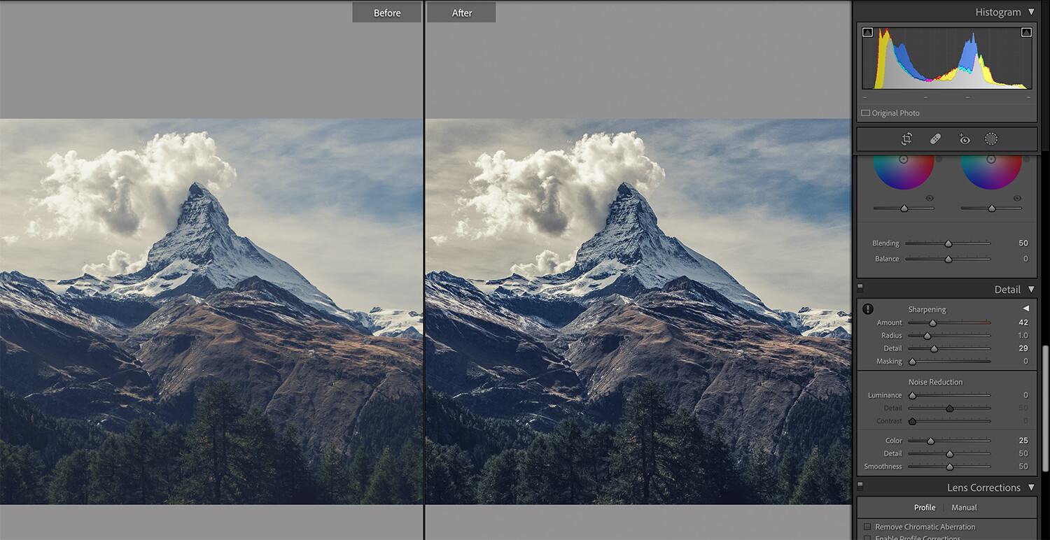
006
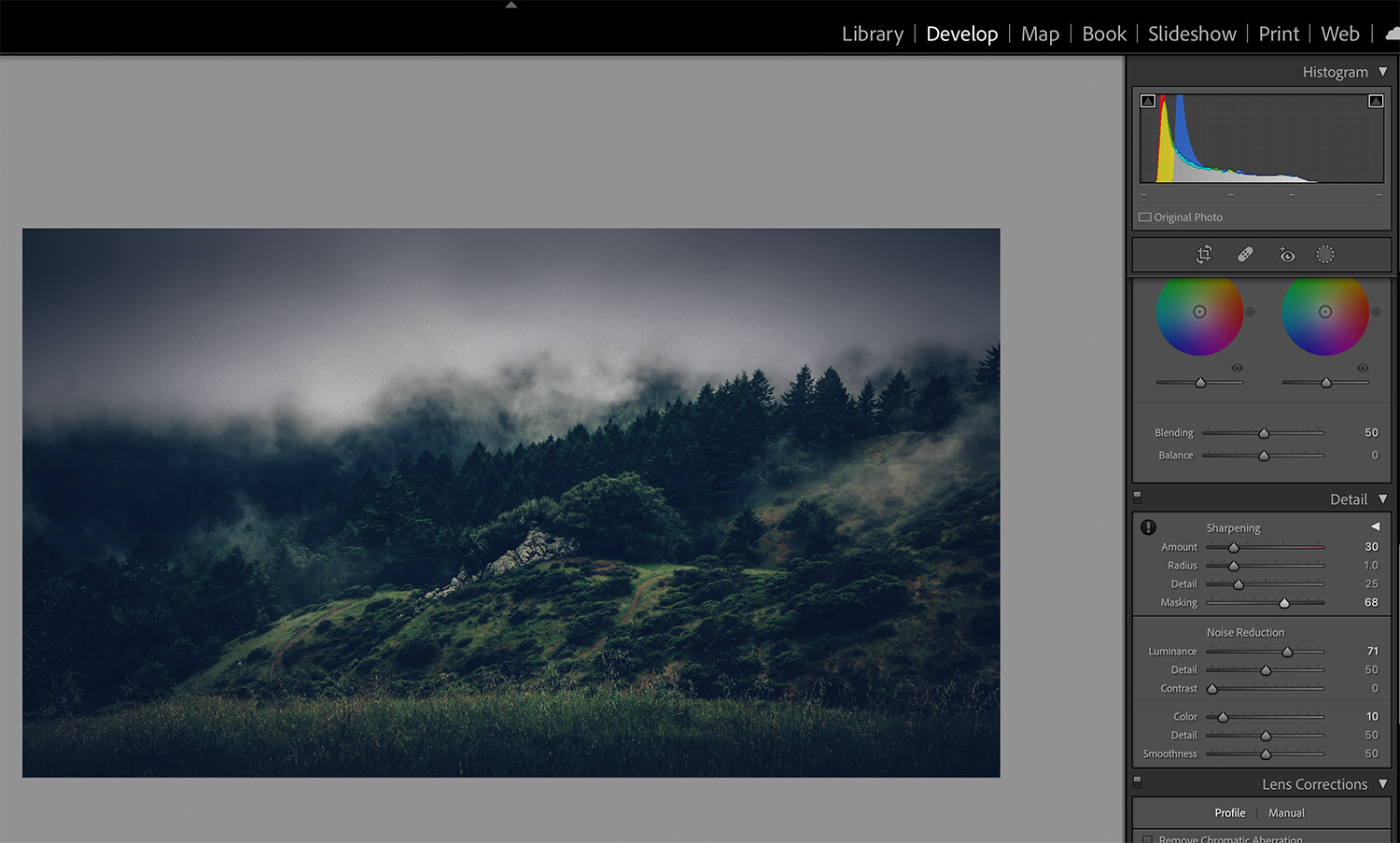
The first Preset applied was the High Sierras 3 in the Contrastly High Sierras collection. It boosted contrast and added sharpening. I backed off a bit on the sharpening toward something that better suited my taste.
This is a valuable piece of information. You don’t have to accept everything that the Preset does. It took me some time to understand that. The preset offers a starting point that will produce a known effect, then you can tailor the settings to your liking.
007
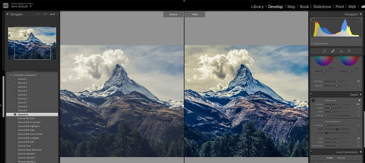
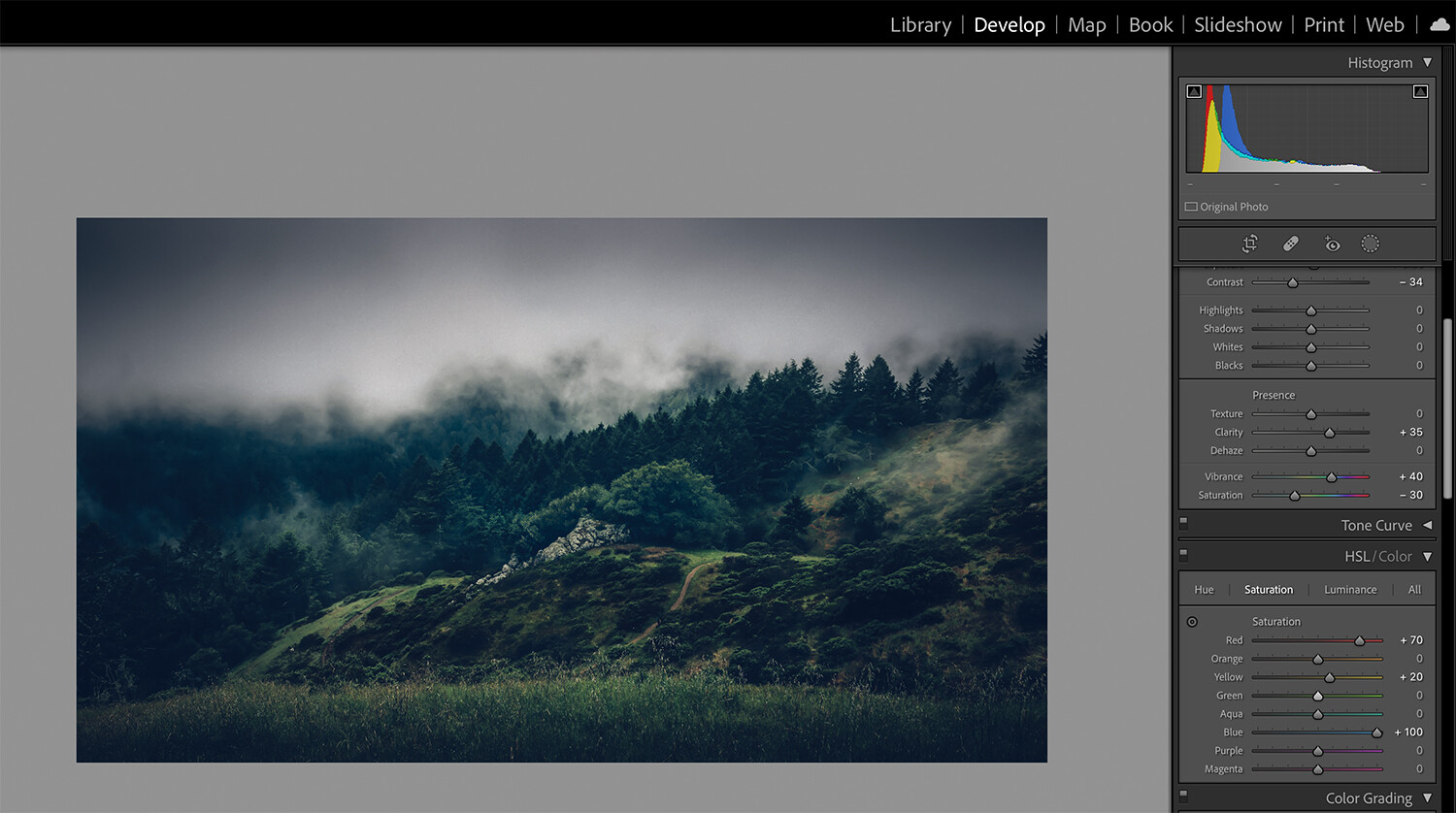
I then applied the Pictorial 5 Preset from the Contrastly High Sierras Preset collection. On the right of Image 007, you can see the changes that occurred.
008
I dialed back a bit on the Vibrance and Color Saturation sliders, as I like to keep my colors looking real in landscape photography.
It’s important to note that you can apply multiple Presets in Lightroom, but you cannot stack them. This means that if each Preset chosen affects the same tool- only the last Preset’s settings will be used. Any tool changes that are not cross-referenced will use each Preset’s settings.
009
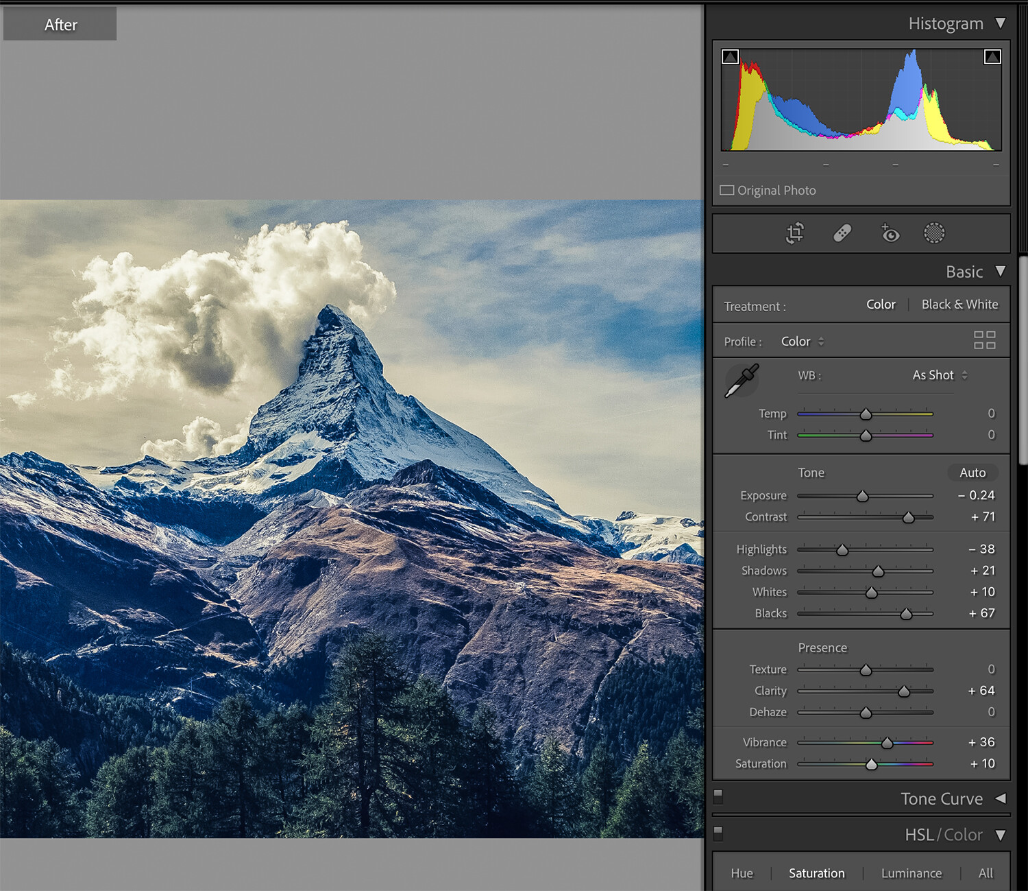
I navigated to the HSL Toolbox and manually adjusted the color saturation of each color channel to balance out my hues for my final result.
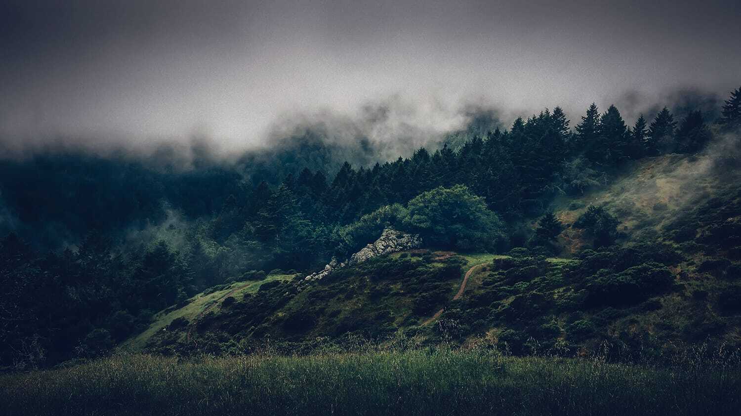
010
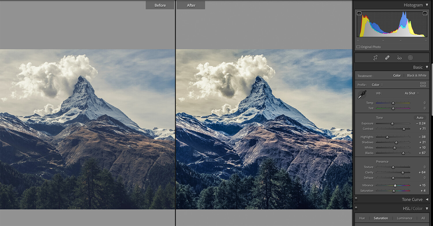
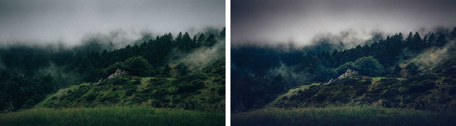
Here is my final photo. Let’s look at a comparison.
011
012
Initially, I resisted Lightroom Presets because I didn’t want my images to look fake. I learned that I can control that look, and Presets can save me a lot of time and energy!
This image (012) has a funky color cast. It also lacks the definition to establish the composition I had in mind. It’s bland overall.
Let’s map out a post-processing strategy for image 012.
013
The area in the yellow oval is my subject area- my resting spot for a viewer. I want to use contrast, exposure, and color to create a 1/3 – 2/3 division along the red line. I wish to make adjustments so that the blue line in the foreground layers to the red line and finally to the two blue lines behind the subject area.
Let’s see what Lightroom Presets can help me out!
014
I want to make my visual plan come alive, but I don’t want to ruin the mood of this extraordinary picture.
I went to the Contrastly Desaturated Cinematic collection and applied the Preset – Desaturated Cinematic Dehaze Specialty 5.
That one click brought the color balance closer to my taste. It also added mood by darkening the sky and started the process of beefing up my 1/3 – 2/3 composition.
015
The Preset created noise in the sky, so I manually applied noise reduction and localized sharpening using the Masking Brush option.
016
I then scrolled through the tools to see what had changed.
I did the following.
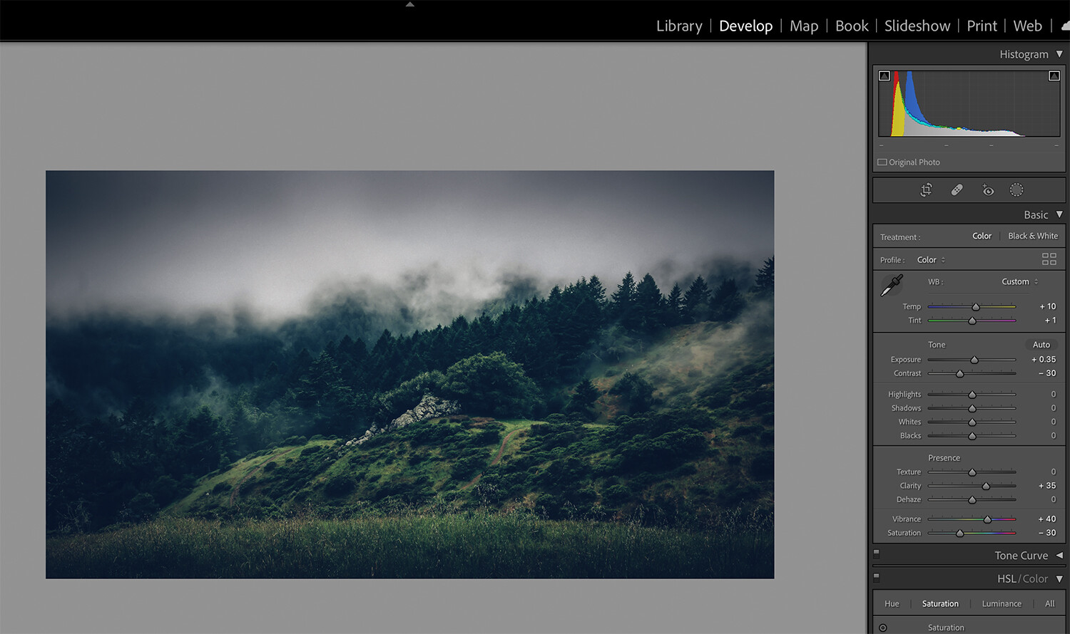
- I tweaked the global Exposure to +0.35
- I added some warmth to the Temp setting of +10
- I slightly altered the Tint to +1
I left all the other settings as they were executed from the Preset.
017
The selected Preset got me started down an excellent path. However, I needed the Masking Brush tool to beef up my subject area and solidify my 1/3 – 2/3 composition. You can see the masks and settings in image 017.
018
My last step was to manually execute some localized color enhancements in the HSL tab.
019
Here is my final photograph. Notice how I didn’t alter the mood of the shot and that my subject area around the tree is now visually dominant.
020
Here is a before and after view. My total editing time was about three minutes. Presets save valuable time when you’ve learned to work with them.
Can Presets save any picture?
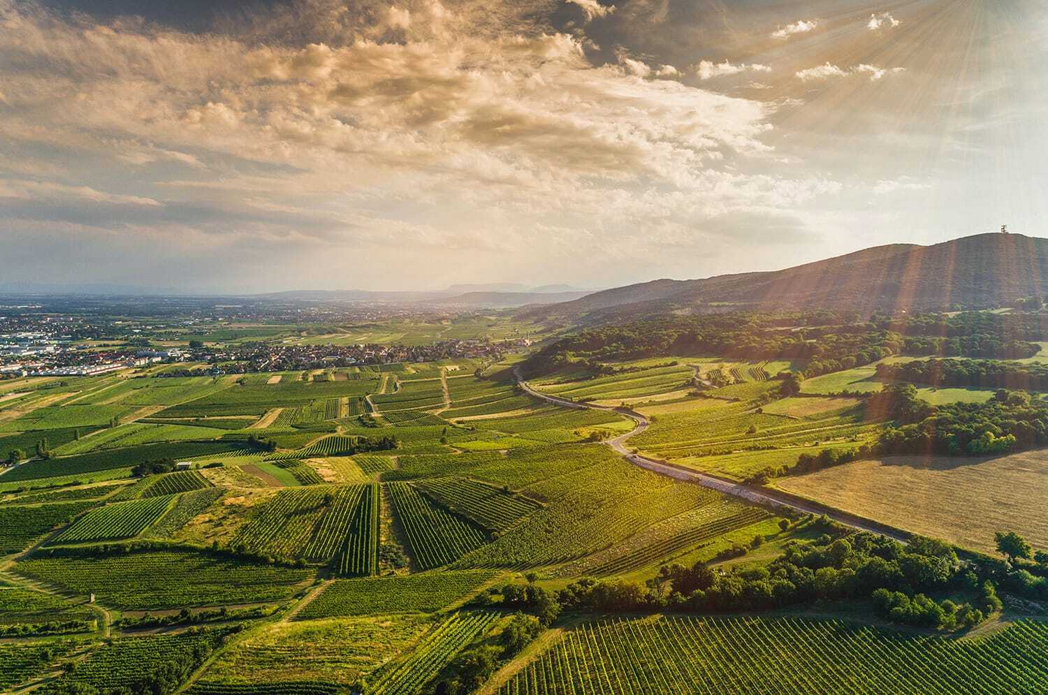
021
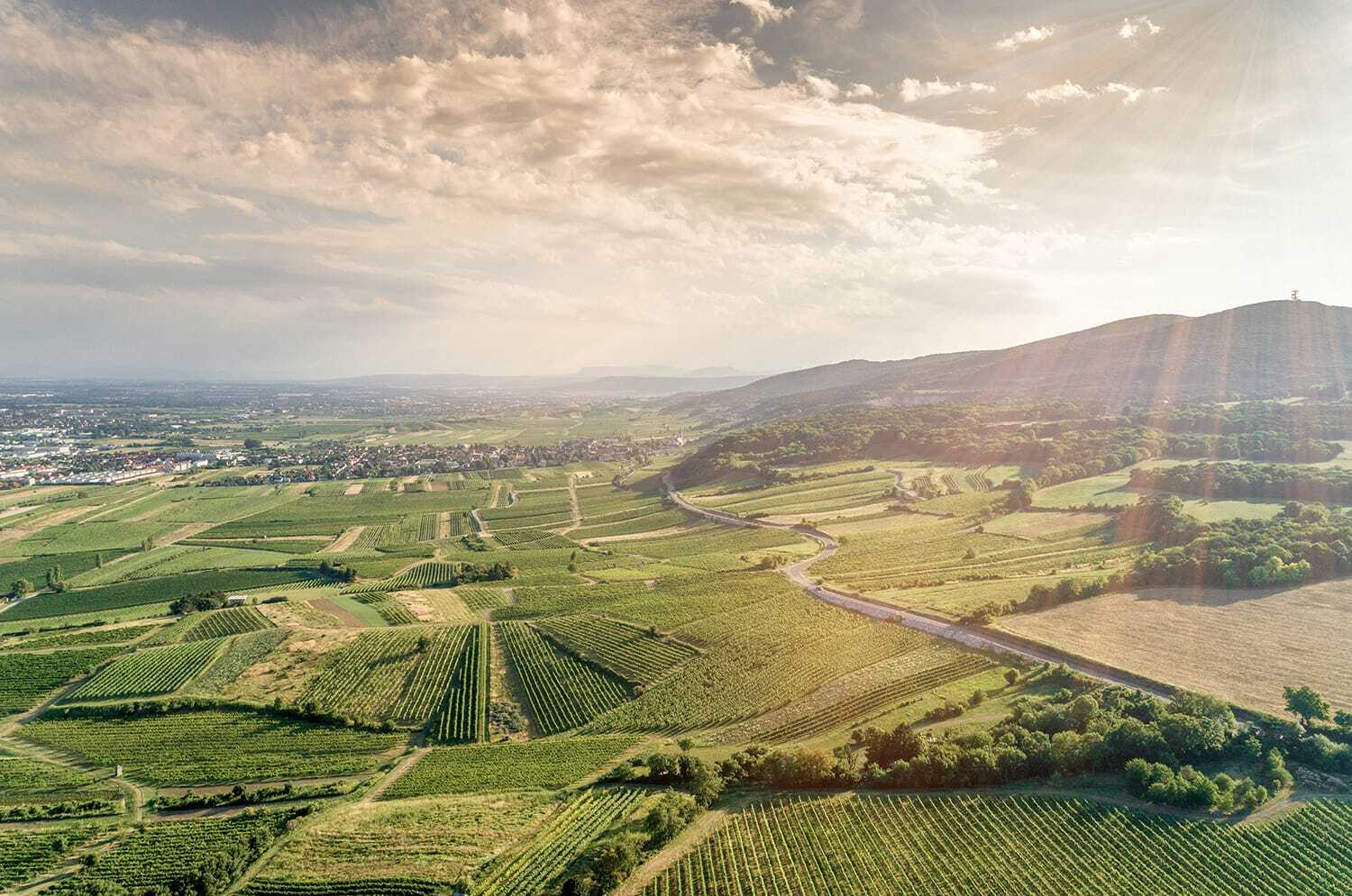
This vineyard scene lacks contrast, is over-exposed, and suffers from haze created by the lens flare.
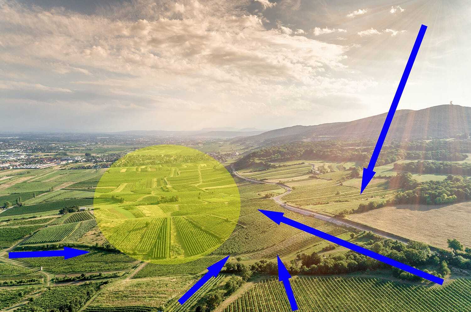
022
The yellow oval was the intended subject area. The blue arrows indicate proposed leading lines and pointers toward the subject area.
Unfortunately, nothing is working very well in this current state. Let’s take a look at some Presets.
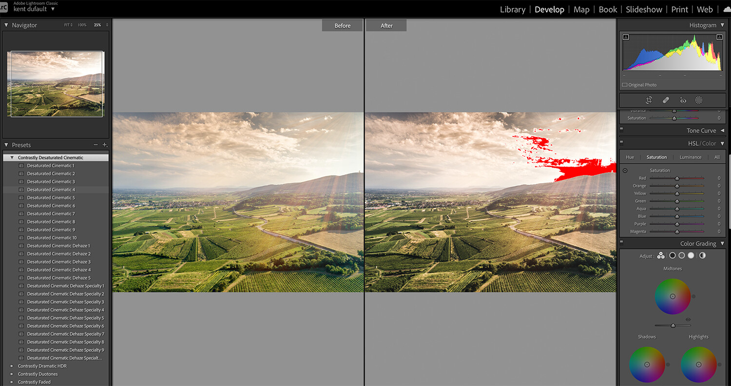
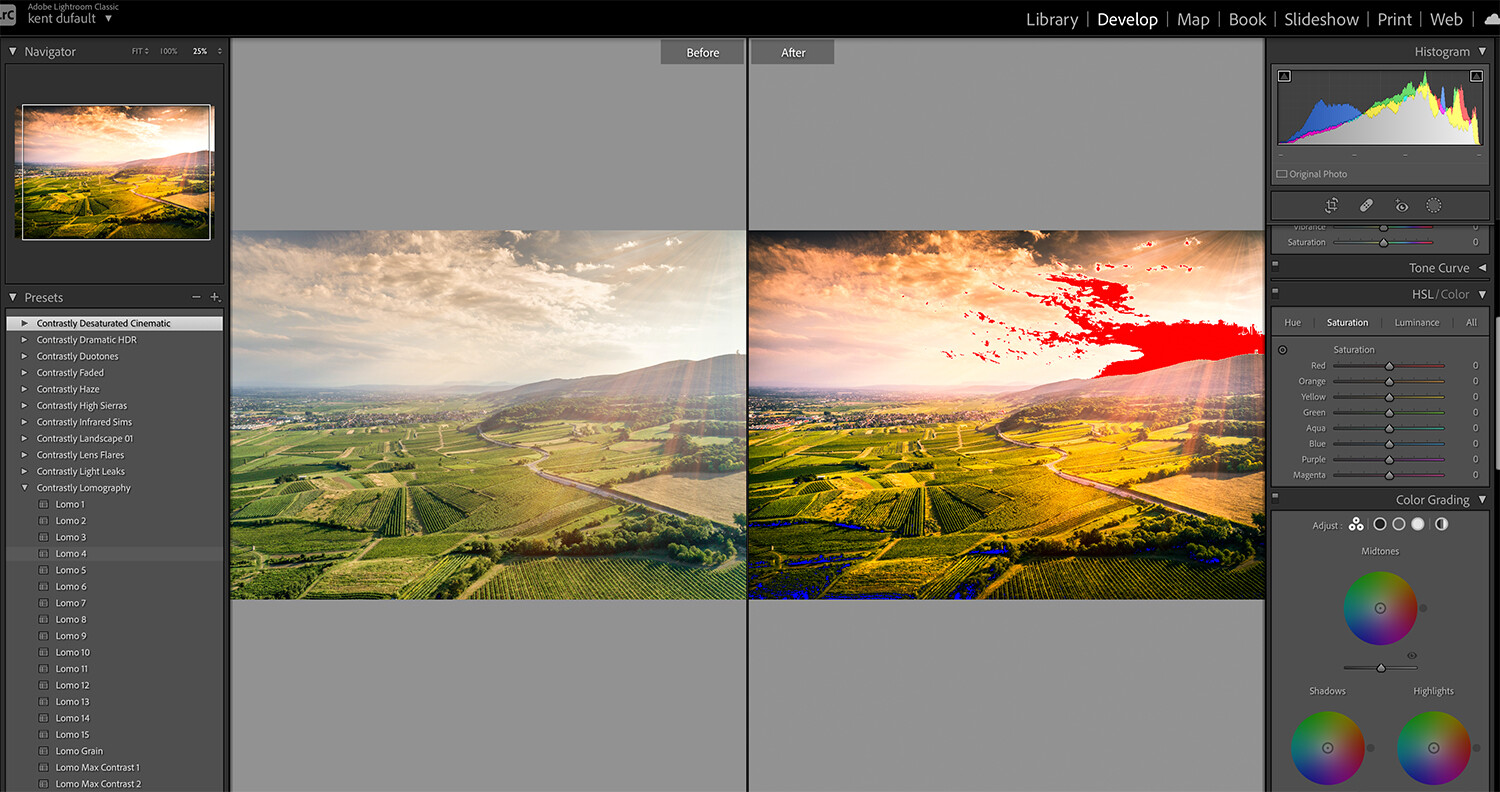
023
The first Preset that I tried did an excellent job of putting some color and contrast back into the picture. It also created a significant problem with abundance highlight clipping in the sky.
When using Presets, you should always have your clipping indicators on. Presets will automatically adjust as they were told to when created.
They don’t know if they are creating clipping!
024
I decided to give a different Preset a try, and that one didn’t work out at all.
When checking different Presets, you can see the result in the thumbnail view (upper left corner of the Lightroom workspace) and the Preview window before actually applying one. If you apply one and don’t like the result, you can use the ‘control’ Z keys (iMac) to back out.
025
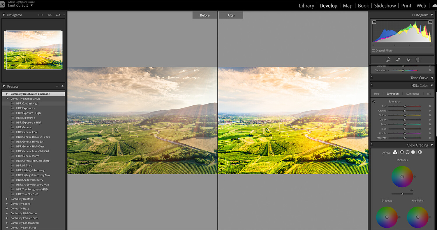
I backed out of the previous attempt and tried the HDR Exposure High Preset from the Contrastly Dramatic HDR collection. However, the result looked overcooked for my goals (image 025).
026
I backed out again and tried some Presets from the Contrastly Lomography collection. Image 026 displays the Lomo 4 Preset.
If my goal was to post to Instagram, I would probably have gone with one of these Presets. But I have other thoughts for this picture.
027
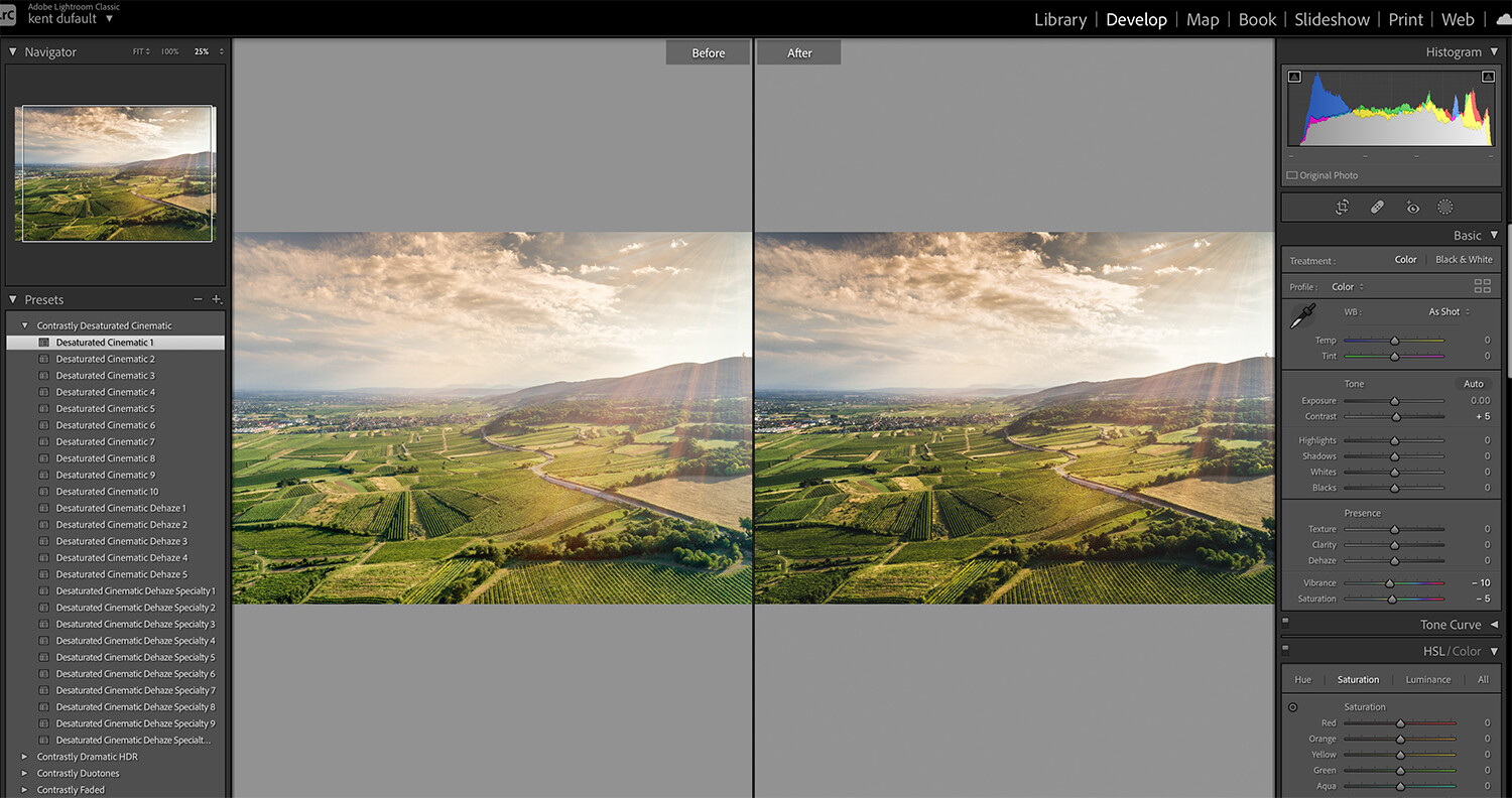
I cleared everything and went back to the Desaturated Cinematic collection. Initially, I had applied the Desaturated Cinematic 4 Preset. That was the one that blew out the highlights in the sky.
This time, I applied the Desaturated Cinematic 1 Preset, which created a subtler effect that worked perfectly! My histogram is well-balanced with no clipping.
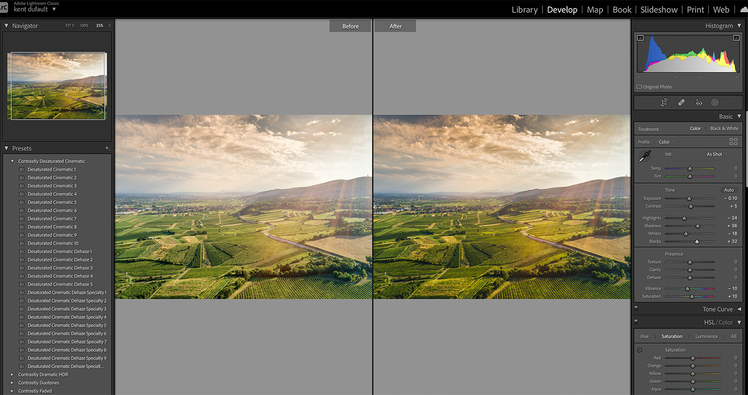
028
I went in and manually adjusted a few tools in the Tone tab. My goal was an enhanced image that didn’t look overcooked.
029
Here is my final photograph. This is probably the least successful of the three case study images profiled here in this blog post. However, with the minimal time it took me, the result was worth the effort.
Conclusion
- Lightroom Presets and Photoshop Presets & Actions are an important and viable solution for any photographer as they save a lot of time sitting at the computer.
- These tools can also help break creative block as you can quickly scroll through and visualize numerous options for a picture.
- A Preset isn’t the end all- click a button, and it’s done. You have complete control over your final result.
- Presets can’t be stacked but can be layered.
- Finally, and most importantly to me, Presets provide viable enhancements for images that had to be created under less than stellar lighting conditions.
- No photo is without consideration when you have Presets in your arsenal!